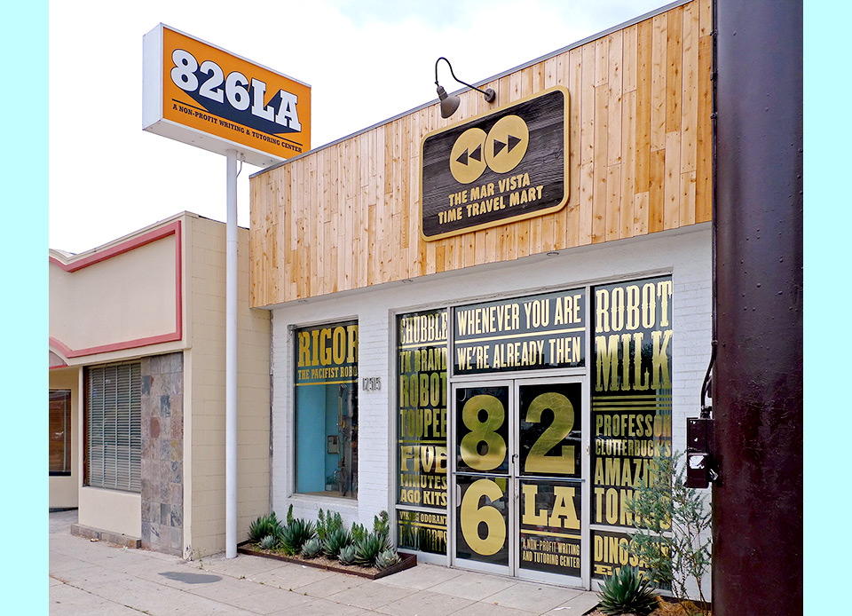
The MAR VISTA TIME TRAVEL MART

826LA and 344 go back a long way. I became the inaugural designer of the Echo Park Time Travel Mart back in 2006, creating all their graphics and packaging for the first few years. Since then I’ve turned into more of a cranky advisor, but I still rappel in on a few special projects. Designing the window graphics for the recently opened Mar Vista branch of the Time Travel Mart was just such an occasion.
As with the original Echo Park location, the store is an elaborate front for a tutoring center that provides reading and writing help for at-need kids in the neighborhood. When 826 first came to Los Angeles, they offered tutoring sessions at the historic SPARC building in Venice, but they never found the right space to open a full store and center in that neighborhood. When a suitable location presented itself, 826LA executive director Joel Arquillos pounced.
We had a few brainstorming sessions about what the new store should look like. Joel and I were joined by current 826LA design coordinator and vowel-aficionado Shannon Losorelli-Doronio, store manager Lauren Rock, and by our excellent design volunteers Molly Burgess, Laurice Feller, Marlene Franco, Lindsay Goldner, Sharon Levy, Jenny Liang, Ken Mori, Christine Nakashiba, Daniel Phillips & Kim Karlsrud, Krista Turner, and Ricky Vodka.
My impression had always been that all the Marts work like a retail Tardis that remains constant as it travels through the eons. But sometimes purity of concept has to give way to the aesthetic desires of the moment. Joel was keen on the idea that this new Mart would be a Mercantile. This is where things got tricky. We both spoke of an 1800s market, and we were both clear on what that meant. In fact, we were both so clear on it that we didn’t feel the need to elaborate or confirm. I was sure we were talking about a colonial British trading post, Joel was sure we were talking about a general store in the Old West. Joel was surprised when I brought in an elaborate pseudo-Victorian marquee design, and I was surprised when he rejected it.


Joel offered that we could just remove the Mirror Mirror style ornamentation and leave the rays, but that felt wrong. Having the rays as a little allusion to my favorite graphic device would’ve been fun, but making it the primary element felt like rolling out a retread, so I begged off. I’d already adapted my original Time Travel Mart logo for the new location, and found possible vendors to make a wood-carved sign of it. Joel and his team took care of the rest, deciding on a lovely wood paneling that goes great with the Old West theme which is on full display within the store:

The Mar Vista location also came equipped with a beautiful illuminated sign, which was a perfect place for the new 826LA logo I’d designed back in 2011. It’s a simple, bold affair that plays off the old Hollywood studio logos and has proven to be really flexible across all kinds of formats—books, business cards, online and on-screen uses, and now three-by-four feet tall above Venice Boulevard.

A logo is only as good as its style guide (let’s say) and a style guide ain’t no good if it’s too damn complicated too use. If you’re dealing with a professional in-house design department and their partners, sure, you can get a little more complex, but failing that? Keep it simple!

Setting boundaries is important, too. And making threats.
A few months after the new Mart had opened, Joel and Lauren asked me if I wanted to design some window graphics to make the store front more eye-catching and to cut down on the afternoon sunlight light that was slowly roasting the store clerks. We decided on listing a few of the product names, and I went to work.
The actual design was a fun, fast, typographic exercise. The real magic would come from the physical execution. I wanted gold foil. 826 wanted gold foil, too, but didn’t have the money to get it done. They suggested that we could just use a flat color foil to stay within budget. Obviously, that wasn’t gonna fly, but I didn’t have the cash to simply make up the shortfall. Instead I went rogue and posted my original mockup on Facebook and Twitter to see if any of my friends could help. Within hours, Nick Carranza and Jon Schleuning had connected me to some great vendors. Jon’s friend Scott Powers of D’ Andrea Visual in Cypress, California.

Hey, did the wood sign people make the logo circles bigger without asking me, turning the sign top-heavy and the spaces uneven? They sure did. (Sigh.)
Scott took up the challenge and matched the original budget with a very generous in-kind donation, making all this possible. He also tracked down a gorgeous foil that’s gold on both sides and could be mounted on the inside of the windows. This was important in a neighborhood where vandalism is still a real problem. (Run-of-the-mill film is metallic only on the non-adhesive side. It would have to be mounted on the outside of the window, and it would’ve been messed up in a matter of days.) You can have the best design in the world, but if you don’t have a great and dedicated vendor to make it real, you ain’t got nuthin.

Please note the reflection of a stack of Mammoth Stew cans—one of the original TTM products!
With every job comes the delicate moment of comparing the comp to the actual item. It’s not uncommon that the real thing is a little bit looser in the joints than the carefully assembled one-off comp. In this case, the real thing far exceeds what I had mocked up. You simply can’t beat gold. Sweet, sweet gold!
