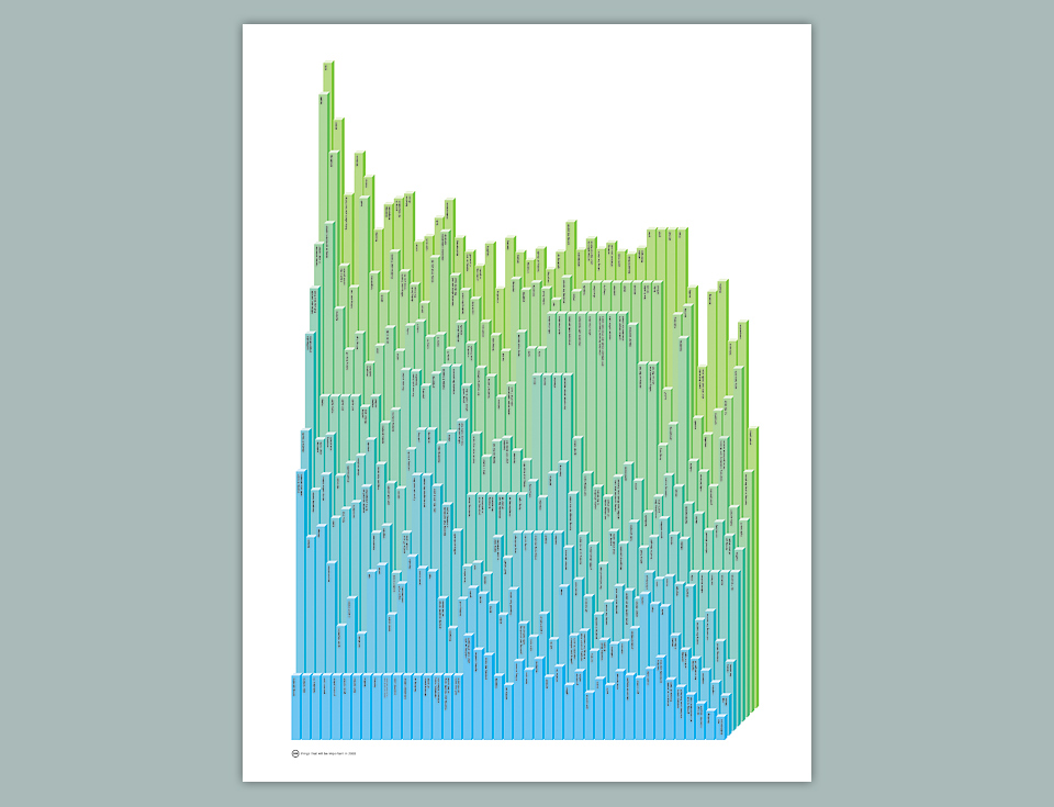
344 IMPORTANT THINGS

Hardly ever does any project arise out of a moment of pure inspiration. The deadline usually comes first. With self-initiated projects the trick is coming up with a deadline that feels real and immovable, so it looms large enough in your mind to scare you into working. The New Year is usually a good one.
As I was casting about for an idea for the 2003 poster, I thought, “Well, OK… what’s going to be important in the new year?” and started making little mental lists. As I’ve said elsewhere, I tend to think that a lot of little funny ideas that build on each other make for a better experience than one big laugh. I also like the musicality of lists. And as the company name is 344 Design, I set out to find 344 things that would be important in 2003. I thought it would take me a long time, but I got into a good rhythm, and the list just poured out.
The problem with all this is, of course, that a lot of little ideas are fun to read, but don’t necessarily make for a great, punchy visual. I experimented with having each item on a separate sphere bubbling out of the palm of my hand, but it felt fussy. When I hit on the idea of using bar graphs, everything fell into place. Not only did they combine into a great architectural landscape that was intricate but massive, it also allowed you to enter the text at random points, and go exploring from there. Which was perfect!

When the Art Directors Club named me one of their Young Guns in 2004, I got to take part in the corresponding group show at their New York gallery. This poster was part of my exhibit, and I got to see actual people read it at the opening party. Which was amazing! It’s just nothing I had ever experienced before. I’d watched friends read things I’d written, but that’s a totally different situation. They know that I’m hovering, watching their face for the smallest reaction. These were students and designers who had no idea that the work was mine. So when they started cracking up, pointing out parts of the poster to each other… What a high! It made me want to do more things as an author instead of staying on the sidelines as a visual adviser.

Aesthetically, this is probably my favorite piece. I’m not sure if it’s my best, but it’s so clean and orderly, and that’s very comfortable to look at for me. The graph is a perfect self-contained object. I didn’t screw up on this design. I got this one right, and that allowed me to loosen up a bit from then on in.
