AI/AP CALL FOR ENTRIES

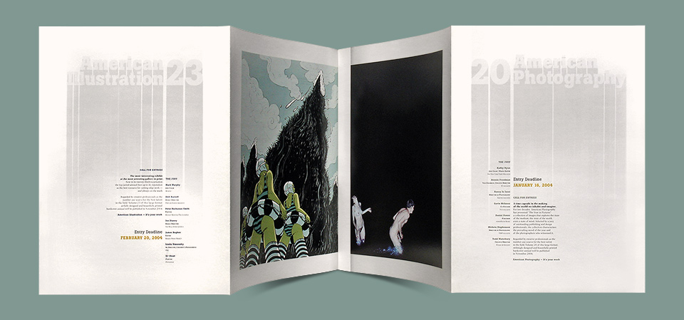
American Illustration and American Photography are two of the premier annuals in their respective fields. I got to design the 17th volume of American Photography in 2001, and it’s tradition for the book designer to create the Call For Entries mailer for the following year as well. Which I did. To my happy surprise, I also got chosen to design a Call for Entries brochure for American Illustration the year after that, and finally this combined Call for Entries poster for both competitions in the waning days of 2003.
Beyond the honor of being asked back more than once, I loved working on these jobs for the sheer joy of it. Mark Heflin, the director of both competitions, has a great eye for up-and-coming illustrators and photographers. He prides himself on championing artists before they become widely known.
For me that meant I always got to build my layouts around the finest possible ingredients. (I felt the same way working with the great writing at the Echo Park Time Travel Mart.) In this case, the illustration was by Yuko Shimizo, who was then still a few years away from becoming Yuko Shimizu®. The picture of the frolicking nudists is by acclaimed photographer Ryan McGinley. The two images made for a fine dirty diptych, and I wanted to present them as such.
By using an accordion fold I could protect both pictures on the inside of the mailer as a surprise for the recipient. The fold also let me put all the crucial information about the competition on the outside, so you’d see it right away. What’s this all about? Who’s judging this? When do you need my stuff? The nuts and bolts were hidden away on the back. Where do you need me to send this? How much do I owe you? Maybe it really is a German thing, but I do so love designing a good form! The whole piece is gridded to within an inch of its life. Everything aligns with something somewhere.

Most of the information payload is contained on the inside of the mailer.
The main typography on the dual covers was my attempt at channeling Hideki Nakajima, whose work I was coming to know as I was writing my first book, All Access. I wanted the letters to rise like trees out of the mist. Which is not easy to do on press. That type is printed purely in black ink. Fading it smoothly to a pure white without a noticeable border at the bottom is a major achievement.
There is also the risk of banding along the gradation—stripes as you’d see in a defective ink jet printer, for example, but caused by noticeable steps from one level of dot density to another. None of that happened here. The faint horizontal stripes you’re seeing in the images on the page are caused by show-through—the printing on the back of the paper shining through to the front. Cost concerns kept us from spending even more money on even heavier paper.
One issue that popped up in the process of designing this piece was the fact that the two images had slightly different proportions. I had intended for them both to have an even one-inch border all around. The fix was easy enough. All I had to do was add an extra strip of black on the right of the bathers. Mark took the very sensible step of running this past Ryan, who rightly pointed out that the proportion he’d chosen was very much part of the piece, and that he’d prefer I not monkey around with that.
The actual solution turned out to be easy enough. Both images would share the one-inch center border. I added a little trompe-l’oeil shadow to make it look like the illustration side of the mailer was overlapping the photography side. I liked the idea that there was more nudity hiding in that late night lake.
I’ve been an illustration groupie all my life, but working with Mark Heflin on these projects gave me a whole new insight into the field. I look at both annuals with such reverence. And now I’ve actually had work in American Illustration twice! The jury chose to include the Daily Monsters in 2007, and then honored the Saks Fifth Avenue Yeti in 2012. Both times I felt like a complete impostor, being in the company of people who really know what they’re doing, but I certainly didn’t complain. I love that my characters snuck in with the cool kids!
- See more