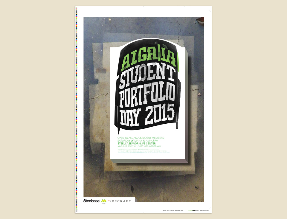
STUDENT PORTFOLIO DAY 2015

My friends David Mayes and Haven Lin-Kirk invited me to design the poster for AIGA/LA’s 2015 Student Portfolio Day, the day when students from all over the Los Angeles area get to show their portfolios to a group of local professionals for constructive feedback. It was an honor, a privilege, and a welcome occasion to whip up some custom letterforms with Scotch tape and spray paint.
As I’ve talked about when talking about some of my other poster designs, these pro-bono gigs are always fun R&D time. When this one rolled around, I’d just finished some highly constructed lettering for Print and for my Austin talk, so I felt like getting my hands dirty with something rough and immediate.
In the process of preparing a gallery show of my work I’d been introduced to the magic of spray paint. I had a few cans of Montana Gold left in the garage, and was keen on using it again. I sliced up a few old event posters that I’d discarded for minuscule imperfections, and stuck them together to make a nice, big artboard for myself. With room to move, I simply created the letters with little bits of Scotch tape.
The plan was to make all the text from tape, then spray the whole sheet with black paint. I’d wipe off parts of the tape mask, and remove parts of it. That way I’d get different textures out of the same setup.
Once I’d created the headline type I migrated to the garage, put on my respirator and went to work with the spray can. After applying the first round of paint I tried wiping off some of the tape. Total non-starter. Montana Gold dries almost instantly. All I managed to do was make was get bits of paper towel stuck to the art. That and some leaves that had blown in. My garage is no clean room, sadly. But I liked the look and doubled-down. I added more leaves, and a straetegically placed No.7 X-acto blade, weapon of choice of design students everywhere.

A little later I thought, “Well, if ONE blade is cool…” and poured out a whole jar of used X-acto blades. This added nothing to the look of the piece, but allowed me spend an extra 30 minutes picking sticky blades from the artwork.
The next step involved removing the tape mask. About halfway through my letter building I’d switched to removable Scotch tape. This proved to be a smart choice. Removing the first two lines of non-removable tape without tearing the paper to shreds took about two hours.
Finally, I cut the whole piece into 16 pieces, so they’d fit on my 9 x 12 inch scanner glass. I’d planned to have the artwork ready in time to be photographed, but when does it ever happen that way? Let’s say that I planned the delay to make the experience more like that of finals week in college.

Once I’d scanned, reassembled, and cleaned the artwork, I added some color. And found the whole thing a bit boring. I briefly toyed with the idea of chucking it all in favor of some digital teasers I’d put together for David and Haven weeks earlier. But no! No retreat! No surrender! Every piece has a moment when it feels tedious and lame—when the original image in your head is fading and there isn’t yet a new one to take its place. That’s when you’ve got to push through!

Teasers for the AIGA/LA website.
As I was cleaning up the mess I’d made in the garage I noticed the lovely pattern the whole thing had left on the floor. I decided to incorporate that into the design. Doing so suggested (to me) a three-dimensional shape levitating above the floor. Once I had the basic monolith mapped out I figured that it was a floating portfolio case. As this was for a portflio review day, I felt that this portfolio should be bulging. Season to taste with event information and logos, and presto!
The last bit of improvisation happened on press. I’d designed the poster with a 1.5 inch white border all around, but when David texted me a snapshot of the untrimmed sheet complete with registration marks and color calibration bars I thought it looked great! So we left the sheets untrimmed. Seemed like another good fit for the event. (One of Haven’s students at USC later hand-trimmed several posters to correct our apparent mistake. Perfect!)