AMERICAN PHOTOGRAPHY 19

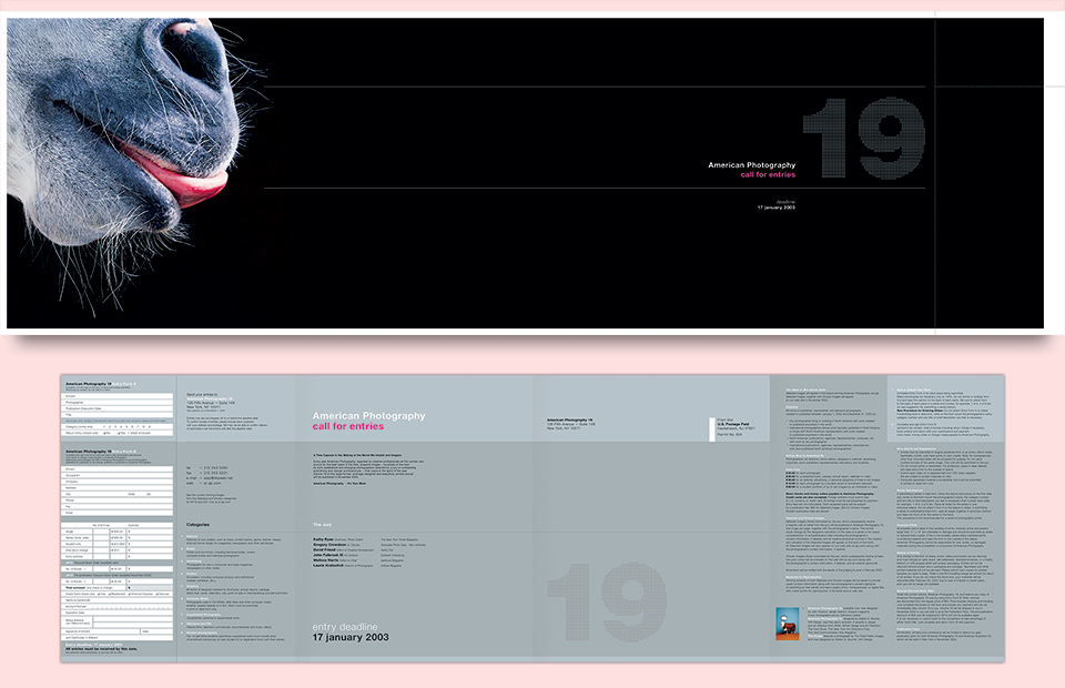
Following my work on American Photography 17 editor Mark Heflin invited me to design the call-for-entries for AP19. He had already selected a handful of images he was thinking of using, but Tim Flach’s amazing lip-licking horse stood out to me right away as a great symbol for a photography competition. The glory is so close you can taste it!
The extreme Cinemascope format of the poster came from that idea. I wanted to put as much distance between the horse and the title. Because I’m cruel.
Beyond being epically sized, this piece had really nicely structured folds and typography. It’s a gatefold with the green side facing out. When it’s mailed the silver 19 appears on the mailing side, and the blurb about competition, the jury line-up, and the entry deadline are on the back. When you open the folder, you get all the categories, and the instructions meet up with the perforated entry form at the center. This was before you could enter everything online.
Initially, I wanted to get the 19 perforated with a grid of holes to match the perforated form. I was imagining holes as you’d see on a sheet of stamps. Turns out that those aren’t standard issue anymore. It’s possible to get them, but that would’ve meant a 38 x 11.5 in. (96.5 x 29.2 cm) die, and that gets expensive quick. Mark gently nudged me in the direction of not spending all his money, so I went with silver arrows instead, which, as you can see, worked very nicely, too.

