BIG ADVICE

After working with Electric Monkey Records on the “Nueva Musica” album by The Latin Project in the summer of 2003, they asked me to design “Love Shines” by the neo soul funk fusion band Big Advice the following year.
Big Advice is made up of session players Ahaguna G. Sun, Juan Nelson, and Werner Schuchner, and their music is in the vein of bands like Earth, Wind & Fire and Tower of Power. They’re amazing players, and “Love Shines” is an excellent album for a lazy summer afternoon.
As you can see below, the band was saddled with a pretty unfortunate logo. The line drawing was a simplified tracing of Ahaguna’s face in mid-belt. The type was nothing short of criminal. (There is a special circle of hell reserved for type stretchers!) But the band loved it, and as I remember it, they wanted to have a version of it on the cover. I say “as I remember it” only because I can no longer find any of my backup files on this job. I do know that I had the idea of recreating the logo face from clouds, but based on new photos I had taken in a few minutes outside their studio.

The band’s original logo. Just not good. But still in use today.
We worked on that idea for a few weeks, and I found one of those comps in an old sketchbook. It’s a bit goofy looking now, but it was getting somewhere. There was some debate about adding Juan and Werner to the cover, too. Using the stylized logo head was one thing, but having it actually, identifiably be just Ahaguna was problematic.

More wood inlay than high end special effects, but it was worth a try.
Fairly close to the production deadline, Electric Monkey asked me to try using the logo instead. I spent a frantic afternoon fiddling with changes, sending comps every 15 minutes for comments by the band. At some point I had made a Photoshop chrome version of the head floating over an airbrushed starburst floating in the clouds. Many small concessions were turning into a big mess.
This happens more often than I like to admit. I’m a people pleaser, and I hate saying No. Instead I tend to say, “Well… let’s try it.” Usually, I can steer things back into aesthetically respectable territory. Sometimes I do it by executing an idea in a way that’s so obviously horrible that it resets everybody’s opinion. It’s a dangerous game. To wit, Starburst Chrome Face was a big hit with the gang.
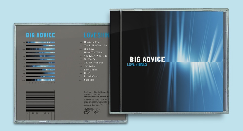
It was the end of a long day at the end of many long projects. The temptation was to just wrap up the job and take off my name. But then, it’s always the end of a long day at the end of many long projects, and it’s my job to make things that work well and look great. So I quickly started fiddling around with the starburst rays I had placed behind Chrome Face, and came up with the final cover. “What about this? It’s got a lot more energy than the floating face, it’s mysterious, and nobody is getting preferential treatment on the cover.”
Sold.
Phew!
As always, I was left to my own devices with the back cover and the inside of the booklet. The credits were dense with guest players, giving me a great opportunity to create a flowchart. Which is so much more fun than a big block of 5 point type.

On back covers I always try to come up with an interesting visual device for the track listing. In this case, I used slivers of the cover to indicate song duration. The length of the blue part within each sliver indicates the length of the track.

In retrospect, I could’ve made this clearer by flipping the whole block so zero is at the left, but I wanted the rays to emanate from the song titles. And why aren’t they on the left and to the left of the bars? I liked the look of the big, bold BIG ADVICE on top of a stack of skinny blocks. And that only worked on the left, because LOVES SHINES / BIG ADVICE would’ve been confusing. What’s the name of the album? What’s the name of the band?
In the end, everybody—me included—was excited about the look of the album. We even made a purple version paper sleeve for a “Love Shines” live performance DVD.