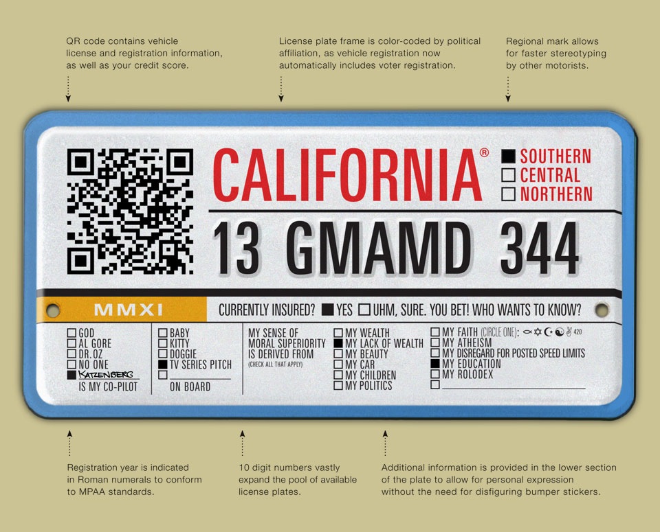
The CALIFORNIA LICENSE PLATE

When the State of New York rolled out their new Empire Gold license plates in the summer of 2010 Fast Company blogger, design guru, and Graphic Eye contributor Ken Carbone invited me and a few other designers to create new license plates for our respective home states.
This type of assignment is a perennial favorite. Get designers to redesign something that currently looks a bit dodgy, and publicize the results. At best, it shows what designers can do without having to incorporate a ton of politically motivated client feedback, at worst it proves that clients tend to understand the particular challenges of an assignment much better than a journeyman designer.
When Ken approached me, I’d already done two of these assignments: During the 2008 primaries I’d created a mildly funny Democratic Party campaign memento for Steven Heller’s New York Times “Campaign Stops” blog. The original (rejected) caption for my keychain was “An Ass Divided Cannot Stand.” Ho-ho. He-he. OK. Moving on. A year later I made the print edition with my re-imagined Super Bowl logo.
As I mentioned talking about that piece, this type of assignment is a bit of a trap. The temptation is to take it seriously, at which point you either create an amazing stroke-of-genius logo overnight, or you just look shallow and earnest. Playing the odds, your work will probably achieve nothing beyond entertainment. And if entertainment is the goal, then funny is always best! To that end, I tried to cram as many California clichés as possible into one license plate. I’m a firm believer in many small gags working better in this kind of forum than one big one. It just evaporates too quickly.
I also like to put in a few little things just to amuse myself. In this case, it’s the license plate number. GMAMD stands for something I thought was pretty funny. Sadly, I’ve long since forgotten what that was. A stroke of genius, I’m sure, now lost to the ages.
If you’d like to see the beautiful and feasible plates my colleagues Bart Crosby and Bart Minor came up with, check out Ken’s original post “Rebranding the License Plate: 4 Designers Clean Up Graphic Road Kill” on the Fast Company website.