CHIP KIDD POSTER

Back in the day, when I was serving on the board of the Los Angeles chapter of AIGA, we invited acclaimed book designer Chip Kidd to speak. As an eager fan, I bullied my way into designing the poster for the event.
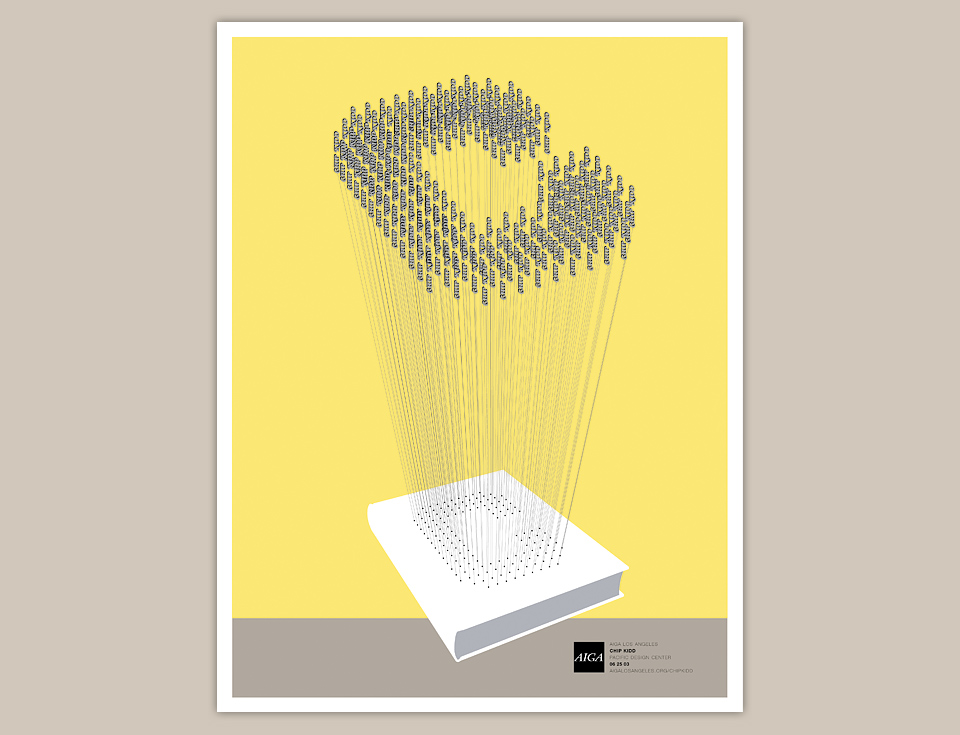
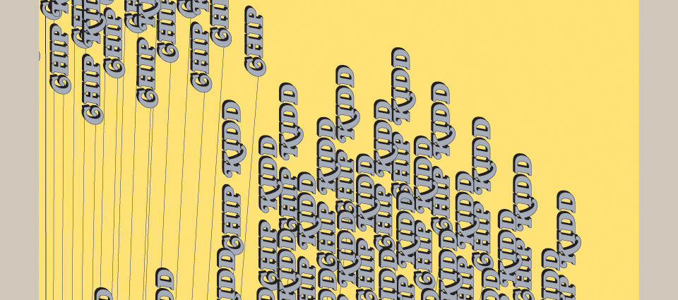
By 2003, Chip had already made his love for Batman comics public by publishing a few books on the subject, so I figured I’d give him his own Bat Signal. The big letter C is composed of 152 identical “Chip Kidd” logotypes printed in metallic ink. It emanates from a blank book cover, so if the Batman reference was lost on anybody, the poster still worked as a visual pun of sorts. “Chip Kidd makes covers that pop.” Or something like that. But the intent was chiropteran.
The clean illustrator art appealed to me aesthetically, but also seemed easy to print, which struck me as a real plus. I didn’t want the team at Typecraft glaring at me every time I set foot in their press room. I was so proud when I handed them the file. I’m sure I said something like, “I thought I’d give you an easy one for once.”
Why were they scowling? As I learned, metallics don’t play well with other inks. The best way to proceed is to do a “dry trap.” Which means that you print the metallic color first and by itself, let the ink dry, and then run the sheet through the press a second time for the regular process colors. This is in contrast to a wet trap, where all the inks run at the same time. A dry trap doubles your time on press, which increases cost. A lot.
Not only that, but to perfectly register dozens of fiddly, overlapping shapes when you’re running the sheet twice? It’s almost impossible. But as always, Typecraft made it happen.

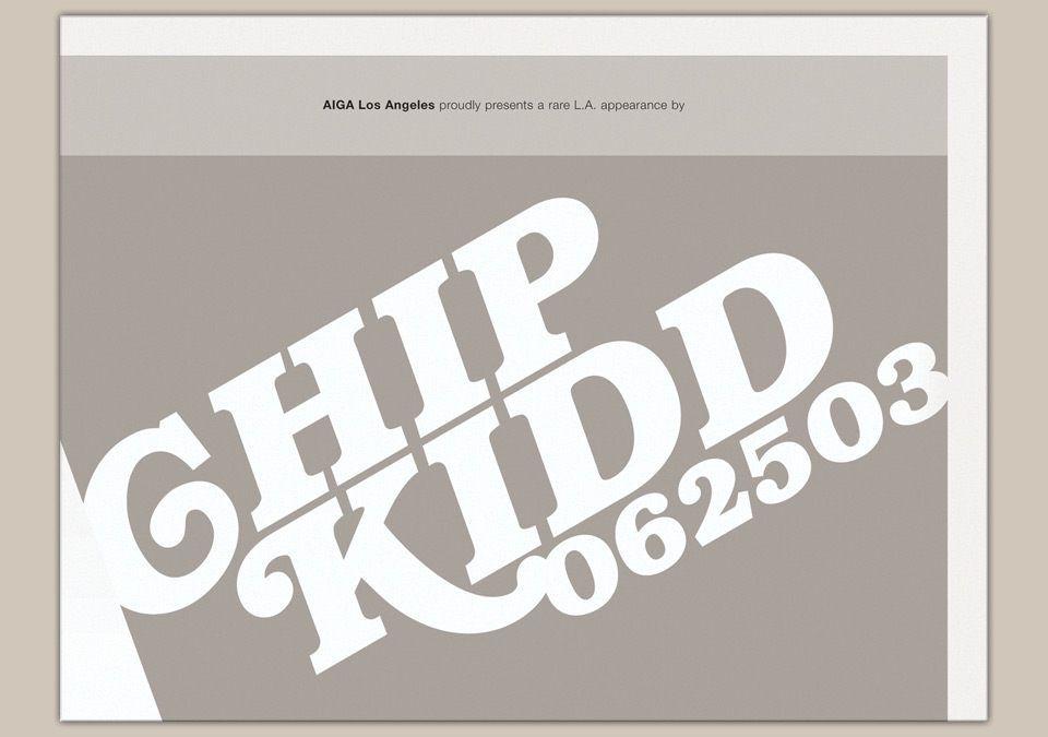
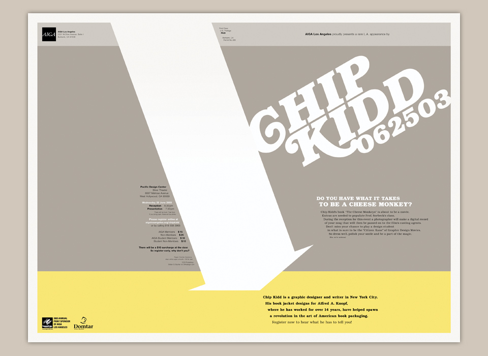
The back of these posters was always a challenge, because I wanted interesting shapes to emerge when the paper was folded for mailing. In this case, the mailing side was reduced to a big white diagonal stripe that held the address label. The other outside panel boiled down the message to its bare essentials.


The folded poster as people received it in the mail.
As per usual, I also wrote the copy. The two small lines below the event details are my favorite: “There will be food. Free food. If you bring cash, there will be drinks.” The event was a smashing success, and while we were at it, Chip agreed to be in my first book All Access. I was chauffeuring him in my car when I asked, so it’s not like he could comfortably say no. He had to drop out out later, but being able to say “Chip already said yes.” got a number of other designers on board, so I owe him great thanks either way.
