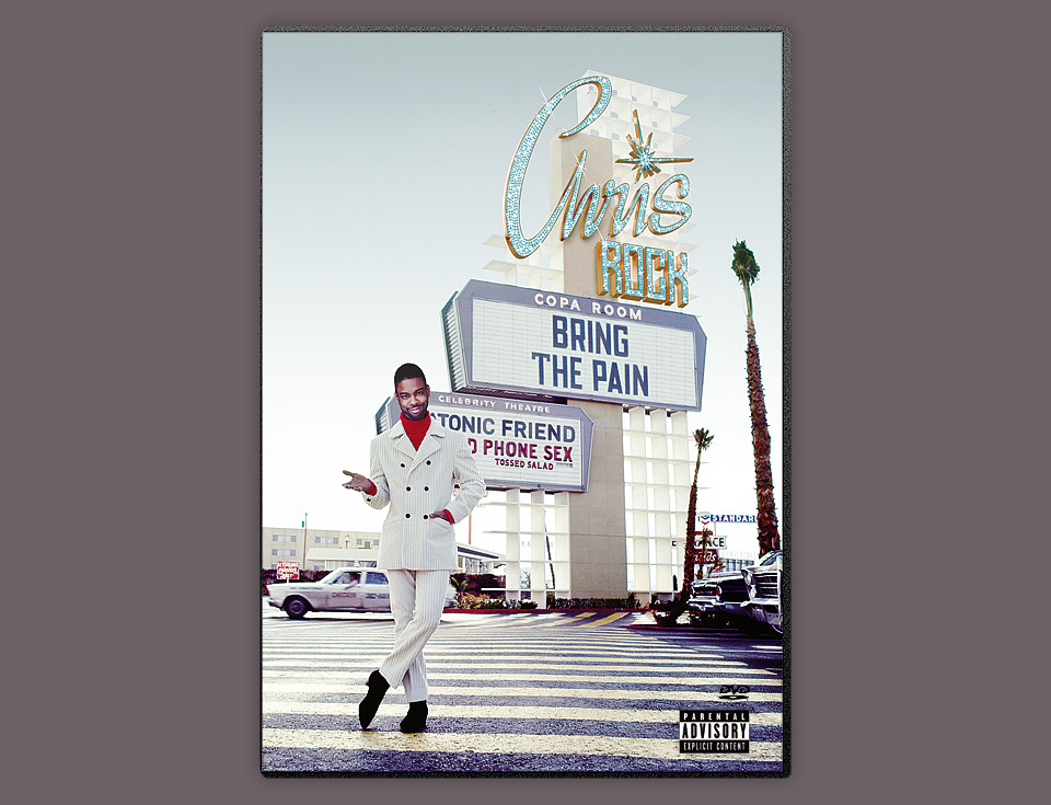
CHRIS ROCK — BRING THE PAIN
Oh, I wish this job came with a great story. Chris Rock and me—hanging out for days, jamming on cover ideas. Chris Rock and me—hunched over contact sheets, picking the right images. Chris Rock and me—on the same conference call for a few minutes. Sadly, none of that happened. As much as I would have loved a fan boy moment with Chris, I talked with the label who talked to Chris’s management who talked to Chris. No matter. It was an honor simply to redesign “Bring The Pain” for its DVD release.
- Buy one
- on Amazon
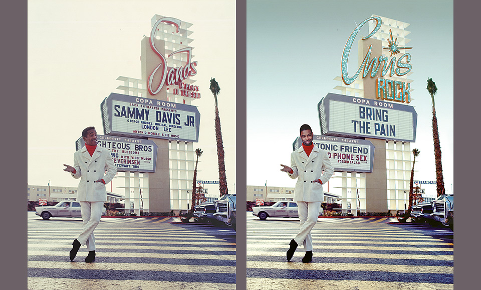
Lauren Nukes at DreamWorks called me in for this assignment. We’d already worked together on soundtracks for Legally Blonde, BikerBoyz, and Minority Report, and I was excited to work with her on another cool project. Chris already had the idea of recreating the famous shot of Sammy Davis Jr. standing in front of the marquee at the Sands Casino in Las Vegas. The only problem there was that he wouldn’t be available for a photo shoot.
I tried to recreate the marquee digitally, and went through existing images to find a suitable shot of Chris. It looked reasonably OK, particularly in black and white, but Chris rightfully rejected that mockup. Once you have the image of Sammy Davis Jr. in his magnificent white double-breasted corduroy suit in your mind, how could anything else measure up?
Thus DreamWorks licensed the original image from photographer Milton H. Greene, and Chris persuaded the estate to let us… uhm… decapitate poor Sammy, and insert his head instead. Luckily, Sammy was wearing a Photoshop-friendly turtleneck. The big challenge was adjusting the studio lighting on Chris’s head to seem at least reasonably plausible in the final scene. I also did a little resizing on the hands and feet, along with an overall stretch, as Chris is a fair bit taller than Sammy was.
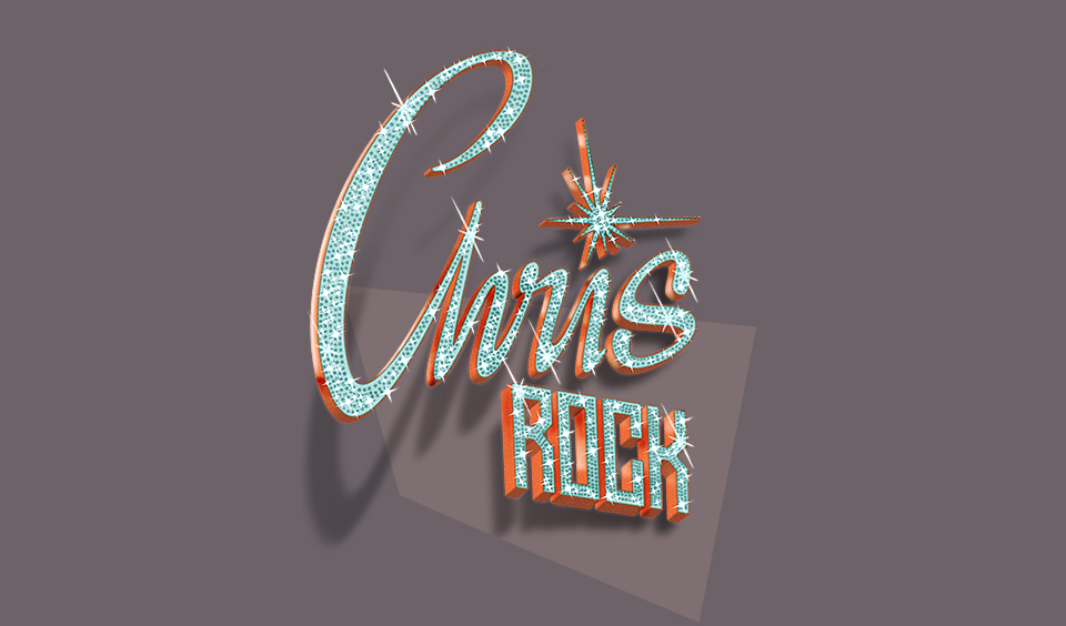
Many, many hours went into removing the original Sands signage, and replacing it with the new text. I drew the scripty “Chris” and the blocky “ROCK” from scratch. I created the 3D effect by hand, and put in the glittery light bulbs one by one—first on a pencil guide sketch, then by airbrush in Photoshop. I tried an automated approach, but it didn’t look right—which just means that I didn’t know how to use Maya or Cinema 4D. Nothing wrong with doing things by hand, either. That said, I wish I had done a better job on the design of the script, particularly with the straight vector art version that appears on the (generally unremarkable) back of the case. The 3D effect hides a lot of sins.
Recreating and distressing the missing letters of the typefaces for the Copa Room and Celebrity Theater was just fun. It’s a little puzzle, and makes for a Zen afternoon. As much as I’ve done it, I still enjoy messing with photos in the computer, and making something imaginary look believable.
When the whole cover image was ready to go to press, I received a last minute note: The original sky was looking too smoggy. Could I please change it to blue? This turned into a big masking operation, because you can’t trust global solutions in Photoshop. No magic wand or range selection will ever measure up to manual masking. Too much subtlety is lost, and you end up spending more time on cleanup than it would’ve taken to simply lasso the whole damn thing in the first place.
Beyond the unavoidable tedium that comes with masking, I ran into trouble around the palm trees. In the original shot all of the leaves were simply blown out by the hazy surrounding light. With a blue sky, you’d expect to see much more detail. Only now as I’m looking at this again years later is a solution coming to me. I should’ve gone outside to shoot replacement palm trees. I could’ve bought a stock image of a palm tree. It’s so easy to get lost in digital tinkering, when restarting from scratch would yield much better results. I wish I had one more round on this one.