HABIT

Jeff Fischer makes great wine and needed labels. I used to never touch any work involving alcohol, because I never used to touch a drop of alcohol. Which counts as being rebellious back in Germany. Over the years my stance on wine has softened to the point where I’ll have a glass when I find myself in an extra fancy restaurant. Besides, my friend Doyald was designing wine labels all the time, and anything that could make me feel more doyaldesque was OK by me. So when Jeff called I thought, “Why not?”
- Buy one
- from the winery
Let’s back up. Jeff actually contacted me three years earlier about designing a totally unrelated site for him. He had seen my work in the pages of Grafuck and liked it. But I hardly ever do web design, and I’m forever overworked, so I said no. But he remembered me. Which is extremely flattering. At the outset, this was a very small job—just one label for one wine, as I recall, and the name “Habit” is beautifully evocative. Jeff wanted this to be all about craving. All of this made saying yes even easier when he approached me about designing for his fledgeling winery.
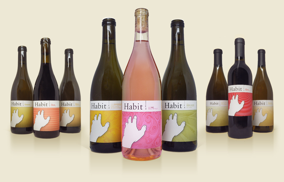
Just the word “craving” immediately reminded me of the original cover I had designed for my first book All Access when it was still named [r]evolution. It was of a hand reaching for the title—and for greater things. To me, this perfectly encapsulated the spirit of the book, but my publisher at the time had quickly rejected it. Too “prisoner-y” or something along those lines. But I digress.
I’d tried using the hand for other projects over the years—you can se echoes of it in the King King flyer I did for bossa:nova—but it never quite fit. It was perfect for Habit, though, and Jeff happily agreed. I placed it over a field of a hundred tiny Habits, reaching toward that one big Habit at the top. It made for a pretty texture, and felt suitably obsessive. In the years since Jeff has made it the Habit icon, and proudly uses it everywhere! It now adorns a whole line of Habit bottles, and beautifully so. It clearly belonged to him all along.
Doyald once asked me why I’d chosen a hand for a wine label. The question took me by surprise, and I think I just asked back, “Well… why not?“ He seemed to think it was unusual. Which… you know… good!

All those tiny little Habits almost brought Adobe illustrator to its knees. (Designer tough talk.)
I’m neglecting to tell you how wonderful the actual wine is. I’ve tasted it, of course, and really enjoyed it. But I have no experience or credibility in this realm. Luckily, I can refer you to the many excellent reviews that confirm its excellence! You can find them on the Habit website, where you can also order a few bottles for your private cellar. Or perhaps you’ll order a bottle next time you dine at Eleven Madison Park in New York, one of the World’s 50 Best Restaurants, according to Restaurant Magazine’s 2012 list.
For the wines released in 2011 and 2012 I updated the backgrounds a bit, bringing in some of my old favorites—rays, stripes, and dots—to create more of a visual distinction between the individual wines. Creating a series of things is always fun!


Of course, it didn’t end there. Jeff’s wines keep finding a larger and larger audience, and the labels keep on coming. For the 2013 wines I evolved the particle stipple design I’d first explored on the 344 Lamp. Jeff gave me descriptions of each wine that I tried to capture in the color and flow of the particles.


Habit is even making some appearances in popular culture. It’s Roger and Hailey’s beverage of choice on “American Dad,” for example. How did that happen? Jeff Fischer’s other career is as a voice over actor, and he’s part of the “American Dad” cast. He stars, unsurprisingly, as Hayley’s husband “Jeff Fischer.”

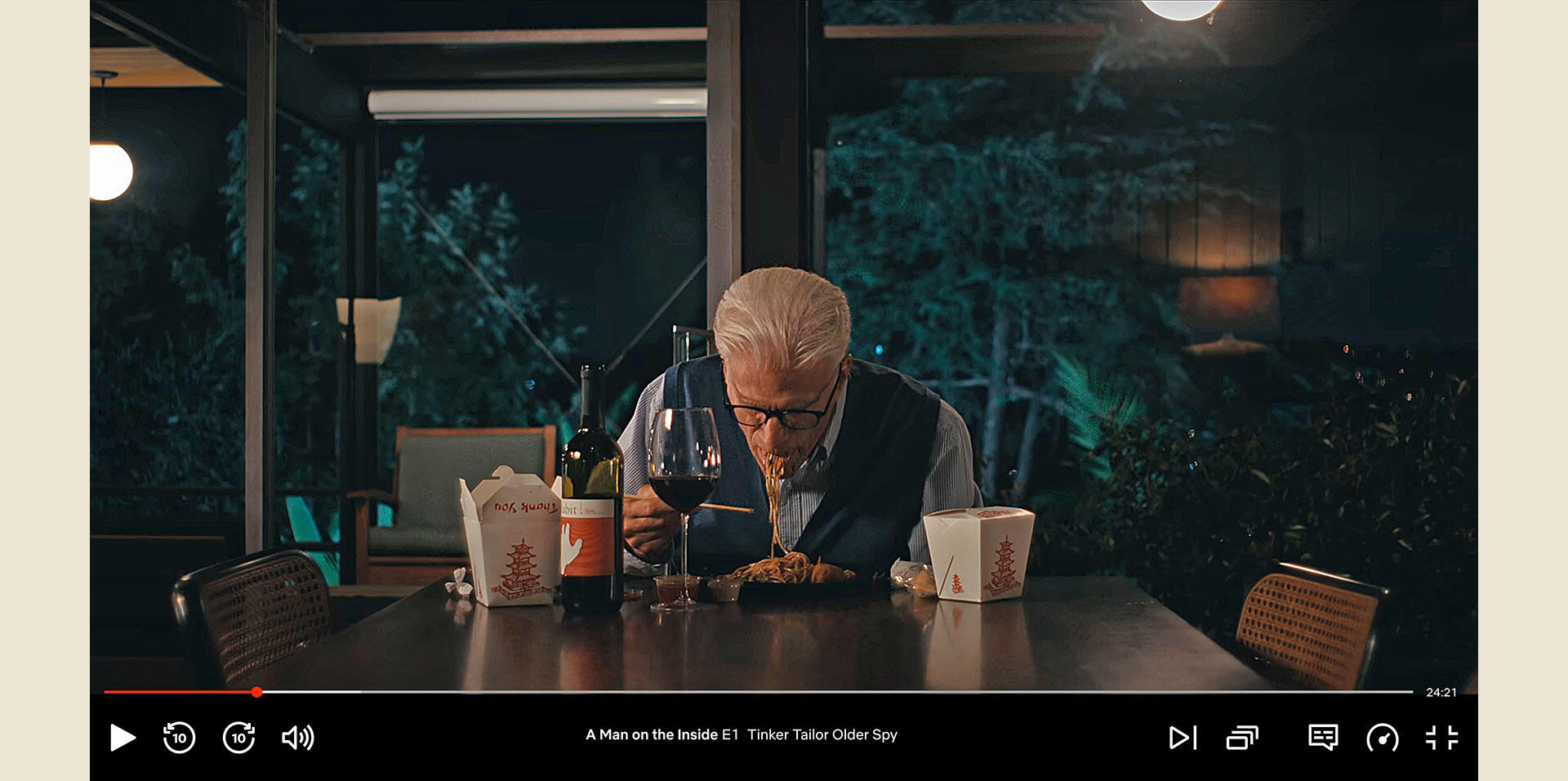
In the Michael Schur comedy “A Man on the Inside,” Ted Danson’s character Charles Nieuwendyk is introduced with a montage of his pleasant, but soul-crushing daily routine in the wake of his wife’s death. It’s appropriate that he’d pair his Chinese takeout dinner with a bottle of Habit:

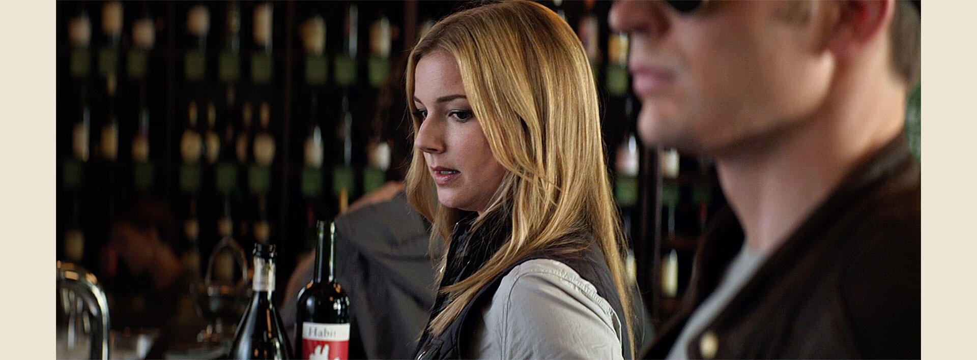
And of course, Habit is part of the MCU, as seen in this scene from “The Winter Soldier”:
