IMMORTALS
For me, the greatest professional compliment is having a client come back to me with another assignment when they don’t have to. I was pretty sure that Tarsem had liked the work I had done for him on The Fall, but I figured that I was also an affordable option. When he went on to direct the decidedly big budget “Immortals” I was sure he’d stick with the studio regulars or go all Kyle Cooper. Happily, I was wrong.
- Buy one
- on Amazon
The marketing staff had already produced a logotype for the posters and advertising campaign based on the typeface Rotis. He asked me to see them, and sort out a deal for me to produce some alternatives. You can imagine how much they loved having me over. We talked for a bit, we sent a few numbers back and forth, and then the whole thing just quietly went away. Instead, Tarsem asked me to help him on the titles that would appear in the movie proper. Here he had complete control. We’d do it just like we had on The Fall.
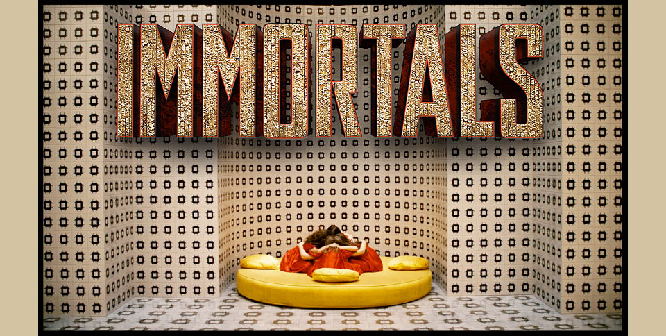
Tarsem knew exactly where he wanted the title to appear at the top of the movie. It would materialize above the praying oracles inside their temple. I created a few rough approaches to get us started. After going through a few rough range finding comps with Tarsem, his production designer Tom Foden, and colorist Lionel Kopp, everybody liked a piece of fairly simple, chunky compressed lettering that was a bit like a serious version of my own display typeface for 344 Questions. Tom had the excellent idea of cladding the type in the intricate gold bricks from the prison of the Titans, which would appear in the film just before the title. Done and done.

From there I went on to lay out the subtitles for the oracles. I used the typeface Grotzec by Mário Feliciano, and colored each title to blend into its respective shot. Because I hate seeing beautiful images marred by careless subtitles that just sit there in white or yellow, taking you out of the scene. Feh! (A lot of what I do is motivated by fixing things that make me angry. I’ve come to terms wit that.)
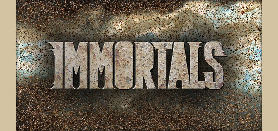
Along the way, plans changed, Tarsem reshot the opening sequence, and the different mood required a much different title. Looking to for something that felt ancient—something that wasn’t Trajan—I built the final version of the logotype on the basis of the font Garda Titling No. 2, again by Mário Feliciano. I kept the I, L and S unchanged, and lengthened the tail of the R. The M, O and A I rebuilt entirely. The curve of the M parallels the curve of the temple alcove, which is also where the O and the top of the A get their shape. Add a bit of a granite texture, some gold leaf and a tasteful light swipe, and you’re in business.
I had to evolve things even further for the French Canadian version of the movie. LES IMMORTELS has three extra letters and one extra space. Simply scaling everything down would’ve made the title look too wimpy in its space. Instead, I created a condensed version of the logotype that could squeeze in the extra letters while maintaining its original height.

For the main end credits I just used Garda Titling No.2 straight out of the can—with judicious spacing and a gold effect, of course. On this movie, all the titles were integrated into the film by Comen FX, who also handled the (massive) crawl on this one. For this we decided on Garda Titling No. 3, because tiny type with tiny serifs is not a good idea on screen. The credits on this kind of big budget affair don’t totally come together until the very last minute, so the crawls tend to be fairly no frills, but we were able to at least keep the type in colors that relate to the rest of the film. It’s to Tarsem’s credit that he creates space for this sort of thing to happen when this would be an easy corner to cut.
By the time Immortals was wrapping up, Tarsem was already off to shoot his next movie, Mirror Mirror. I didn’t assume that he’d call me again, but I started sketching anyway.
