The AURORAS of JUPITER

Anybody who’s spent more than five minutes with me knows that I’m a huge space nerd. You can imagine how excited I was to get a call from NASA’s Jet Propulsion Laboratory asking me to contribute a futuristic poster to their 2016 “Visions of the Future” series!
- Buy one
- for $0 at JPL
The series is an evolution of an earlier trio of faux-vintage travel posters advertising trips to newly discovered exo-planets. Those posters were designed by Dan Goods, David Delgado and Joseph Harris of The Studio at JPL and proved to be so popular that JPL asked them to expand the lineup. Dan and David and their team do some amazing things up there—check out their talk at the 2015 AIGA Design Conference in New Orleans on the AIGA YouTube channel. I’m a fan of their work, and I couldn’t have been more excited when they asked me to help out. For somebody who travels through time and space both as a hobby and on the job, this was just about the perfect gig!
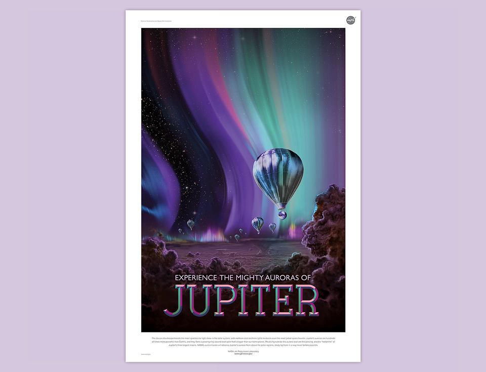
When the team briefed me on the assignment, I was immediately captivated by an illustration of the auroras on Jupiter. Nobody has seen these auroras up close yet, but they’re massive, and we’re on our way to take a look. In fact, JPL’s Juno spacecraft will reach Jupiter on July 4th of 2016. Of course, that’s a space probe. The way human travelers would see the spectacle in Jupiter’s atmosphere would be in giant mylar balloons. What an image! I couldn’t resist!
The rest of the story is simple. I created a series of comps, looking for the right level of abstraction in the image, and for the right typographic flavor. The posters mimic classic travel advertisements from the early years of the 20th century up until the 1960s. I tried a few styles, from pseudo-Victorian to a more 60s vibe, but found myself most drawn to something reminiscent of early London Underground lithographs.

I always like to create custom letterforms for the main title, and so I did here. The swirly J lettering was a bit too fussy, and the overlapping block letters too 60s prog rock, but the beveled slab serif typography was just right. I took the colors from the aurora itself and, as you can see below, I amped them up a bit for drama. That turned out to be a bit much for the occasion and drew focus away from the star of the show—the auroras. No problem. Dialing things back is always easy. David suggested making it look like the type was lit by the auroras, and that worked out beautifully!

Experimenting with different illustration styles I also came to realize that abstraction wasn’t going to work in this case. Abstraction relies on instinctive knowledge of the original thing. Auroras aren’t a common enough sight even on Earth to allow for this. Show them as anything other than a glowing green veil in the sky and they end up looking like poorly drawn clouds, or sheets of glass, or some sort of sky fence. Add to that the idea that these are Technicolor auroras on Jupiter and confusion is just about guaranteed.
With all this in mind, the original image Dan and David had shown me far and away outstripped anything I’d come up with from scratch. They were kind enough to track down the original artist and to get his permission to use his artwork.As it turns out, that artist is Ron Miller. Beyond being an author of many great books, both as a writer and illustrator, Ron was the production illustrator on the David Lynch movie DUNE. It’s a good thing I didn’t realize any of this until today, because I messed with Ron’s original artwork to make it fit our format and to beef up the auroras. I messed with it a lot! Had I known his background, I’d have shrunk like a little space violet. I’m grateful he allowed us use of his image, and that he didn’t have me roughed up for monkeying with his illustration. This is his beautiful original:

Of course, I still had to create a small armada of Jovian balloons. I tried out a few futuristic shapes, but the problem was the same as with the auroras: If you don’t know what a “real” hot air balloon on Jupiter looks like, any abstraction causes confusion. Accordingly, I kept the balloon shape very traditional, and then futured things up by making the surface from silver Mylar. For the passengers I added a round metal capsule supported by semi-rigid struts, so it wouldn’t bounce around too much traveling through Jupiter’s fierce atmosphere. The Jovinauts themselves are a direct lift from Joseph Harris’ poster for Kepler-186f. They get around, those two!

Dig the attitude jets! They’re damn near invisible when you look at the full poster, but I made them with love.
The final step was settling on a tagline. Here, too, simplicity won out. “What am I looking at?” Auroras. “Where?” On Jupiter. “Cool!” Between The Studio and myself we tossed around a lot of options. In the end they took “Experience the Auroras of Mighty Jupiter” and switched it up to the final line, “Experience the Mighty Auroras of Jupiter.” Auroras. Jupiter. You got that? Good!
If you’re a fellow space nerd and would like one of these posters, you can download free high resolution versions of the complete poster lineup at JPL’s Exoplanet Travel Agency.

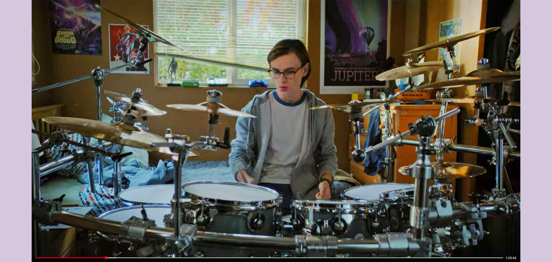
Being part of NASA, JPL is publicly funded. That means that all of the art released by JPL is in the public domain. Anyone can use the work for derivative works, either personally or commercially. I’ve seen it used on T-shirts, art prints, 1,000-piece puzzles, and many other items. It’s always a pleasure! Still, one of my favorite things is seeing my work on screen, so I was extra fun noticing it in the background on the Netflix show “Metal Lords.” If you ever see the poster in a fun place, please take a snapshot and send it to me at stefan@344design.com I’ll be grateful!
