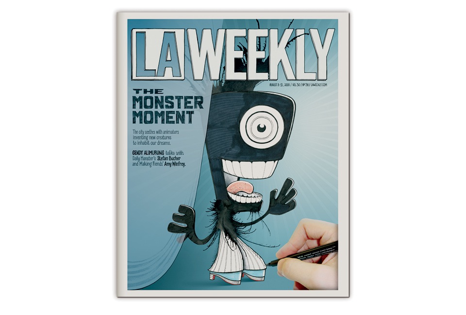
The L.A. WEEKLY MONSTER

Around the time 100 Days of Monsters came out, Gendi Alimurung wrote a great article about me for the L.A. Weekly. While she was interviewing me, I mentioned that I’d be happy to film a custom Daily Monster to tie in with the article on the site. A few weeks later I got a call from the L.A. Weekly’s art director Ryan Ward. “I heard you volunteered to illustrate the cover for this issue. Is that right?” Uhm, I’m sorry, what? I mean… Absolutely! You bet! Yes! “OK. Great. I’ll need it by Tuesday.”
You gotta love an unexpected upgrade, and when it comes you have to be ready to get to work. I dropped everything else, and drew and lettered and animated for four days straight. The nature of the Daily Monster process is such that I can’t really draw them to spec. I need to just keep making them until one of them fits. I think of it as casting a part. The right Monster came through soon enough, and before I knew it, he had multiplied 200,000-fold and was making his way to all corners of the city by way of the new L.A. Weekly. Please feel free to watch the video of his genesis (and swift rise to stardom) below. Please note my 2-second beatboxing solo at the end.
You may notice that the color scheme in the video is a bit different than the final printed cover. I was unsure of the color. Here are some of the iterations I went through before Ryan stepped in and laid down the law:

When I draw a Monster on camera, I have a little code of honor: I won’t alter the drawing after I turn off the camera. I won’t fix mistakes in Photoshop. And I won’t change the colors I used on paper. In this case the Monster came through with a blue tongue and blue shoes. So I based the whole color scheme around that, which put me into a day-long frenzy of minuscule adjustments. 5% cyan? 7% cyan? Such momentous decisions. In the end Ryan discreetly took the reigns and made the final adjustments on his end.

As always, I put in a little Easter egg for those who paid attention to the fine print.
Here is a photo of the actual issue. Newsprint is a cruel mistress.
Everything looks a little bit dirty, everything’s a bit faded, but it’s also beautifully real.

