MIRROR MIRROR
Following my typographic contributions to Immortals and The Fall, I was keeping my fingers crossed that Tarsem would ask me to help out on his new movie “Mirror Mirror,” too. I kept track of the production on IMDB. By the end of 2011 the release date had been moved up to March to be ahead of the competing movie “Snow White and The Huntsman,” but it was still listed as “Untitled Snow White Project.” As soon as it switched to “Mirror Mirror” I started sketching. Just in case.
- Buy one
- on Amazon
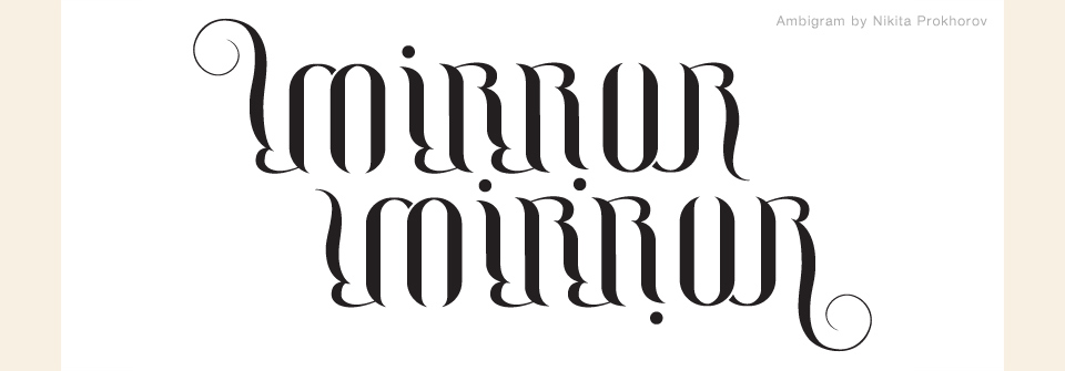
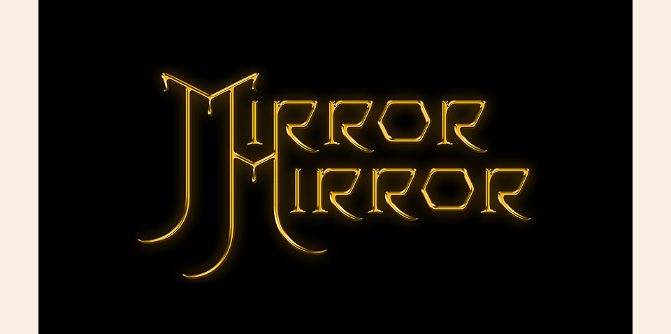
The call came a few weeks later. “Tarsem’s asking when you can come in. He says he already talked to you about the titles. Is that right?” “No, but that’s no problem. I’m ready.” I had already been in touch with my friend Nikita Prokhorov, who is a master at creating ambigrams—type that reads the same whether it’s right side up and upside down. I thought an ambigram would be perfect for “Mirror Mirror,” and he did a beautiful job. I had it in my bag for my initial meeting with Tarsem, ready to blow his mind, both with Nikita’s excellent lettering and with my sheer preparedness.
Well… within two minutes of talking to him, I realized that, sadly, the ambigram wasn’t going to be the right solution. I’m happy that it gets to live here on the site. I went back to my sketches and found the right direction there. I would take a page from the Book of Doyald.
Over the course of a night I started working on a refined sketch of my initial doodle. Having just seen the first reel of the movie, I was coasting on a nice high of early-in-the-project excitement and visual inspiration. It was coming together great. I polished, I refined, and when it was all done I thought, well… that looks like I’m ripping of Marian Bantjes.
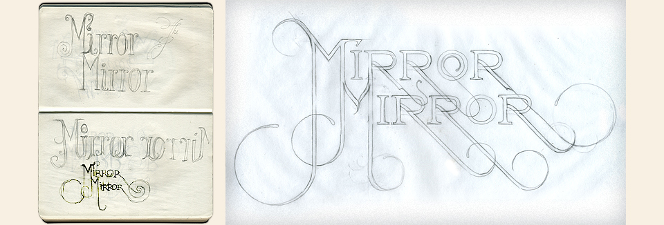
I sent the design to her and asked. Being a sport, Marian was fine with it, and I was flattering myself anyway. It just didn’t sit right with me. I started over with another sketch I’d liked, and it quickly turned into a true homage to Doyald. Being a fellow night owl, Marian was kind to give me feedback on my curves along the way. We’d both been close to Doyald, and we both tried to figure out which parts would make him furrow his brow.
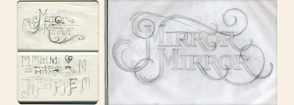
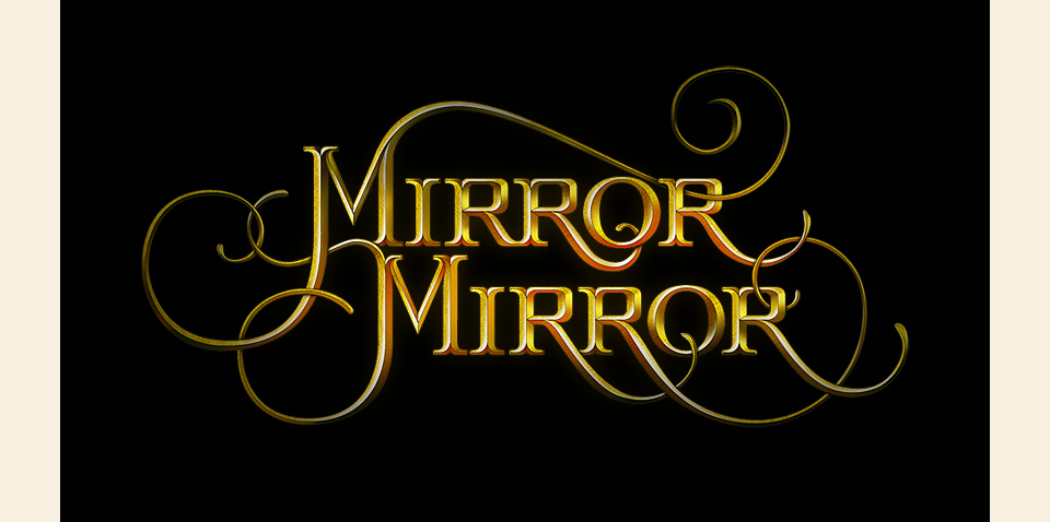
Usually, I present the work to Tarsem in person. In this case, I had to send a file, and didn’t hear back for a few days. Never a good sign. When I did hear back, it was a call to come in. Tarsem and his production designer Tom Foden had looked at the lettering, and they weren’t wild for it. I was floored. I was so sure of this one… But that’s life. I went back to my desk comped up a few alternate titles that were more directly in keeping with the art nouveau design of the film. I brought them in for Tarsem’s review, along with my inadvertent attempt at channeling Marian.

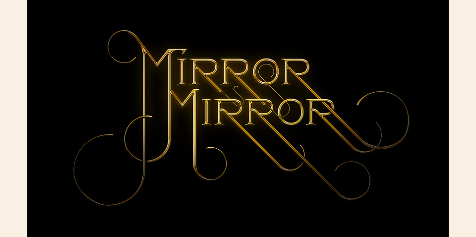
I also brought back the swirling letters they’d already rejected. Which is not something I usually do, because it tends not to go over well, but I had fallen in love with this type. I thought it was the prettiest type I’d ever done. I showed it to Tarsem again, and asked him to reconsider. I reminded him of our discussions about the book cover for The Fall. “Remember how I came back to you three times about the legs? This is that.” Seeing my pleading eyes, he chose three comps, including my favorite, and told me, “Show these to Tom. Let him pick one of these, and that’ll be it.” And lo and behold, Tom picked my favorite!
From there everything went swimmingly. I designed three versions of the main title—stone, brass, and gold. Dissolving from one to the next to the next created the effect that’s in the final movie. Comen FX then added the slight zoom and a little extra sparkle. My friend Tim Moraitis had mocked up a great little animation of the tendrils growing out, but at that point of the process it looked like we had run out of time, and I didn’t want to push my luck too far. I will show it to you here, though:
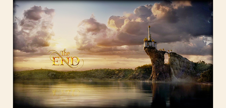
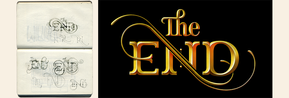
I also designed matching gold lettering for “The End,” which appears in the final shot of the movie proper, floating below the enchanted clouds and reflecting in the lake below. Technically, the lettering isn’t quite consistent with the opening title, but it matches the feel, and that’s what counts, isn’t it?
Tom Foden created a beautiful art nouveau mirror for the final dance sequence, and I got to use a solid gold version of Doyald’s typeface HomeRun Script for the end credits. He sometimes groused about art directors messing with his carefully constructed work—as I would, too—but I hope that this would have pleased him.
At the very last minute, Tarsem decided to add a few funny title cards about what happened to the seven dwarves. Could I come in and take a look? Stephen Berkman had shot the actors in character using the same wet collodion process he’d used on my ADCMW portrait, and Tarsem wanted the type to look like the white-on-black hand lettering in old photo albums. Also, he’d need it right away. As in, “Don’t go home. Do it here at in our office, so we can pop it right into the edit.” I borrowed a few pencils, grabbed some copier paper, found a desk, and started lettering. I used a stapler as a ruler. There was no real scanner, but the office copier could save a PNG to a flash drive. Good enough. I put that on my laptop, did a bit of cleanup in Photoshop, and walked the result over to the editor. This went on until deep into the night as the lines kept changing. And for a few days after that, but at that point I was back at my own desk, with a proper ruler, so… no problem.
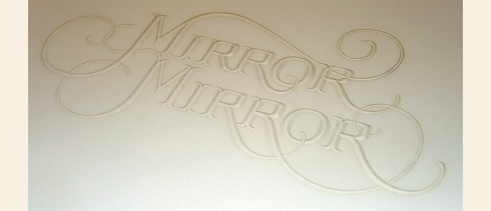
At the end of the project I asked the team at The Ligature to make the Mirror Mirror logo into an embossed card as they had done for 344 Loves You, so I could give a set to Tarsem as a gift. They added a beautiful burnt effect using embossing foil. It’s a gorgeous little card, and seemed like a fine, old-fashioned thing to do to finish up my work on a classic fairy tale.
