MOVE SANCTUARY
Motion teacher and wellness entrepreneur Jacqui Burge and her investors contacted me to brand her Ojai studio, Move Sanctuary. Move’s offerings center on a rope yoga system first popularized in Iceland. Exercises are done slowly and gently using a simple setup of ropes and pulleys. I got to take a sample lesson with Jacqui and found the experience inspiring both physically and visually. The ropes would become the conceptual anchor for the entire Move identity.
The original Move Sanctuary location in Ojai makes its home in a charming bungalow nestled among gorgeous trees and California wildflowers. The setting couldn’t be more serene, and the lessons themselves were inspiring and rejuvenating. Jacqui blew my mind pretty much immediately by clearly and accurately outlining psychological issues I had been working on in talk therapy—simply based on the way my toes were gripping the exercise mat. After our initial conversation and an hour of instruction I couldn’t wait to develop a great visual palette for a remarkable person and her enterprise.

Above you can see Jacqui herself demonstrating some of the rope exercises that make up the Move system. This is the visual origin of the logo.
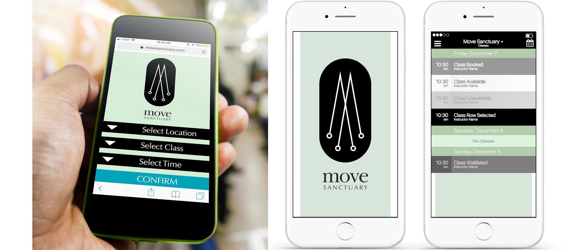
The entire process couldn’t have been more enjoyable and seamless. Following an initial round of three different identities, Jacqui chose the final, I made some refinements, created a brand guide with different logo lockups and sizings to make sure all bases were covered, and fleshed out the visual brand language. One of the most immediately important parts was working with her team to create a look and feel for the mobile booking system. We kept it simple, direct, serene. Things have evolved in the years since, but here’s where we started:

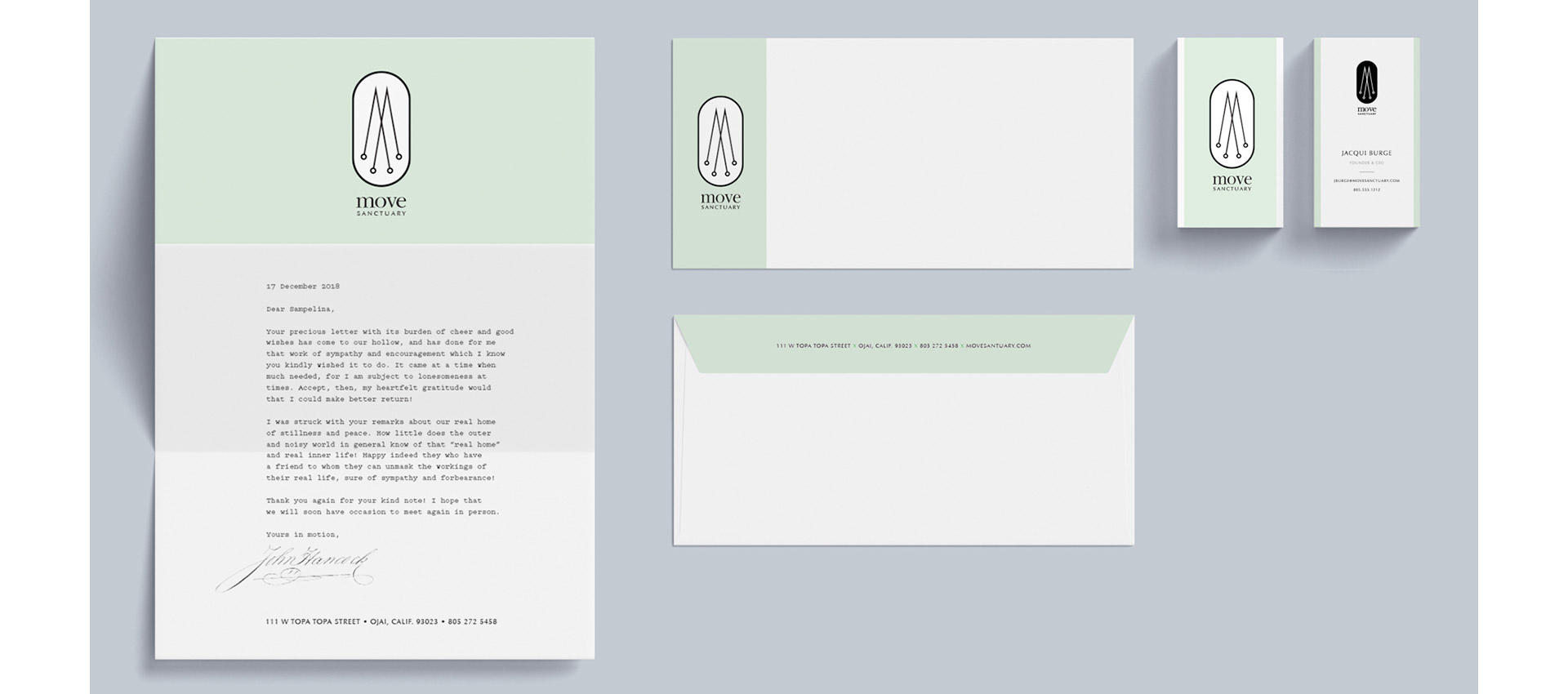
On top of that, I designed a sumptious stationery system so any written comunication with the studio would feel luxurious, and I created an array of fun patterns for merchandising. I have one of those bags and I always love the way it turned out! Of the things I’ve made, that bag is among my very favorites. If I have one regret, it’s that we didn’t get to reupholster that wingback chair in the lobby.


Of course, I also had to mock up a few notional designs. You never know when you’ll need some giant posters or a step & repeat for a co-branded event with one of the neighbors.

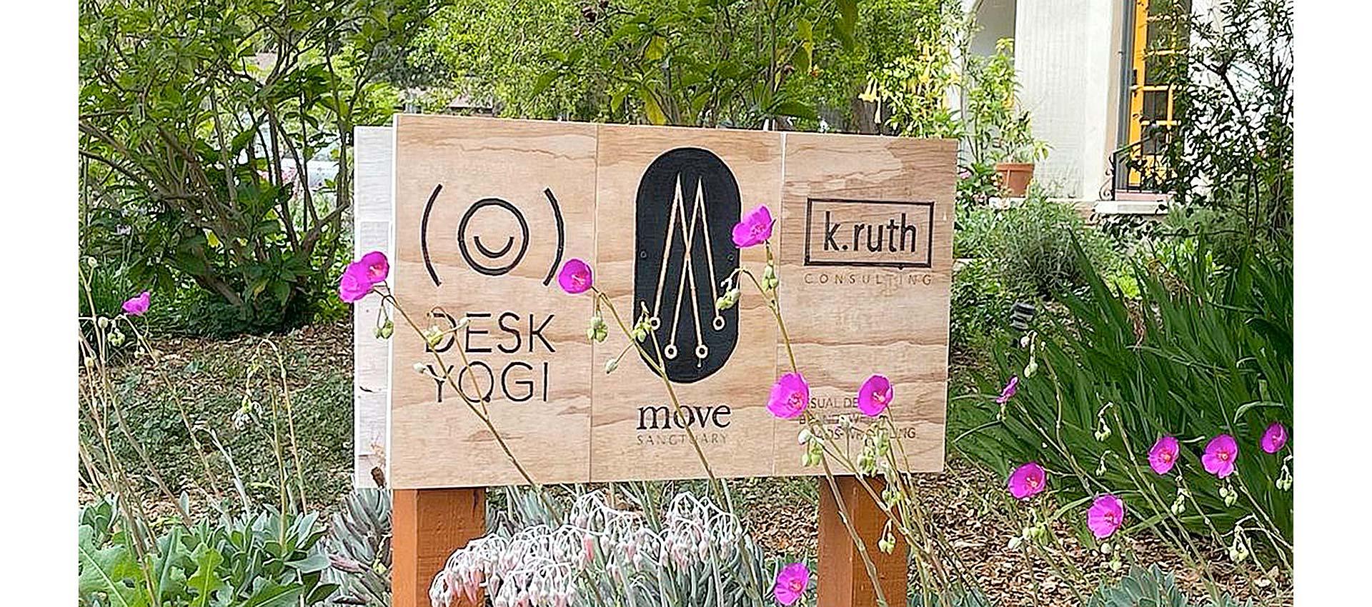
The actual sign currently sitting out front makes me very happy. This couldn’t have been a better experience! I’m grateful to Jacqui and her team for a wonderful collaboration!
