REALIOS LOGO
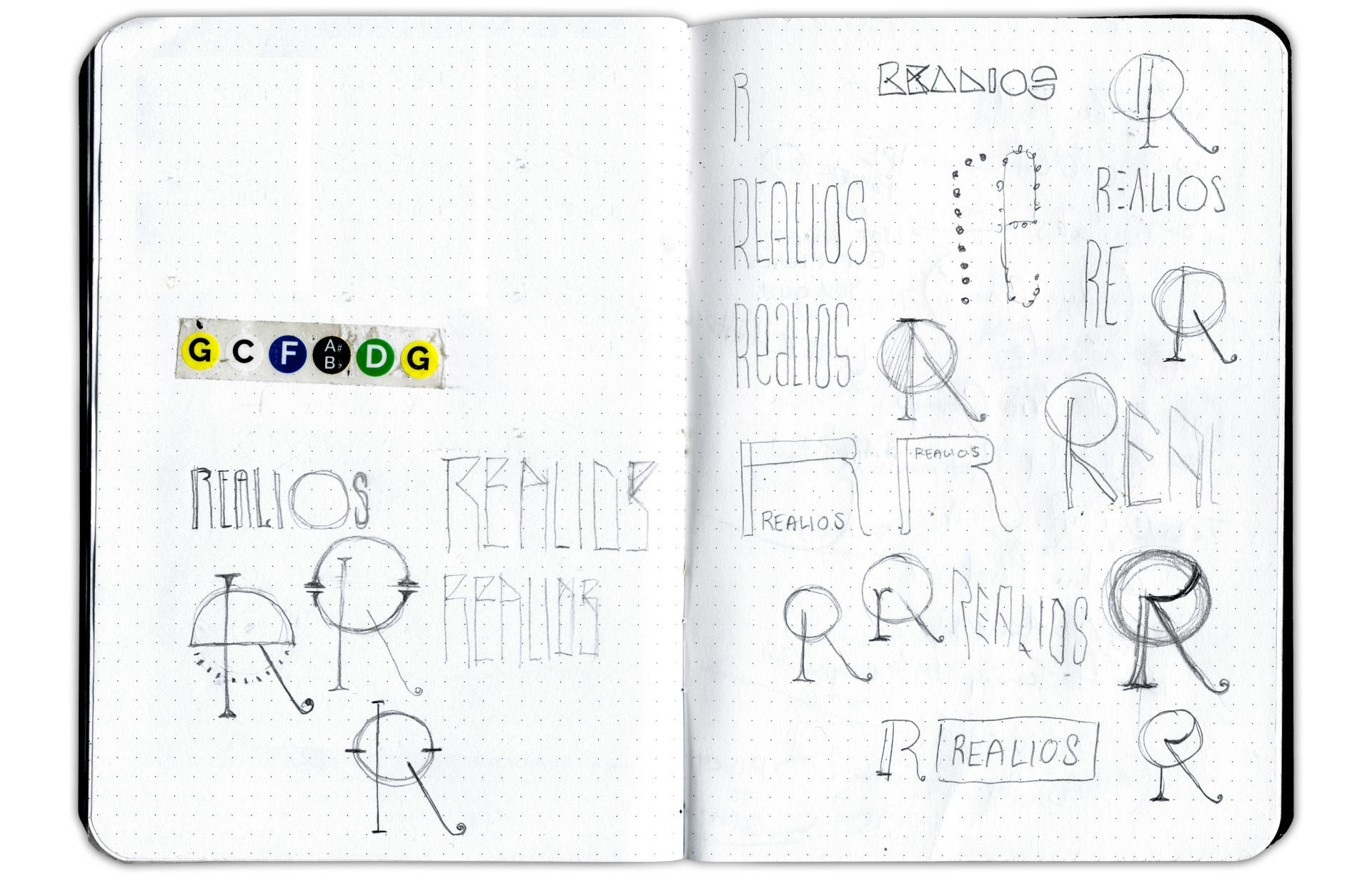
As part of rebranding audio equipment maker AnaMod, I was invited to create a logo for the Realios line of recording studio components. It’s my conviction that studio wizardry calls for wizardly design solutions, so I aimed for something at the intersection of a wiring diagram, an ancient rune, and an alien crop circle that popped up in the English countryside.
In terms of design, this was a very intuitive and organic affair for me. After sketching for a bit, I fell in love with a small pencil doodle, and then worked to preserve the spirit of the drawing as I digitized it. Among the logos I’ve designed, it’s one of my very favorites. It lives up to one of my primary requirements for a good piece of design: It should feel as natural and inevitable as a tree—adapted to its environment and unique; as if it’s always been there and always will.

- See more