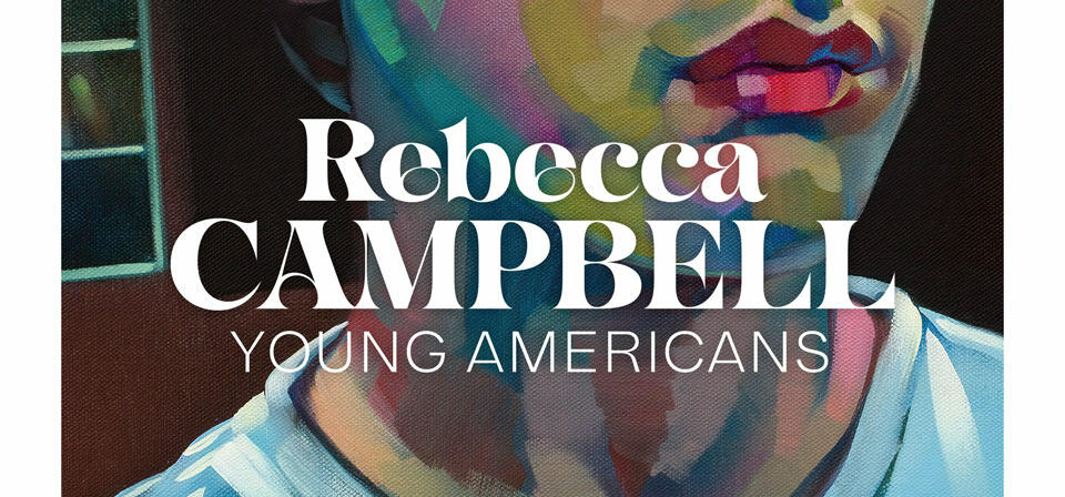
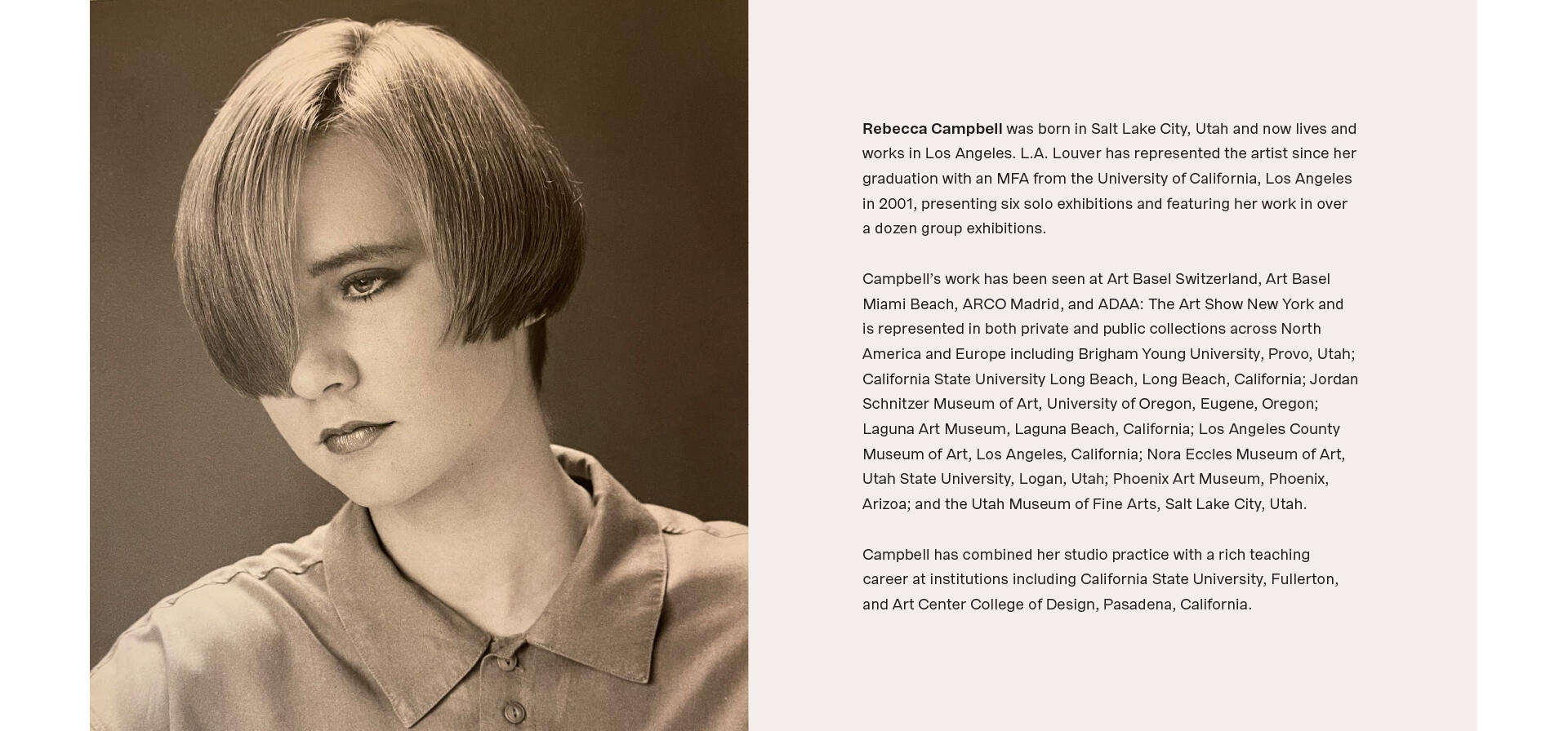
REBECCA CAMPBELL:
YOUNG AMERICANS
It’s always an honor to work with my friends at L.A. Louver, and doubly so when I get to design a catalog for one of my favorites. I’ve loved the work of painter Rebecca Campbell going back to her 2011 show “Romancing the Apocalypse.” That show first introduced me to her masterful use of paint. Her confident, energetic brushstrokes create bold, near abstract marks, but through her skill they coalesce into almost photorealistic images.
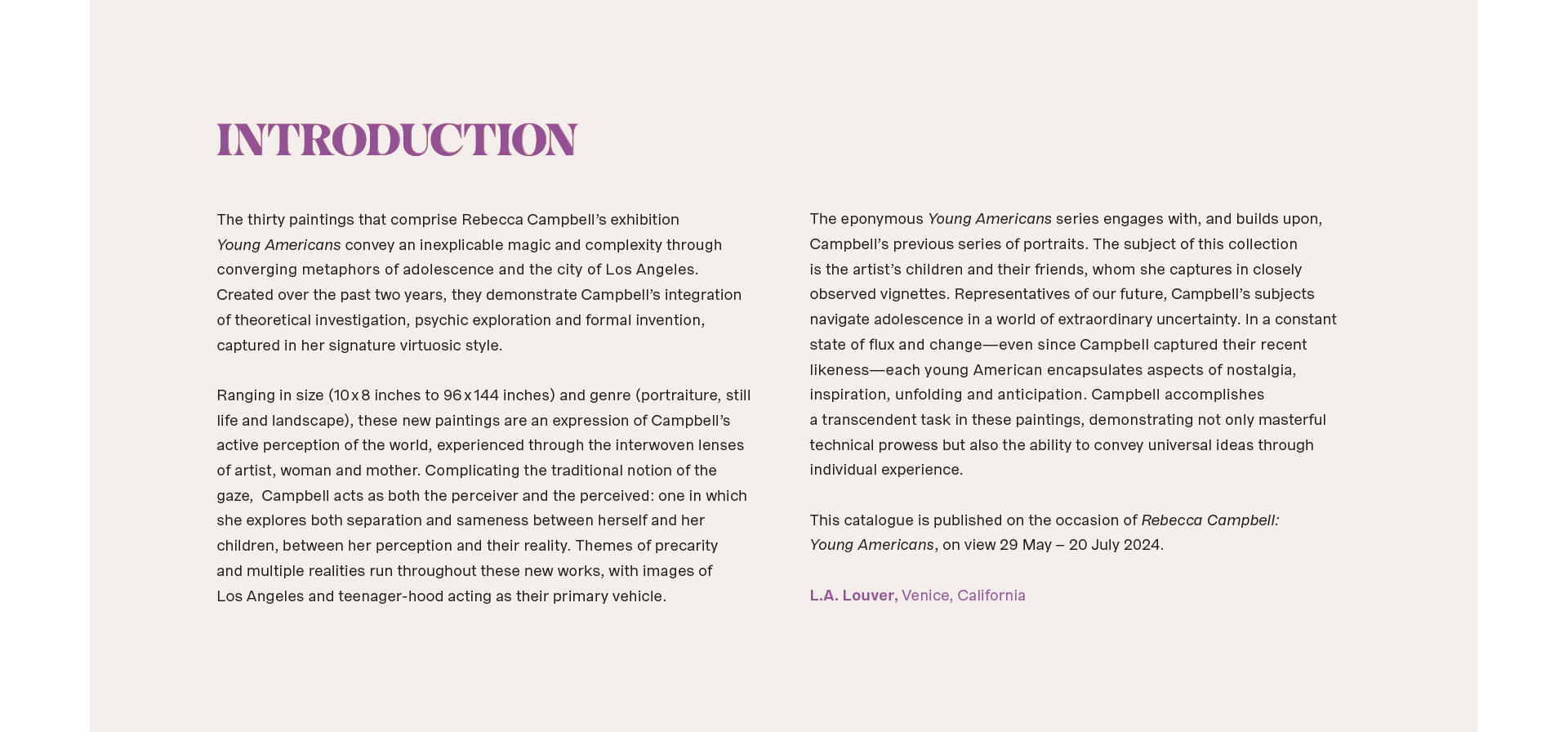
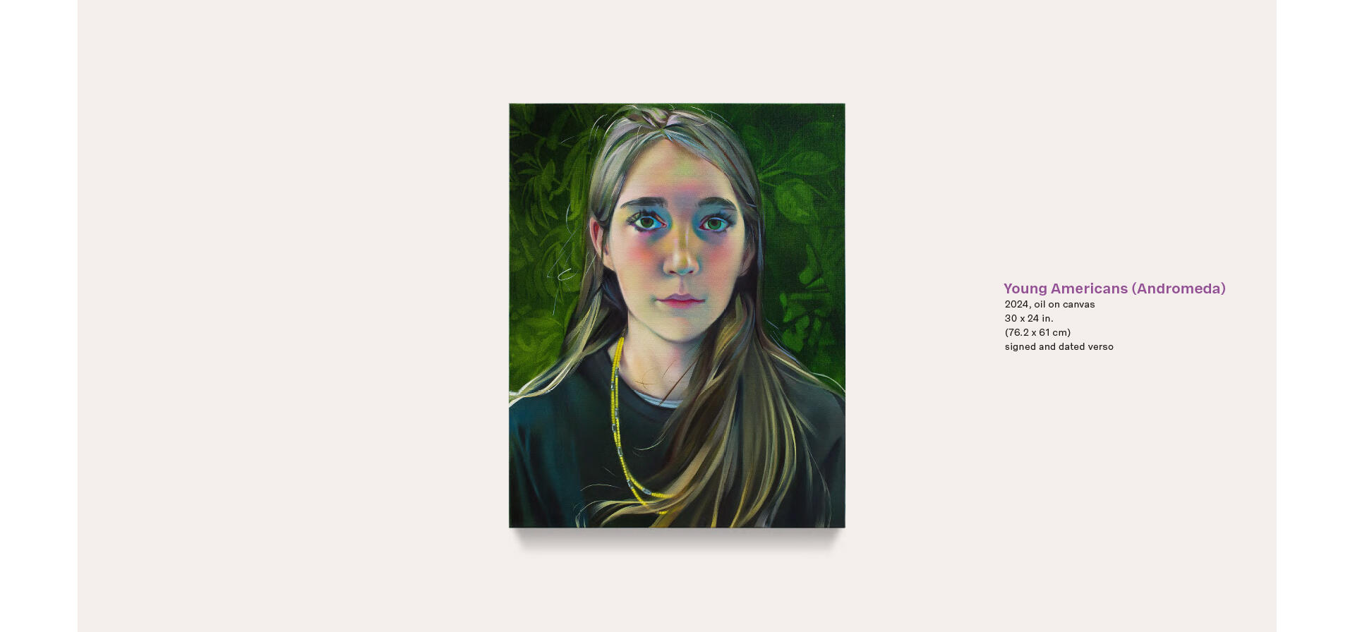
For her new show “Young Americans” she combines those strong, gestural elements with another part of her work—soft, intricate portrait renderings of her children and their friends. The way she plays those two techniques off each other creates a striking three-dimensional effect that you have to see to believe! Needless to say, I was excited that “Young Americans” would get a catalog, and that it would fall to me to design it.
We chose to create a digital catalog to allow us ample space to highlight the work and to preserve the intensely vibrant colors that jump out at the viewer throughout these paintings. As much as I love immortalizing artwork in print, the advantages of staying in an RGB space can’t be denied. Those colors pop!
Working without a set page count further allows for visual luxuries. With a traditional catalog, every extra page means extra money and extra time in production. With a bound book, the number of pages usually has to be divisible by 12 or 16 to facilitate the folding and gathering of the final book block. (If you’d like to get really nerdy about production, please take a look at my Book Design 101 class.)
There is also the matter of where paintings end up on the press sheet relative to each other. Each side of a press sheet has six or eight pages, and color adjustments are made in vertical strips along the sheet. If you have two paintings stacked on top of each other on the sheet, the tradeoffs start. Does one painting need more blue, but the other one needs less? Time to start making hard choices. In a purely digital setup, each painting can be color-calibrated individually.
One challenge with a digital catalog is type size. Some people may view the catalog on their 30 inch desktop monitor, others on a tablet or on their phone. We decided that it would be best to use a standard 1920 x 1080 proportion to take over the entirety of most screens, and to have each page appear as large as the device allows. Still, how big to make the text? Too big, and a short introduction will spread over a dozen pages and be annoying to read on a large screen. Too small, and we’ve made you squint.
Splitting that difference isn’t an exact science. Here’s where we landed:
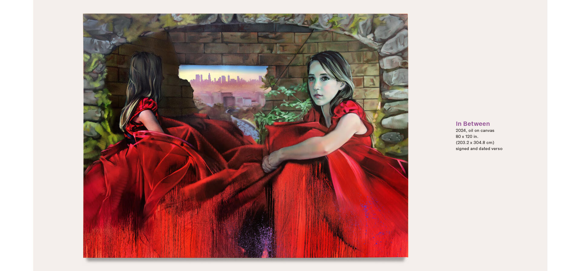
We kept the captions fairly small and at a proportion that’s only a little bigger than what we’d do in a printed catalog. Again, not too big to be clunky, not too small to be squinty. With the painting details, it also felt reasonable to assume that somebody sufficiently interested would zoom in.

Another benefit was that larger paintings wouldn’t be split over a page gutter—always a tricky thing to navigate. Not so here, in the seamless world of the screen.
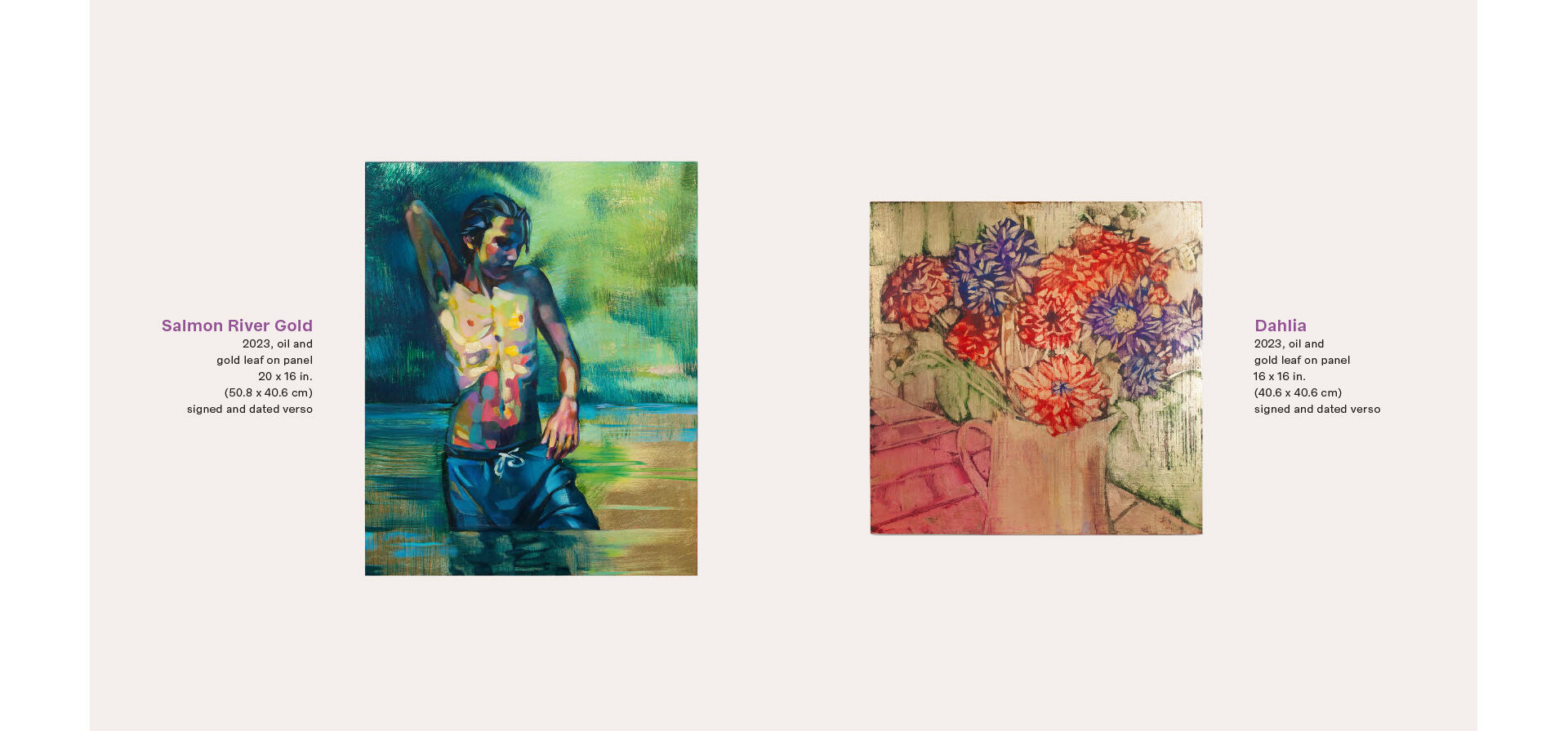
One particular challenge in documenting these paintings was that Rebecca introduced gold leaf. As we’ve found out again and again over the years, gold leaf looks fantastic in person and in videos, but can fall flat to the point of being invisible in still photography. Gallery photographs seek above all to document. Works are traditionally shot straight on with even, diffused light. Which is exactly what you don’t want if you’re dealing with shiny things.
Beginning with the “Gajin Fujita: True Colors” catalog, we now shoot paintings that use gold and silver leaf with a locked off camera and three or more lighting setups—the classic diffuse lighting, as well as spotlights coming in from different angles to make the metal glimmer. We overlay the resulting shots in Photoshop and blend in the metallic areas to get a composite image that is an accurate representation of the painting, metals and all! It’s a lot more work than the standard process, but it’s always worth it!
With a purely digital catalog, we also had the luxury of selecting countless details, and drinking deep from Rebecca Campbell’s library of process photography. Seeing so much of the making documented always gives me a better understanding of and appreciation for the finished pieces.
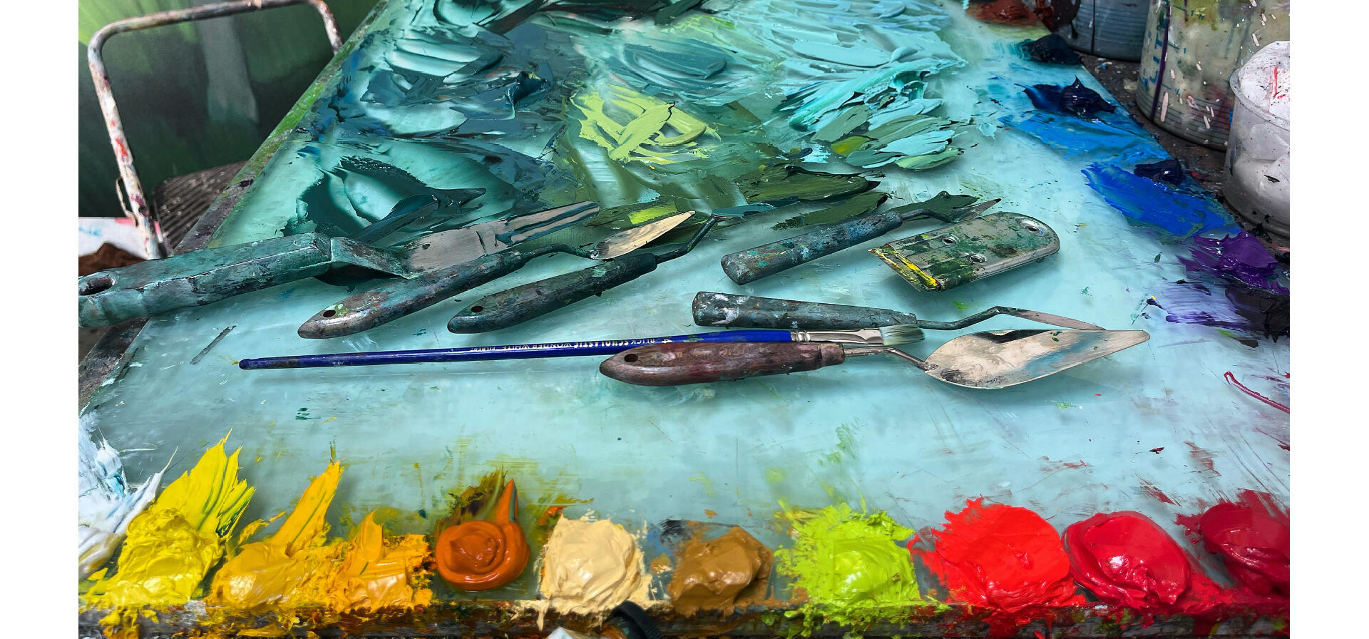
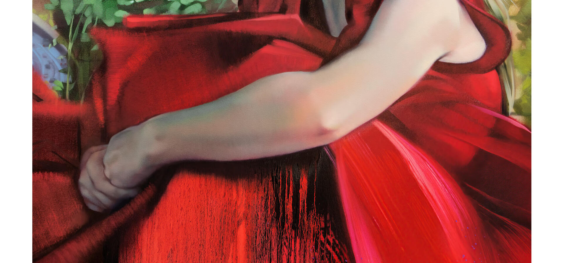
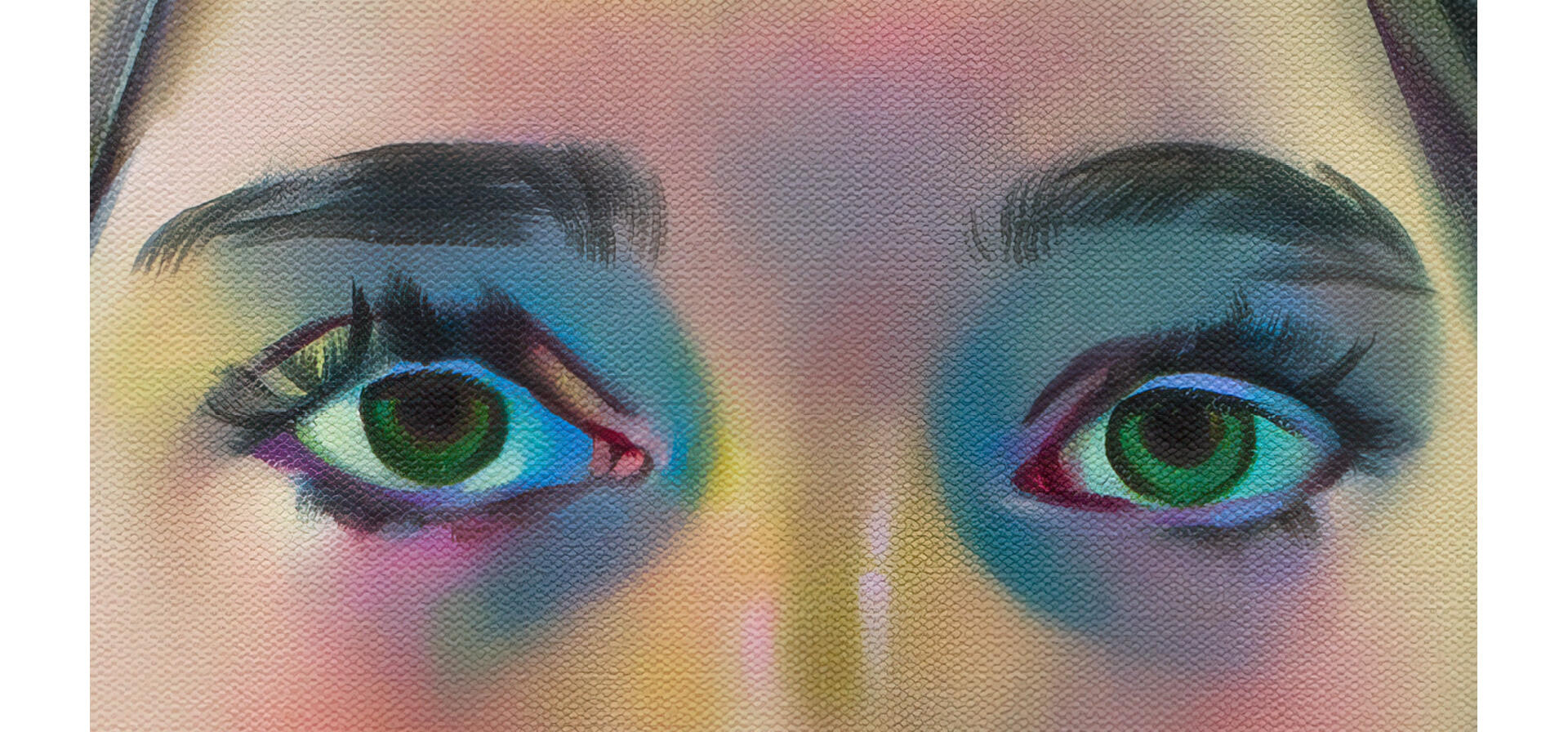
And the pieces are spectacular! Look at the contrast between areas of paint so minimally applied that the canvas remains readily apparent, and the layers of impasto where the paint is placed with a paint knife, creating brash strokes that pop off the canvas both figuratively and literally. The whole show was a tour de force of painting mastery, and as much as nothing beats seeing the works in person, I hope we represented it well in this catalog!
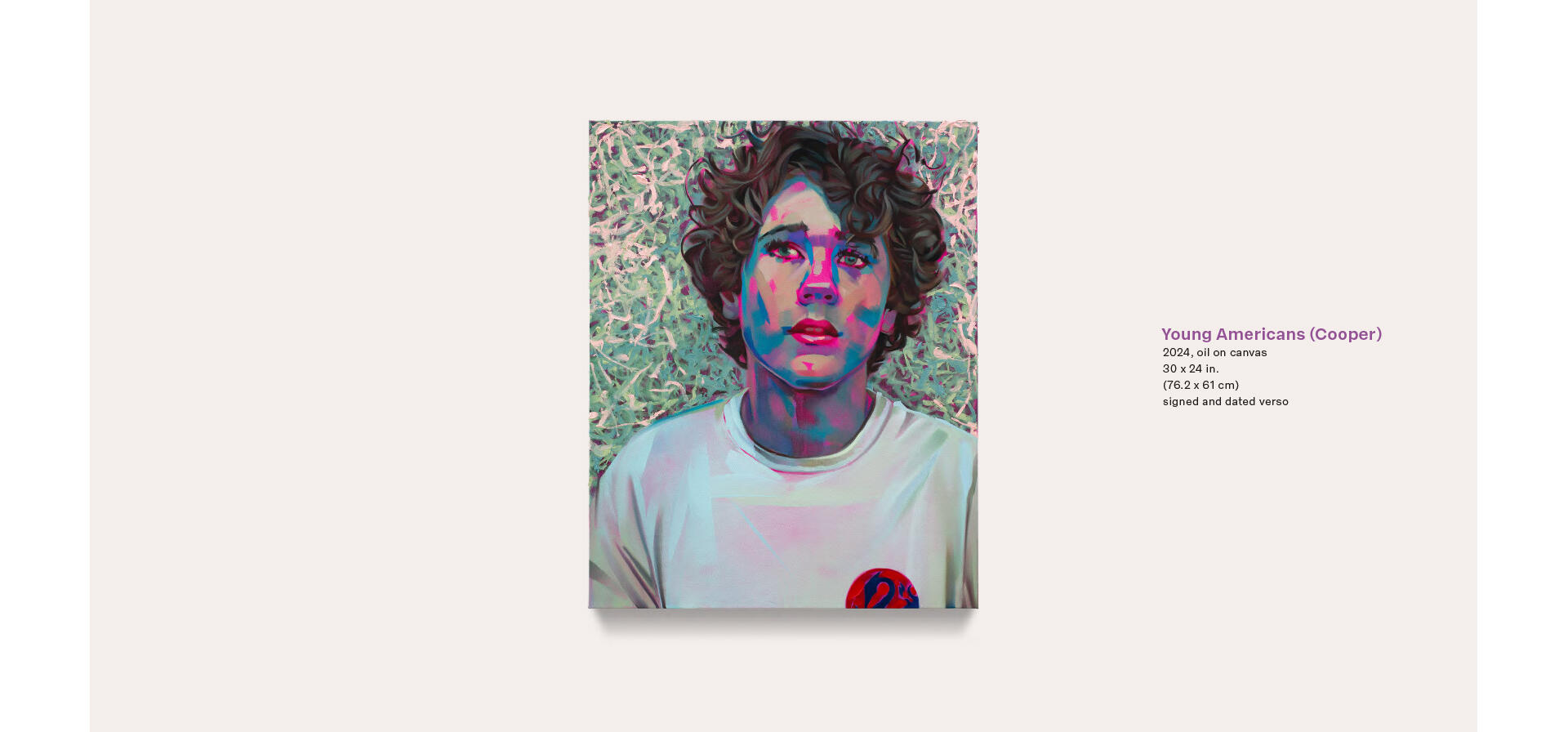
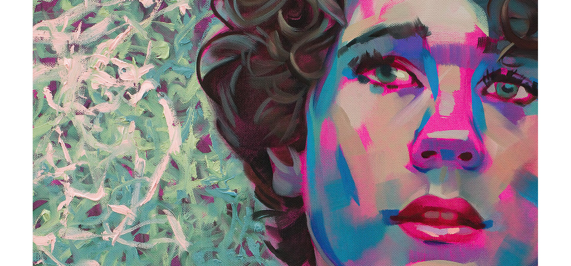
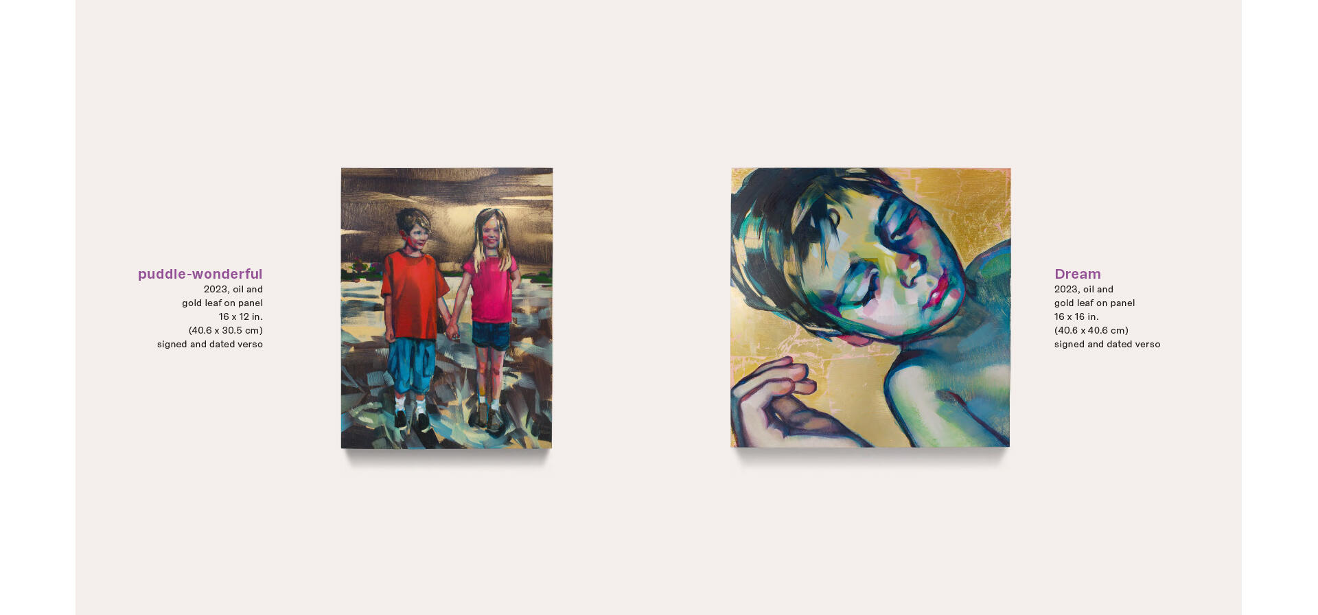
The catalog gets its name from a series of portraits of Rebecca Campbell’s children and their friends. This series creates the book’s grand finale. Look again for the contrast in painting styles, and enjoy the incredible use of non-intuitive color that bring these characters to life!
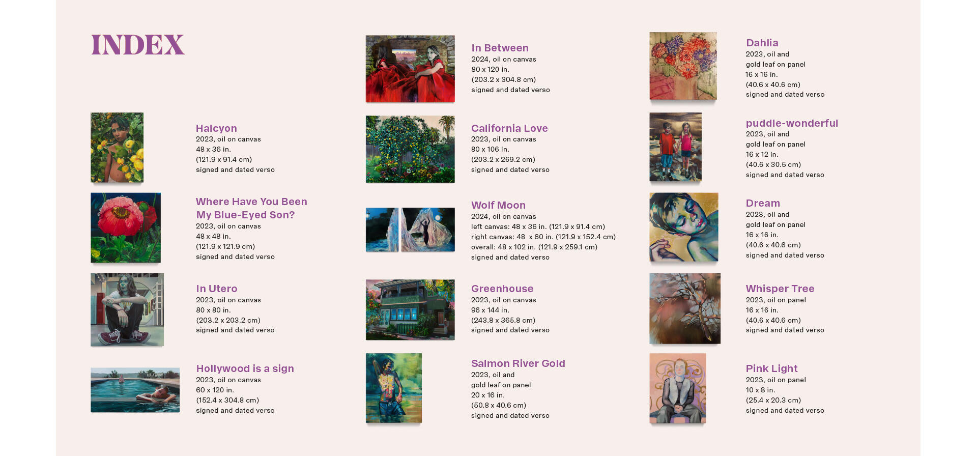
Lastly, what can I tell you? I love an index—lots of little images and neatly organized information? Be still my Bauhaus heart! Thank you again to Rebecca and to the L.A. Louver team for trusting me to design a book around this beautiful body of work!
You can view the catalog in its entirety at this link. To see more of Rebecca Campbell’s work, please visit her artist page on the L.A. Louver website.