S CLUB 7—SEVEN
7 is the second album by British pop group S Club 7. Originally created by Spice Girls manager Simon Fuller, they were a huge act in the U.K., where the album had already been released with different artwork. In the U.S. the band was known mostly to viewers of their TV show on the Disney Channel, and Interscope wanted to use this repackaged edition to give them a more grown-up image.
This was another assignment from my friend Joe Mama-Nitzberg at Interscope-Geffen-A&M. We had already worked together on CD packages for Sting, Cold, and Whitney. By the time this album rolled around, I was just another part of Joe’s team, which hummed along like a well-oiled machine. Joe provided me with a stack of great images by photographer Isabel Snyder, and then guided me through a smooth approval process. Production coordinator Les Scurry made sure everything looked great on press. The whole thing was a pleasure. It just felt professional in the best way.
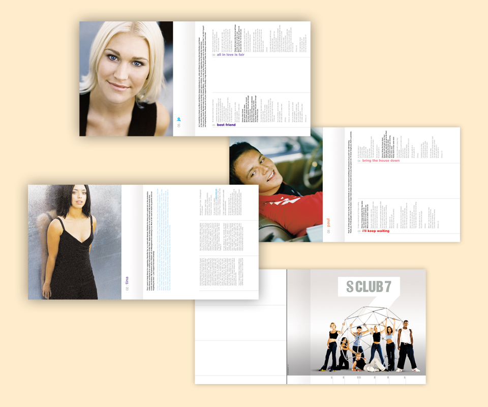
The type inside the booklet is far too close to the edge of the page, but it was already so small. There was nowhere else to go. Shall we reclassify this from “act of desparation” to “formal daring”?
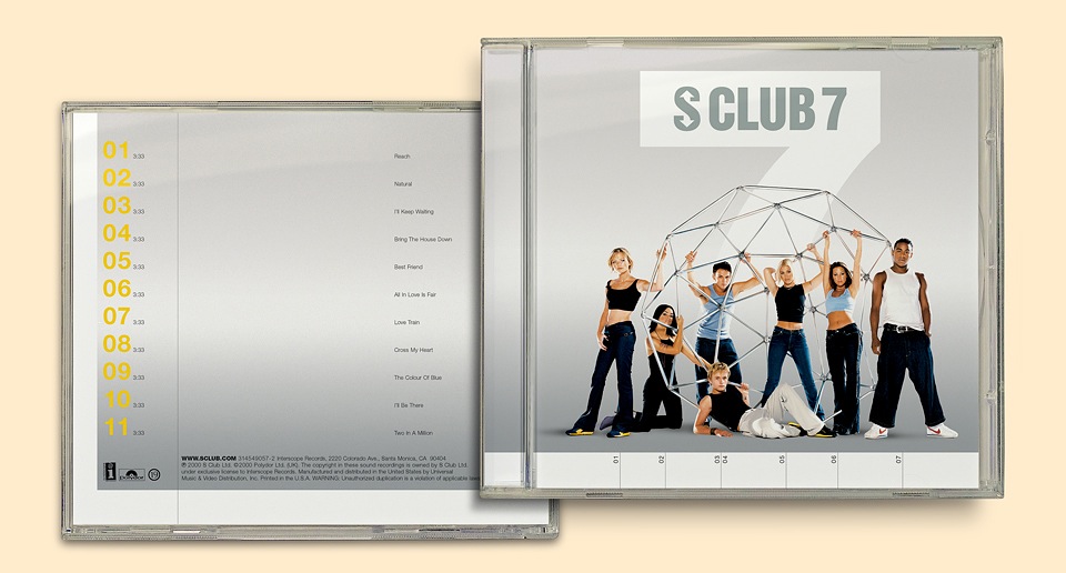
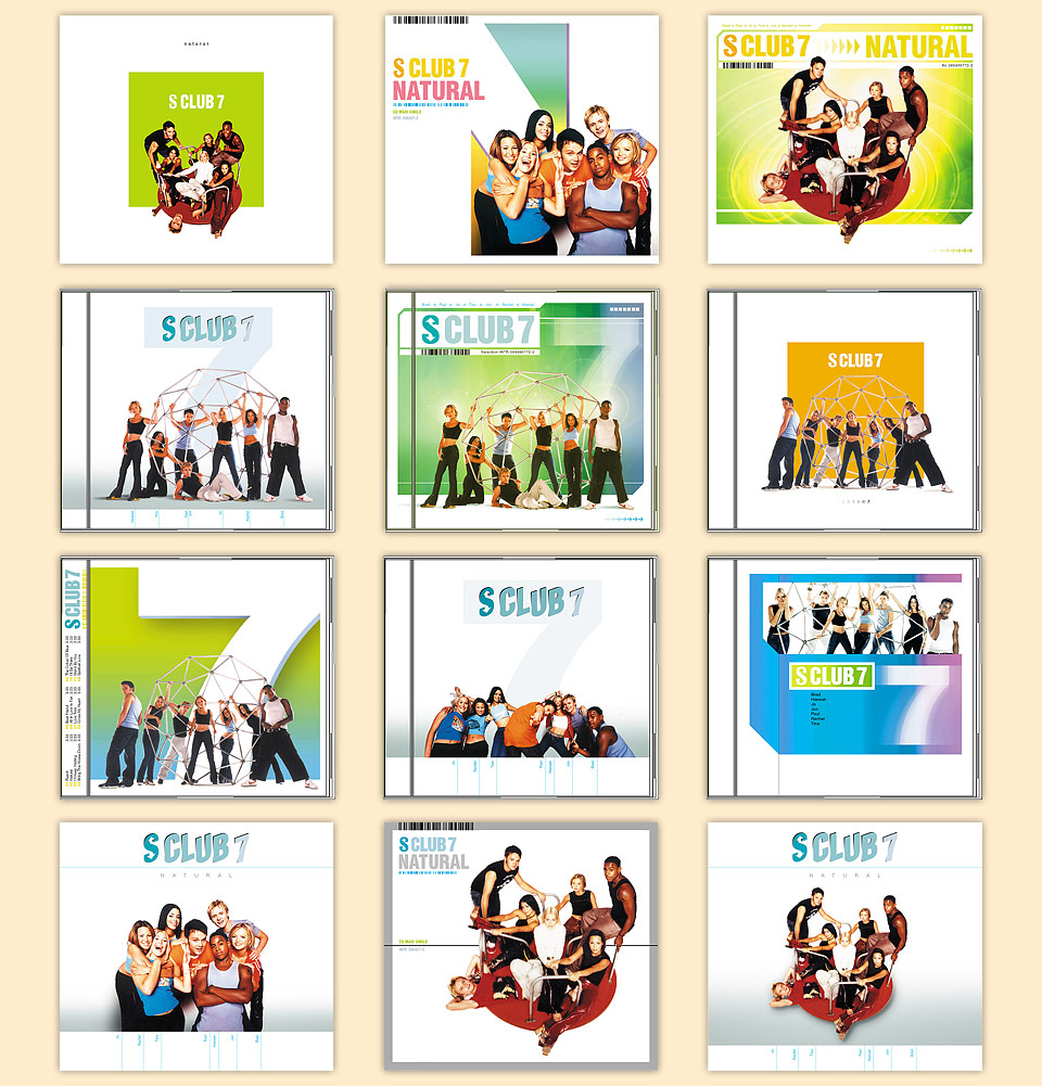
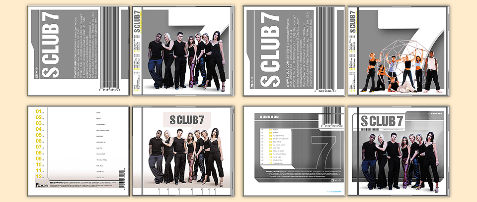
As you can see from the variety of designs below, I was trying to find my way around the duplication of the number 7. I also had to use the pre-existing S CLUB 7 logo. I tried spiffing it up a bit with a tilted metallic effect, but in the end the call was made to keep thing very simple and elegant. Hard to argue with that.
This album was written and produced in large part by Cathy Dennis. (If that’s kind of exciting to you, too, you’re also European and also around my age. Congratulations.)
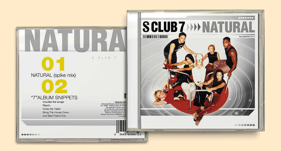
The little number callouts on the album cover correspond to the individual photos on the inside of the booklet. Why are the band members holding on to a flattened jungle gym? And why are they on a merry-go-round on the single? I do not know. This was from a period where I was often brought on board after the shoot had already taken place. That said, with a group of people props really help loosen things up on set. The more straightforward, fashiony shot of all of them wearing darker colors is still my favorite, but it did look a bit too much like a J. Crew ad, I suppose.
The only drama, if you can even call it that, was that I hadn’t realized that management had already chosen the cover photo. When I sent out comps with alternate shots there was a bit of upheaval, but it was easily fixed.
Lastly, I have to admit to a technical screwup: I had placed a barcode sliver on the cover of the NATURAL single, purely for style. Once the design went to print, none of us thought to replace the temporary FPO barcode—For Position Only—with the proper code. Sales departments will forever drill it into your head that small barcodes won’t scan properly, and this one was less than an eighth of an inch high. Well, we proved that they scan after all. The proper regulation sized barcode was on the back, but whenever record store clerks scanned the UPC sliver on the cover instead… it came up as an old Maverick project, “Music from ‘The Wedding Singer,’ Volume 2.”