STEP CONFERENCE REPORTS

Before I created the Monsters, I was always looking for client projects that were also means of self-expression. That’s the case here. Little did I know how much self-exposure I was going to open myself up to as a result.
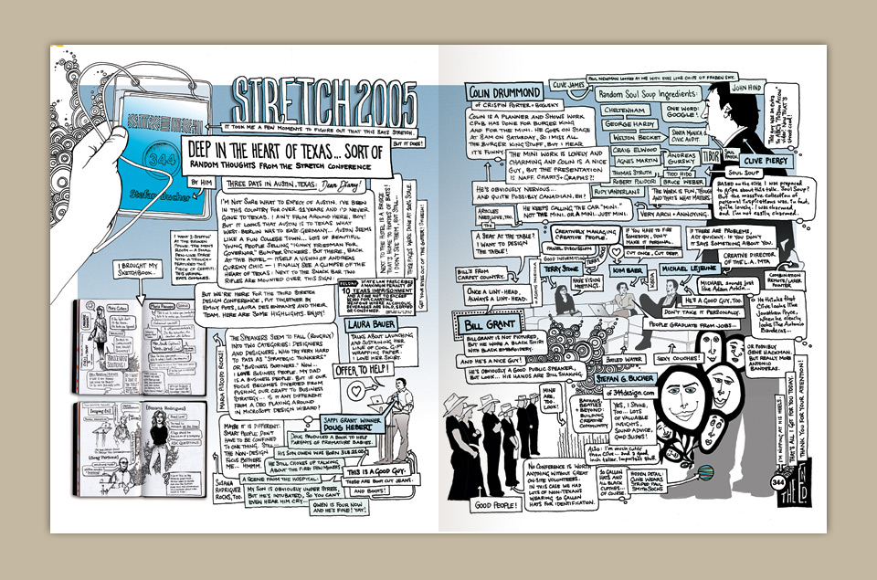
Inspired by illustrator/underground comix creator R. Crumb and wife Aline’s reportage of Paris Fashion Week for The New Yorker, I pitched STEP Inside Design editor, Emily Potts, the idea of covering the magazine’s own 2005 Stretch Conference in Austin, Texas in a comic book flow–chart style that had been on my mind since the Deep Thought poster. (Which in turn sprang from a Microsoft ad I’d designed years before that.) Happily, Emily agreed.
She placed no restrictions on me, either. My assignment was to cover the event in my own way. The result is a two-page journal of my experience as a speaker and an attendee of the conference. Taking some cues from the foldout chart I’d created for the paperback version of All Access, I drew up a pseudo-flowchart of bubbles flowing around some of my visual impressions. Using the speech bubbles and arrows gave me the freedom to write with much more rhythm than I usually do. That style has become something I’ve since evolved in a number of projects—most recently in my book, 344 Questions.
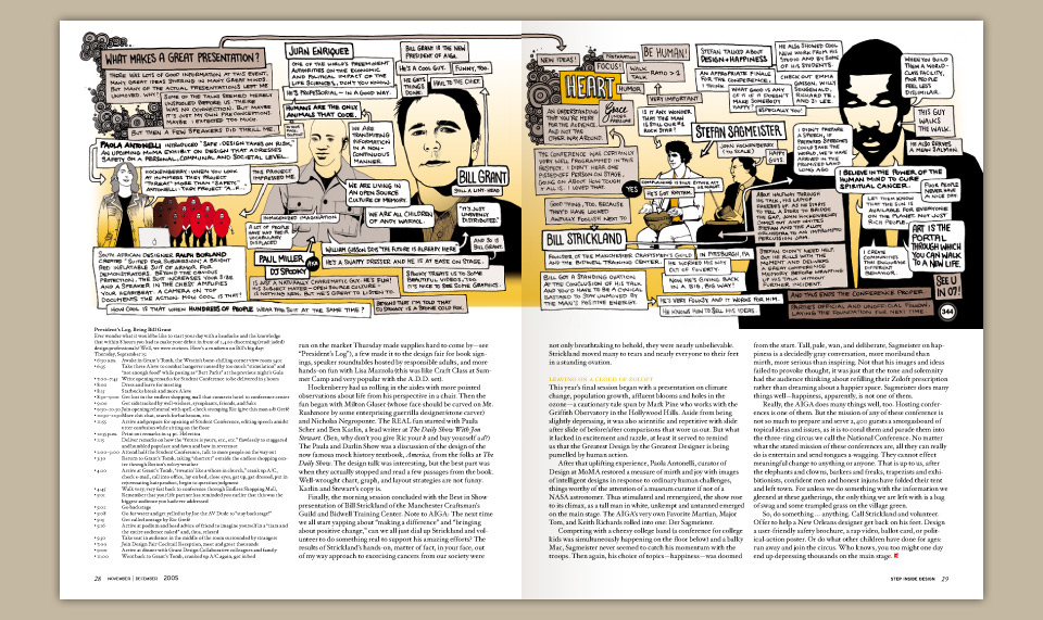
Next I covered the 2005 AIGA Conference in Boston. This time, Emily’s vision was to integrate my illustrations as editorial art in support of text she had commissioned design journalist Matthew Porter to write. It was supposed to be a traditional writer/illustrator collaboration. However, that’s not what happened.
As I attended the conference, my notes and drawings reflected my own point of view about the various speakers’ talks more than could be combined with an article. When I began to compose my illustrations for STEP, it was as much writing as drawing. As a result, my work didn’t exactly sync up with Matt Porter’s, so the conference coverage layouts ran as horizontally split pages with two parallel experiences documenting the same event.


From the conference pieces, I was able to talk Emily into the idea of giving me a full page in each issue of the magazine to mouth off about graphic design and illustration. I called it Ink & Circumstance. You can be see those columns here [Year 1] and here [Year 2].

Getting back to the conference reports, I wanted these pieces to be a bit more personal and critical than your average design conference wrap-up, where never a mean word is spoken. I was pretty cranky about a few things that kept popping up again and again on stage, and I thought I should actually say so, instead of just grumbling about it to friends. This was true for Austin and for the AIGA Design Conference in Boston, too, though I was perhaps a bit more timid there. Sometimes you merely want to nibble on the hand that feeds you.
