STING
Sting had been one of my musical heroes growing up. “Nothing Like The Sun” was the third CD I ever bought, and the first “serious” album. When Joe Mama-Nitzberg called me to design this Japan-only compilation of dance remixes I couldn’t believe my luck!
- Buy one
- on Amazon
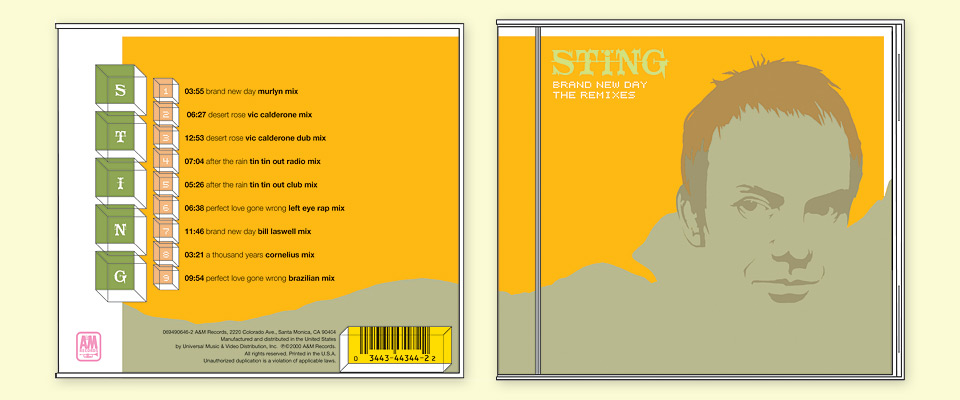
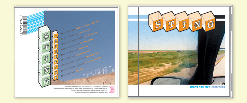
All the remixes were based on tracks from Sting’s then current record “Brand New Day,” which featured photographs by Olaf Heine. I traced his cover photo to create an illustration of Sting. I wanted to see how few lines I’d need to keep his face easily recognizable. I spent a great deal of time working out the colors of this design. The contrast had to be just so for the whole thing to come together properly.
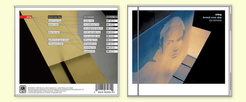
Beyond that, I wanted to come up with some great typography for the track listing on the back. I was designing for one of my idols. I wanted this thing to sparkle and shine! I expanded on the original orange illustration by placing it inside an architectural photo I had taken at the end of my time at Art Center to give the cover a more austere, electronic look. I can’t tell you how I pleased I was with all of this work. I knew I had something good.
By this time, most presentations happened by way of e-mailed PDFs, but I wanted to do this right, particularly as the color was so critical to the success of these covers. I went back to what I was taught in school: I made beautiful printouts, mounted them on LetraMax Super Black board with a two inch border, and delivered them to the record company in person.
This project was administered by the international division of Interscope/Geffen/A&M. The head of which was reportedly not a fan of design. I was worried, and so was Joe. Lo and behold, he loved the comps. Which apparently never happened! We were off to the races!
What happened next? Nothing. I didn’t hear anything for weeks. When I did, it was a call from Joe. Sting had seen the comps, and he’d hated them. “Really? What did he say?” “It doesn’t matter. We just have to come up with something else?” “No, come on. What did he say?” “He said, ‘These make me look fucking ugly!’” Ouch.
Further, the label and management felt that the packaging had to look more generic. All the tracks on the CD had been previously released as bonus tracks on various singles. The compilation should look good, but not so good that it suggested new material. A fine line, indeed. Also, what designer doesn’t love making things look more generic?
I liked this comp so much that I created a full roll-folder for it. The basic structure survived in the final.
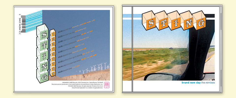
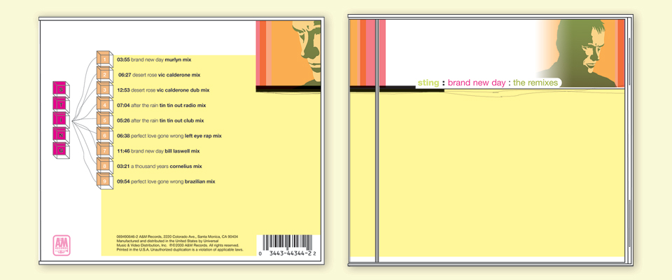
As you can see, I nixed the portrait, and came up with typographic solutions in attractive, but non-specific spaces. I kept the architectural image, because I thought it was too nice to let it go. Again the comps went out, again there was a long silence, until Joe finally called me again. “I know you’ll hate this, but we’re up against the deadline. I’m flying to New York this week to show things directly to Sting. Can you just make me a few comps that are really generic? I just need to have something they can approve.”
I think I was craving a double-scoop of orange and strawberry ice cream.
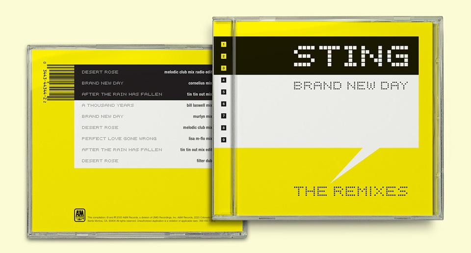
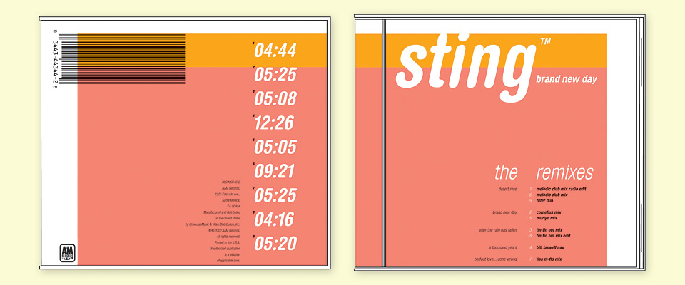
With that I went into Typography 101 mode, knocking out a few minimalist solutions that still seemed like fun. At the very tail end I made one more comp heavy on the white space. I let the barcode on the back cover turn into a black bar along the top of the package. That bar terminated on the cover, with the white letters STING set in Bubbledot, the same typeface I had used for the Solar Twins CD a year earlier. Below the black title bar sat a wider yellow bar. I liked to use solid process colors for things like this, because they’re the closest thing four color process has to offer to the vibrancy of a PMS spot color. Process yellow is particularly intense, and had been used on a few electronica albums I admired, such as the second MTV amp compilation.
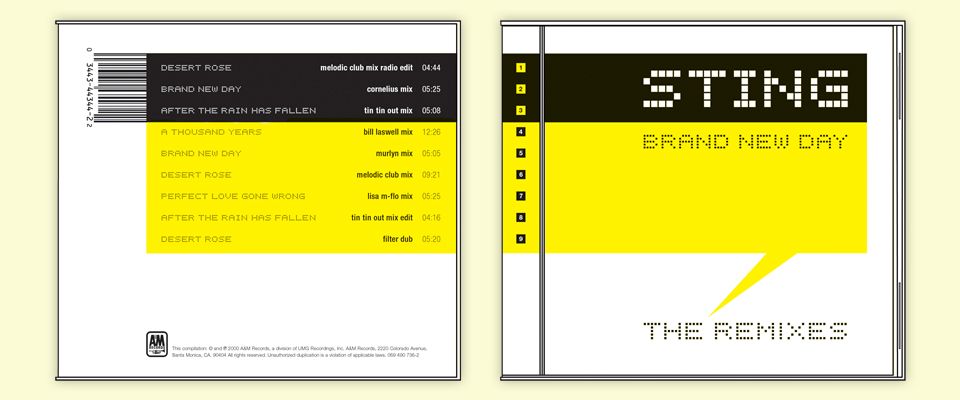
So then: White background, black stripe, yellow stripe. Like a bee, don’t you know. I added a yellow stinger to point at the title “Brand New Day : The Remixes.” I sent it to Joe along with the rest of the last minute comps as a bit of comic relief. It really was meant as a joke. You know where this story goes, right? Some clients have an uncanny ability to sniff out the one comp they’re supposed to dismiss and approving it. Which is, of course, what happened here. They loved it! Joe was relieved, and I was… stunned. “Really? The bee layout? With he stinger? For Sting?!” Yup. So it was.
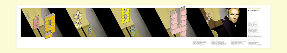
The nice thing about the CD design process is that everybody on the client side puts all their attention on the cover, and to some degree on the back cover. Nobody really cares too much about the inside of the package. If nothing else, I was able to spin the bee stripes into a beautiful, minimalist insert that grouped the remixes for each original track on their own separate pages as you unrolled the folder, placing the title on the adjoining page.


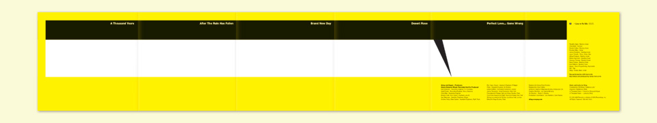
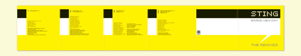
The trick is to end up with an attractive backside once it’s fully unfolded. I think I did OK here.
Adjusting the line spacing to work well in the transition from the black bar to the yellow field proved tricky, because the height of the black area was dictated by the width of the barcode, but I fiddled around until I got it sorted out. As a last ditch effort I asked Joe if I could please switch the white background to yellow, and the yellow stripe to white to somewhat disguise the visual bee pun. Happily, he agreed. I made the change, added a translucent yellow to the disc itself, and sent everything off to production in Japan.
Color proofs would’ve been the next step, but instead I just received a sample of the finished CD in the mail a few weeks later. There had been no time for an extraneous luxury like proofing. Luckily, I had buttoned this file up tight, and everything looked great. Something seemed off about the back cover, though. It took me a surprisingly long time to realize that the barcode was missing. Japanese CD releases don’t have them. All that information is contained on a paper strip that’s folded over the spine of the CD. The formal reason for the entire design… gone. Nobody recognized the barcode as the backbone of the design, so off it went into the ether, never to be seen again. Oh well.
Months later I talked to Joe about the project, and he got a little sheepish. “I gotta tell you something.” Remember how Sting hated my stylized color portraits of him? Turns out that somebody at the label had misplaced my lovingly assembled presentation boards, so they sent Sting color copies of the color copies they had made of those boards instead. No wonder he hated the way they looked! “Why didn’t you call me?! I could’ve made new boards.” There was no time, they were embarrassed to ask. I was completely baffled. It would’ve taken me a few hours. It would’ve been no problem.
How proud I was of these comps! And still am. Now that more than a decade has passed, the disappointment has dissipated. Mostly. I still wish I could’ve shepherded one of the earlier designs into production. To me, they would have been the best CDs I’d ever designed. Certainly back then. But so it went. What can you do? I gave new life to a few of the elements with the Oliver Peoples 3 compilation, and of course, the design we did end up with for this CD is pretty nice, too. For years after I told people that Sting wanted photos of himself, or some goofy illustration, but that I fought tooth and nail for something minimal. Designing for your teenage heroes is dangerous terrain.