THE BLUE MOMENT

and the Remaking of Modern Music — 5.625 x 8.5 in. (14.3 x 21.6 cm)
Richard Williams’ book “The Blue Moment” talks about the massive shockwave Miles Davis’ 1959 album “Kind of Blue” sent through the culture. A British edition of the book by Faber & Faber already existed, featuring a beautiful photo of Miles Davis and classic typography in the Blue Note style. W.W. Norton called me in to design the jacket for the U.S. edition. The direction art director Francine Kass gave me was to use neither a photo of Miles Davis, nor Blue Note typography. Which made me very happy.
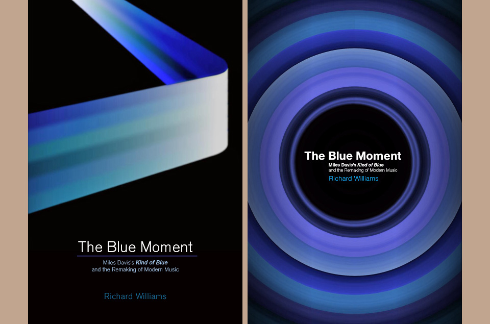
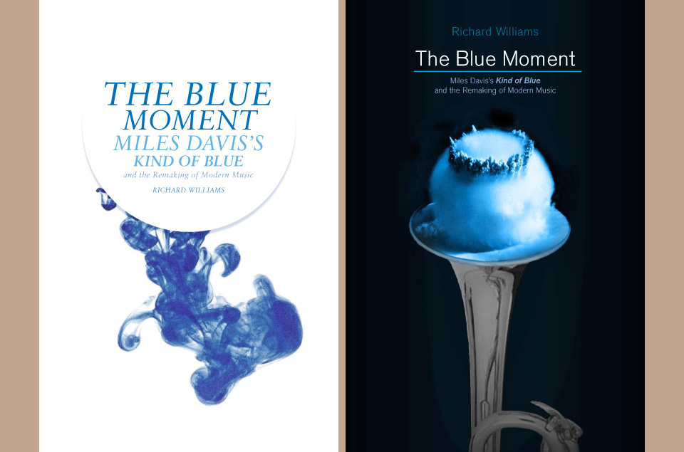
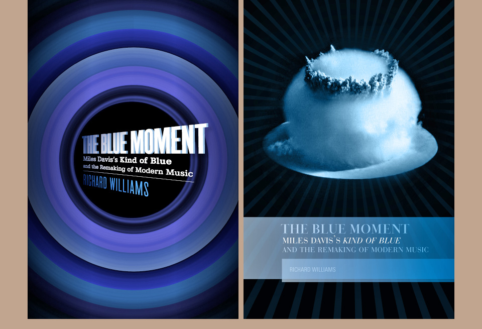
As much as I like moody black and white photography of a moody genius, and no matter how much I adore that flavor of typography, how many more times do we have to see it? A classy trope is still a trope. I was excited to try something else. As you can see below, I quickly ran through a few distinct directions with art director Francine Kass, but the nuclear test trumpet was an immediate hit.
Aesthetically, I actually preferred some of the other comps, but that sort of high concept “Thing A meets Thing B” idea is almost irresistible in a lineup. And it does get across the idea of the book. Which… you know… that’s important, too… I guess. The real trick was not making the blast look like a snowball.
Kidding aside, designing a cover for a book or a CD is a great honor, but I also feel a real sense of responsibility. I know how anxious I get about my books, and I don’t have to let somebody else design it. How non-designing authors do it, I don’t know. I always strive to do right by them, and I hope I did it here.


Round 1: The drop of blue ink survived into Round 2, and I preferred the metaphor, but what can you do? Nothing withstands the power of a nuclear blast.
