THE FALL
As I was finishing up work on the book for The Fall, I asked Tarsem who would be handling the titles for the movie. I told him that I’d love to do the job, but he had already assigned the work. “I’ve got some guys who do this stuff all the time.”
- Buy one
- on Amazon
A little while later he asked me to take a look at the titles, and to maybe recommend a typeface. He had spent months fine-tuning the precise edit of the black and white opening sequence, matching it to a new recording of Beethoven’s Symphony No. 7 in A Major, Op. 92 (2-Allegretto). He had overlaid the titles more for pacing than anything, and they looked terrible. “That type looks terrible,” I told him. “Can I please do these titles already?” He told me that they had practically no money for this. Maybe I could recommend somebody who’d do it on the cheap. “I’ll do it for free! It just can’t look like that!”
After much cajoling he said, “OK. Do it.” Working with screen grabs I laid out out the type in Helvetica Light Condensed, matching the design of the book, and asked my friend John Waters of Atomic Zoo to help me with the motion graphics. John and I had met in line for registration on the first day of Art Center, and later worked together on our first commercial for Stephen Berkman’s Basics of Film class. It had a nice symmetry, and even if it hadn’t, John does beautiful work, and what more do you need?
As I said, Tarsem had spent months crafting the opening sequence, perfecting a look of “a lot of chaos, but not much energy.” We had to find ways to insert the type within this existing structure. Contractual obligations bound us to show each title for the exact same duration. That means the shortest available shot would dictate the length of all other titles. This was tricky, because most of the opening is so beautifully languid that a title flashing only briefly becomes a real distraction. We tried extending the shortest title across two shots, but that looked awful, so we spent a lot of time experimenting with different timings for the way the titles fade in and out. Fractions of a second make a huge difference, and we finally got everything just right.
I asked Tarsem if we could skew some of the titles to stay in perspective with the objects in the shot—such the credits appearing below the bridge—and he liked it. Simply overlaying them looked cheap, and robbed the moment of magic. With this decision we also created a ton more work for John, and I’m grateful that he put up with me on this.
Along the way I learned a great lesson about layout from Tarsem. I was trying to persuade him to let me move “The Fall” to the far left of the frame. He told me, “That looks great on the page, but you have to think in time. The eye is still on the head coming out of the water, and I don’t want it to have to move to find the title.” So simple. So brilliant. And great advice for designing anything sequential. I’ve been thinking about it ever since.
Following all of this, I asked if I could please design the end credits, too. Again, Tarsem had guys who do this all the time. They started doing their thing, Tarsem wasn’t excited, asked me if I knew a guy, “Yeah, I know a guy.” There’s no money. “Don’t care.” And so I designed my first end crawl. How hard could that be? I designed it at a tiny type size, so as not to max out the maximum file height in Adobe InDesign, chopped it into four giant Photoshop files, and off it went to France to be moved along at a stately pace. Everything’s nicely spaced, the TTs are properly kerned into a ligature. It’s good! But I will never look at a crawl the same way again. Who knew the production driver in Bucharest gets a credit?
The full end credits. (And if you think this isn’t the bit I wait for each time, you’re crazy!)
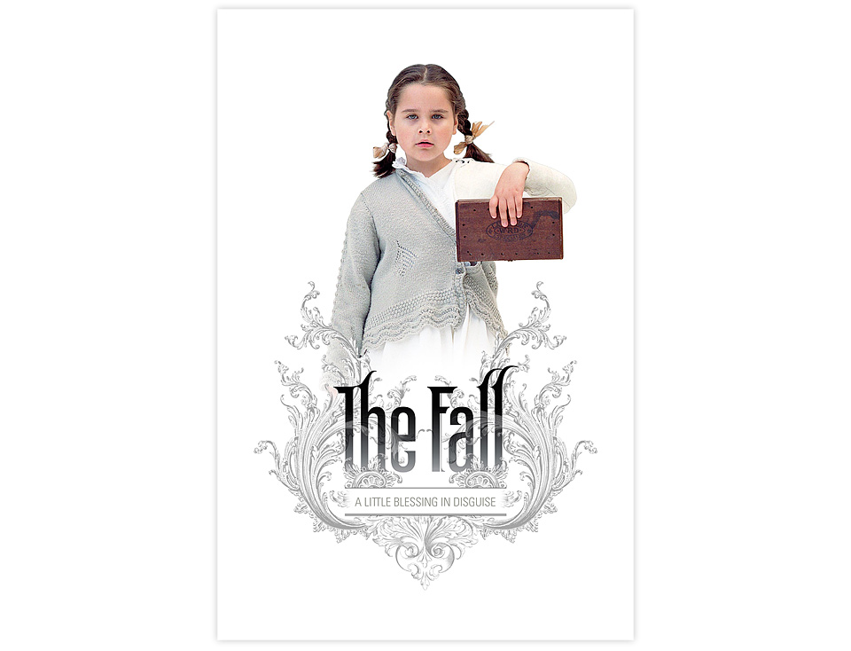
I tried to get in on the design of the movie poster, as well, and designed a version for the screening of the movie at the Toronto Film Festival. Between that and designing the billing block for the TV commercials it gave me a crash course in working around actors’ contracts. It also made it clear to me why a lot of things look the way they do. Once Sony signed on to distribute the movie, their marketing department took over, and they did a beautiful job creating a cool poster. And they kept my logo. Which is rare, indeed. I got lucky there.

My Poster Design for the Toronto Film Festival
Seeing the movie on the big screen for the first time was a thrill. It had been over 15 years since I’d talked my way into designing advertising slides that ran at my local movie theater back in Germany, and I thought that was cool. Seeing your work on a movie screen is just about the best thing ever—particularly when it’s in service of a mad genius like Tarsem. It wouldn’t be the last time, either.