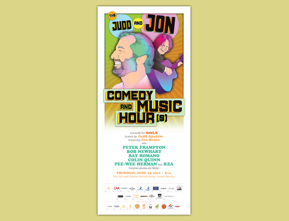
THE JUDD & JON COMEDY HOUR(S)

Writer/director Judd Apatow hosted his first big fundraiser for 826LA back in 2007. He came back in force in 2010, publishing a book to benefit the organization—I Found This Funny—and hosting a fundraiser of the same name. I was lucky to design the poster for that event, and even luckier that I got to design the poster for this 2012 follow-up event, too. Return business is always the greatest compliment.
Judd’s idea for this event was to promote it like a 70’s variety show in the mold of the Donny & Marie or The Sonny & Cher Comedy Hour. It would be the “Judd & Jon Comedy & Music Hour(s).” An early save-the-date flyer by 826LA designer Shannon Losorelli featured Judd & Jon’s heads back to back in silhouette, which I liked a lot, so that became the basic idea for the poster, too.
Working on the I Found This Funny poster I learned how quickly event lineups change, and how frequently. In a situation like that hand lettering each name in an interlocking block is fun, but not an efficient choice. For this poster I decided to create one big illustration by hand, while setting the type like a non-crazy person for once.
When it came time to do the illustration I found a few decent scrap images of Judd, but hardly any of his co-host Jon Brion. I asked if I might swing by Judd’s office and Jon’s studio to take a few shots. Judd was game, but our travel schedules clashed, and Jon isn’t a big fan of photo sessions, period, no matter how quick and painless. This left me in a bit of a lurch, because I wanted to do some very detailed illustrations, chasing my Revolver cover fantasies for the umpteenth time.

Lincoln DeFer at the fabled Largo Theater sent over some great shots of Jon in concert, so that was a solid start. A few nice shots of Judd came in from his assistant. I was reasonably set. And then I caught a lucky break. My friend Bruce invited me to a benefit event where I ran into Judd and his daughters. We said a quick Hello, and I told him that I was having trouble getting great photos to base my illustration on. I asked him if I could just take a few quick shots of him right then and there. “No problem. Let’s do it.” As I said, the man is a mensch. He gave me a few solid poses, and a few decent fake laughs. Looking on, his daughter offered a very dry “Great laugh, dad.” Which cracked Judd up, and that’s the shot that formed the basis for the illustration. Thanks, Iris!

That shot of Judd had exactly the level of detail I was looking for. Jon’s shots were taken with show lighting and from further away, while Jon was playing. So I couldn’t go with the original idea of a sort of comedy and music Janus head. I decided to make Jon a little bit smaller, but to show more of his body. And his guitar, of course.
Everybody liked the resulting piece, but Judd was worried that people would think he’d requested that he be bigger on the poster than Jon. This was a totally reasonable fear. I’ve had a number of situations where the relative size of portraits or title type sizes had been precisely negotiated by agents and managers. At the same time, I wasn’t keen on messing with my pretty drawing. I suggested that we make Jon’s name bigger than Judd’s to restore balance. Luckily, that did the trick.
As with the I Found This Funny poster, Typecraft kindly donated the printing—in this case on a fancy pearlescent stock—and I got to see some fancy people parade in front of it at the event itself. (Bob Newhart! Can you believe?)
