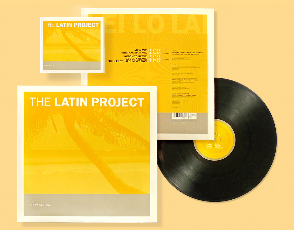
The LATIN PROJECT

The Latin Project is an inspired mix of deep house, hip hop and Latin melodies brought to life by British producers and multi-instrumentalists Jez Colin and Matt Cooper, with the help of a long list of stellar guest performers. This was my first collaboration with Electric Monkey Records, and another chance for me to get all bent out of shape about things.
- Buy one
- on Amazon
My friend Jennifer Stone of bossa:nova had recommended me to Jez, who liked my work and asked the label to hire me. Electric Monkey was a small operation, and the budget was predictably meager. On the plus side, they were working on an extremely tight deadline, which I like. Tight deadlines keep everybody from getting fussy.
Most importantly, I loved the record and was eager for something new and interesting to do. I agreed to take the job on the condition that I’d present only one design which they could take or leave. I’d make reasonable adjustments—text changes and such—but that would be it. We all agreed, and off I went.
Things got hairy fast. A previous designer for the band had come up with a poorly traced silhouette of a flamenco dancer. There was talk of using her as a logo, which was anathema to me. I tried cleaning up the artwork and recreating the character out of stereo speakers, but it just wasn’t right. Somebody else with the band created a second silhouette that I liked better, so I put her in my initial comp. Small. And screened back. I may have suggested printing her as a clear varnish. Embossing would’ve worked, too. “Look! I put your thingie on the cover! If you hold it into the light just right you can totally see it!”

Before and after. Let no one say that I don’t try to make things work with provided art.
I was far more excited about my artfully distorted type—an homage to Bruno Monguzzi and a holdover from my Lazy Dog bossa:nova flyers—which spoke to me of melodious sounds and swaying hips much more than some rickety piece of line art—particularly one that was created elsewhere. Ahem.

Sadly, my enthusiasm was not shared by the band. Going through the correspondence now it’s clear that the olive color scheme was the big stumbling block. Had I pitched the same design with something bold, it might have changed things. I did use brighter colors in my second round, but I also banished the photos Jez had taken from the cover entirely. I liked this second round, and thought it was more fun, but the band still felt that it wasn’t right.

Right around there, I started getting a bit grumpy. I had originally agreed to one design only, and now I’d already struck out twice with designs I quite liked. At this point, the band committed a cardinal sin: They asked a friend of theirs to fiddle with my designs, and sent me some of his covers to incorporate into the package. That’s simply not done. Fire me, if you like, but don’t hand my work to somebody else while I’m still on the job. No careful phrasing here: That just pissed me off.
Through all this, I had enjoyed working with everybody at the label. Jesse Lombardi, Chris Pekoe, and Casey Dunmore were my primary contacts, and they couldn’t have been sweeter. I got along great with Jez, too, but now, with these outside covers in the mix, things got tense. Jesse ran interference, Jez identified yellow as a strong preference, and I picked one of his more overtly tropical shots for the cover with a subtle orange on yellow treatment. And suddenly, magically, all was well. We had ourselves a cover.
From there on, in I blitzed through the CD packaging, the gatefold vinyl sleeve, and a 12-inch remix single. That one went to No.1 in the Billboard dance chart, and the included Masters at Work remix of “Lei Lo Lai” got nominated for a Grammy Award for Best Remixed Recording, Non-Classical. (The award ultimately went to a remix of Beyoncé’s “Crazy in Love.” Feh. Where is she now?)
A few months later, I reused the basic yellow and gray layout for the poster advertising Chip Kidd’s AIGA/LA lecture. Due to the delay of release dates the poster actually came out a month or two before the album that spawned it. On the poster I got to use a very nifty tarnished silver ink, too. And after all of this, Electric Monkey called me back for another job, designing the artwork for “Love Shines” by the band Big Advice.
After all this time, I still love the album, and I’m glad it looks the way it does. A little while ago I ran into Jez at an event, and I shrunk into myself a bit, thinking back with some embarrassment to my pissed-off self of years past. We never had a falling out or anything, but still… so much drama for something so simple. Why? We talked for quite a while, and I’m happy to say that everything’s cool. With the passage of time, we all tend to forget the process and end up remembering what counts: Hey, we did something together, didn’t we, and it came out good!
