The MONSTER MAKER APP

The Daily Monster MONSTER MAKER is an app that lets you make your own creatures in the style of the Daily Monsters. You start by tapping on a drop of ink, blowing it into a satisfying splat on the page. Now you can choose from over 300 parts to build your character—eyes, mouths, arms, legs, and a whole mess of special parts? Space helmet? Check. Viking horns? Yup. Roller skates? Obviously.
- Buy one
- at the App Store
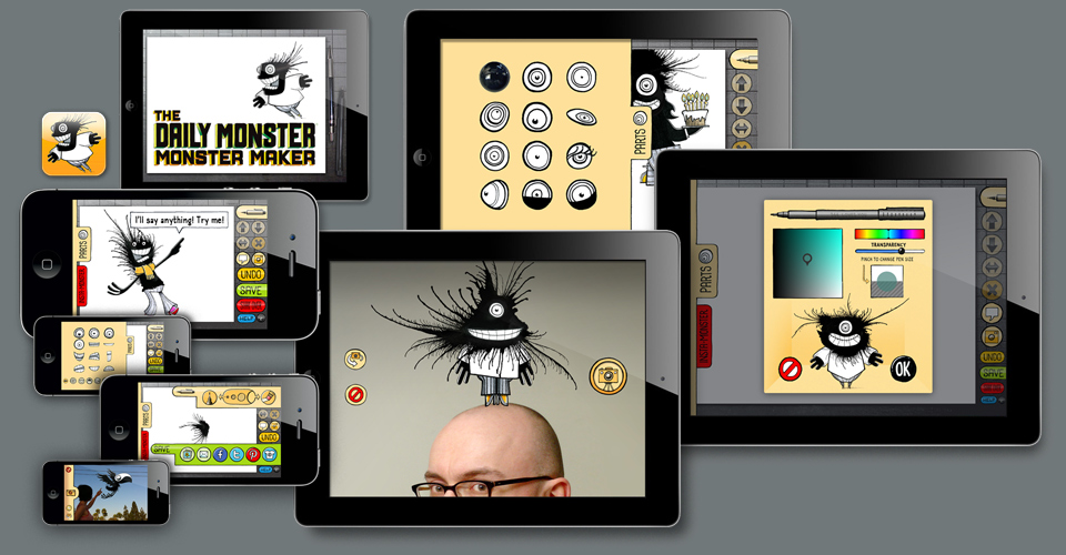
You can scale and rotate each part, you can add more ink splats. And if prefab just isn’t enough, drawing tools are waiting for you, too, including some very cool fuzzy brushes courtesy of Mr. Ze Frank. You can even pose for a photo with your Monster, and use the speech bubble to add personalized messages. When you’re done, you can save your work to your photo album, or post it to Facebook, Twitter, or Pinterest right from inside the app. If you’re really ready to go for broke, tap the Zazzle button and you can instantly order your creature on greeting cards, mugs, T-shirts, binders, and iPhone cases. This app is what jargon lovers would call “feature rich.” It’s your one-stop-shop all-in-one Monster making solution!

The app in action on the iPhone 4 and on the iPad 3.
The app came into existence in a somewhat roundabout way. I had been impressed with the elaborately staged photo booth setups of PoliteInPublic.com at a few events around town. When I planned the launch party for the Monster book in the spring of 2008 I contacted PinP’s Joe Rubinstein about creating a booth for the event. Back then it was a bit outside of my range, but Joe was extremely kind about giving me advice for doing my own setup. He even let me borrow one of his old photo printers for the night.
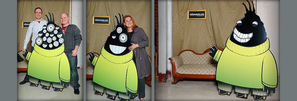
But what to do for a set? The event would be in the back of the Echo Park Time Travel Mart, so I was confident we’d find a photogenic corner there. Obviously, people should be able to pose with a Monster. My friend Elizabeth Thinnes, a movie art director, connected me with Steve Babcock and his team at the Universal Studios sign shop. I asked Steve if he could build a big cardboard Monster like you’d see as a standee in a movie theater lobby. I was going to do a few book signings at ComicCon a few weeks after the launch, so this would work for both occasions. “Sure,” he said, “but we should make it out of half-inch masonite. Cardboard will get wrecked too quickly.” Masonite it was.
A little while before all this, I had taken a breather from posting new Daily Monsters. One of the frequent visitors to the site, Charlotte Saylor, had suggested that I put up raw ink blots on the site, so people could make their own Monsters while I was on hiatus. I thought this was a great idea, and it led to many months of excellent Open Source Monsters. It was so much fun to see what different people would do with the same original shape.
When the time came to nail down the details of the big standee Monster for the book launch party I had a thought: What if we put a layer of Velcro over the Monster’s face, so people could get into the Open Source Monster spirit, and attach different eyes and mouths for their photo. Steve liked the idea, but suggested we use magnets instead of Velcro. Much cleaner. “You can do that?” “Oh yeah.” So we made one big Monster with a half dozen different mouths and a bucket full of of eyeballs. As you can see, people loved it!

Tim Moraitis and Kenn Rudolph produced the 100 Days of Monsters DVD. Vesna is a friend from AIGA/LA days.
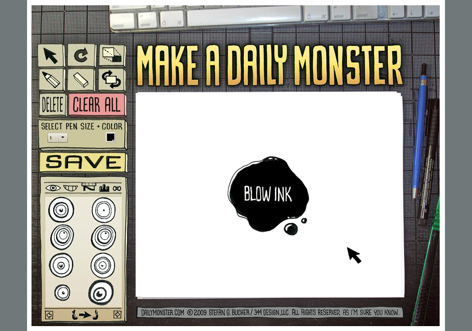
I immediately started thinking how I could make this into a bigger thing. The first thought was to simply replicate the standee at desktop size, but that would’ve been surprisingly expensive, and would’ve meant having to ship things from my kitchen, which I wasn’t keen on. It didn’t occur to me to make this into something digital until I read an article about elance.com, where I could connect with developers. I hired a young programmer in Bangladesh, and drew up an interface design and the first set of parts. We worked on putting together the prototype in Flash for over a year. Due to personal difficulties, the programmer wasn’t able to work for long stretches of time, and would sometimes vanish for weeks or months. In the end, I had to face that the project would never got finished. It was almost, almost working, but it never quite reached a point of elegance. I chalked the whole thing up as a learning experience and moved on.

The original Monster Maker interface from 2009 — All Flash, all desktop
Then the iPad came out, and I thought, “Hang on! This could work!” Through friends I connected with a local programmer who was so good that he was forever too busy with well-funded gigs to actually work on my app. Within months of our introduction he got hired by an undisclosed company in Washington State. Back to zero. Luckily, my friend Tobias Rink introduced me to German developer Dominik Wei-Fieg, who took the ball and ran with it. He understood what the app was all about, and put in countless hours building a truly excellent product. After five months of intense work, the Daily Monster Monster Maker 1.0 went on sale in the iTunes App Store on August 8, 2011.

The first sheet of parts, dating back to June of 2009
Since then, we’ve had almost 20,000 downloads, and I’ve gained a whole new appreciation for interface design, how much work it takes to make something seem simple, and how angry people get when their app crashes. Which is one of the reasons there’s no Android version. This whole thing lives between Dominik and me, and it’s tricky enough making everything work smoothly on the various Apple gizmos. Maybe one day… In the meantime, it’s been amazing to see people have fun tricking out their own Monsters, and posting them online for their friends.
Dominik and I are forever fiddling with the next version, trying to integrate fun new tools, and making things work more beautifully. Of course, I’m adding new Monster parts all the time, too. Go ahead, download that app!
