TOM WUDL CATALOG
Almost exactly ten years after first designing an announcement for one of his shows, I finally had the opportunity to design a catalog for artist Tom Wudl. It was a particular honor as this is the first time a body of his work had been gathered in a book, and I’m grateful to L.A. Louver for entrusting me with the task, and to Tom for so kindly embracing my contribution to the effort.
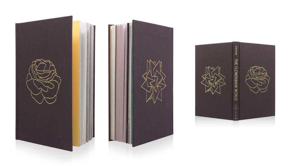
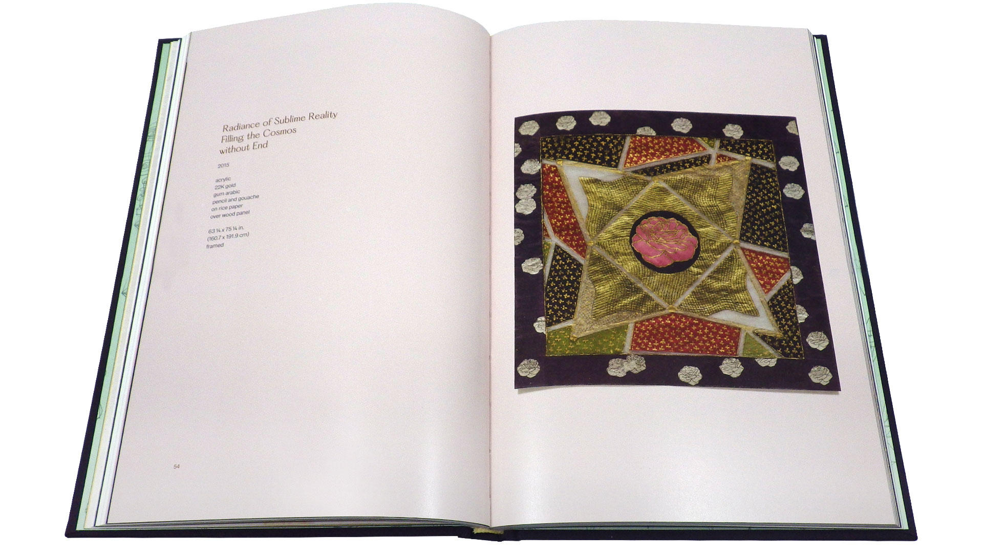
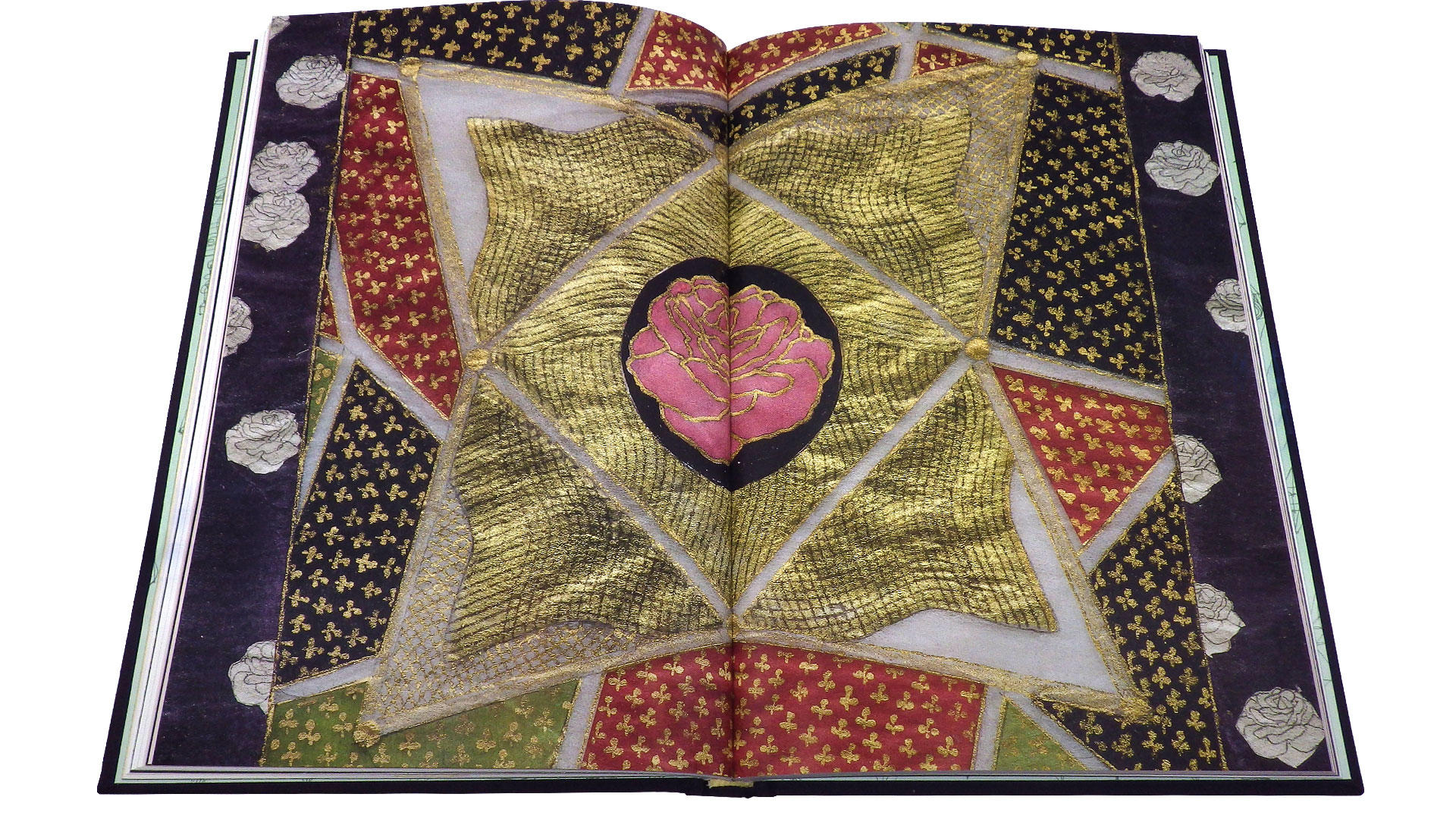
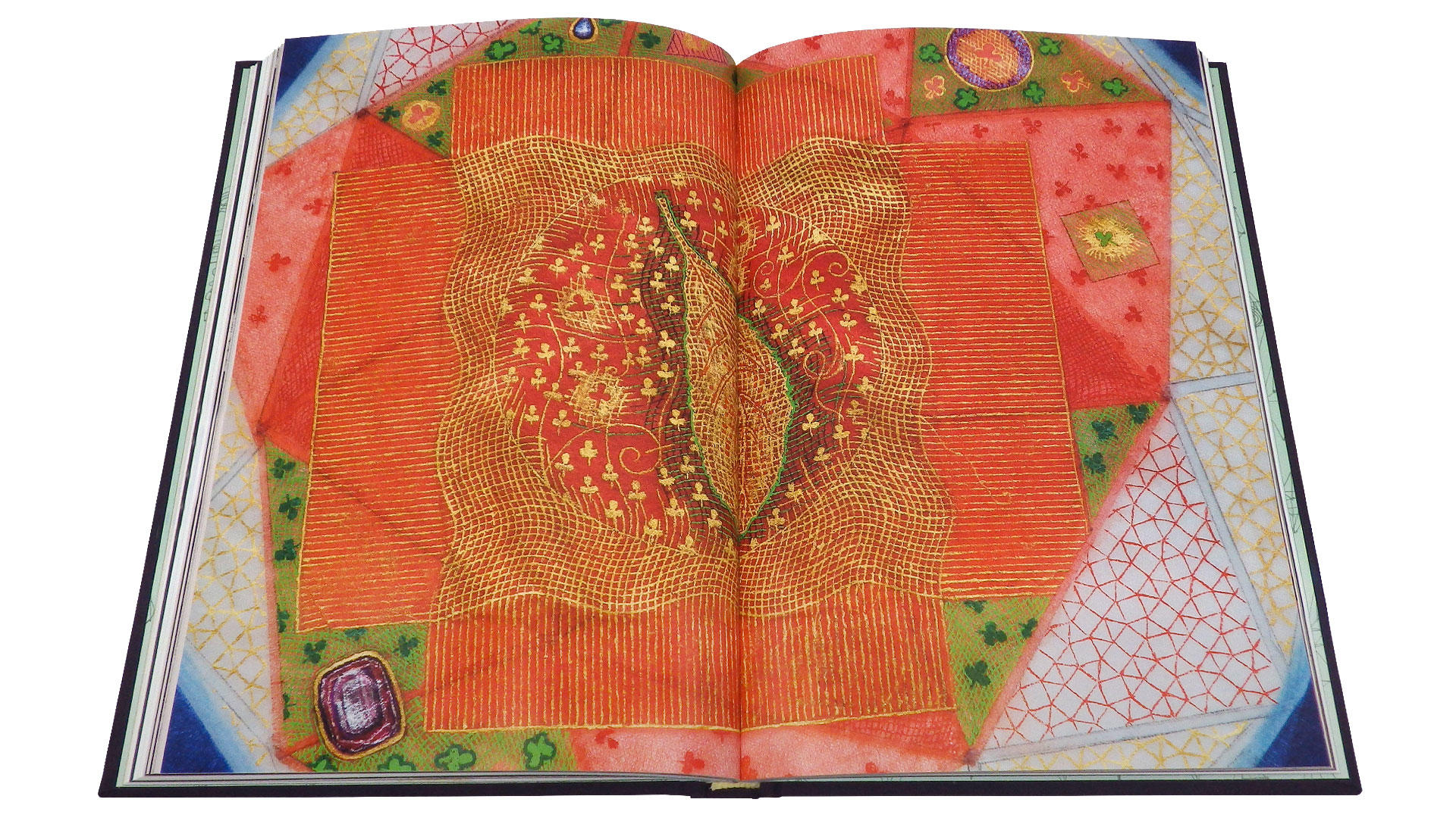
Tom has been on one of my favorite artists for ages, and it was a pleasure to make this book for him. The degree of detail and obsessive attention in his work makes mine look positively relaxed by comparison. When discussing formats with him and the gallery, we felt that we should choose a relatively small size, so we could increase the page count instead. Even a fairly large format—like 12x12 in., for example—wouldn’t let us properly reproduce the truly staggering amount of near-microscopic detail in Tom’s work. By prioritizing page count over size, we were able to show each piece in its entirety along with two accompanying spreads each of details at original size.
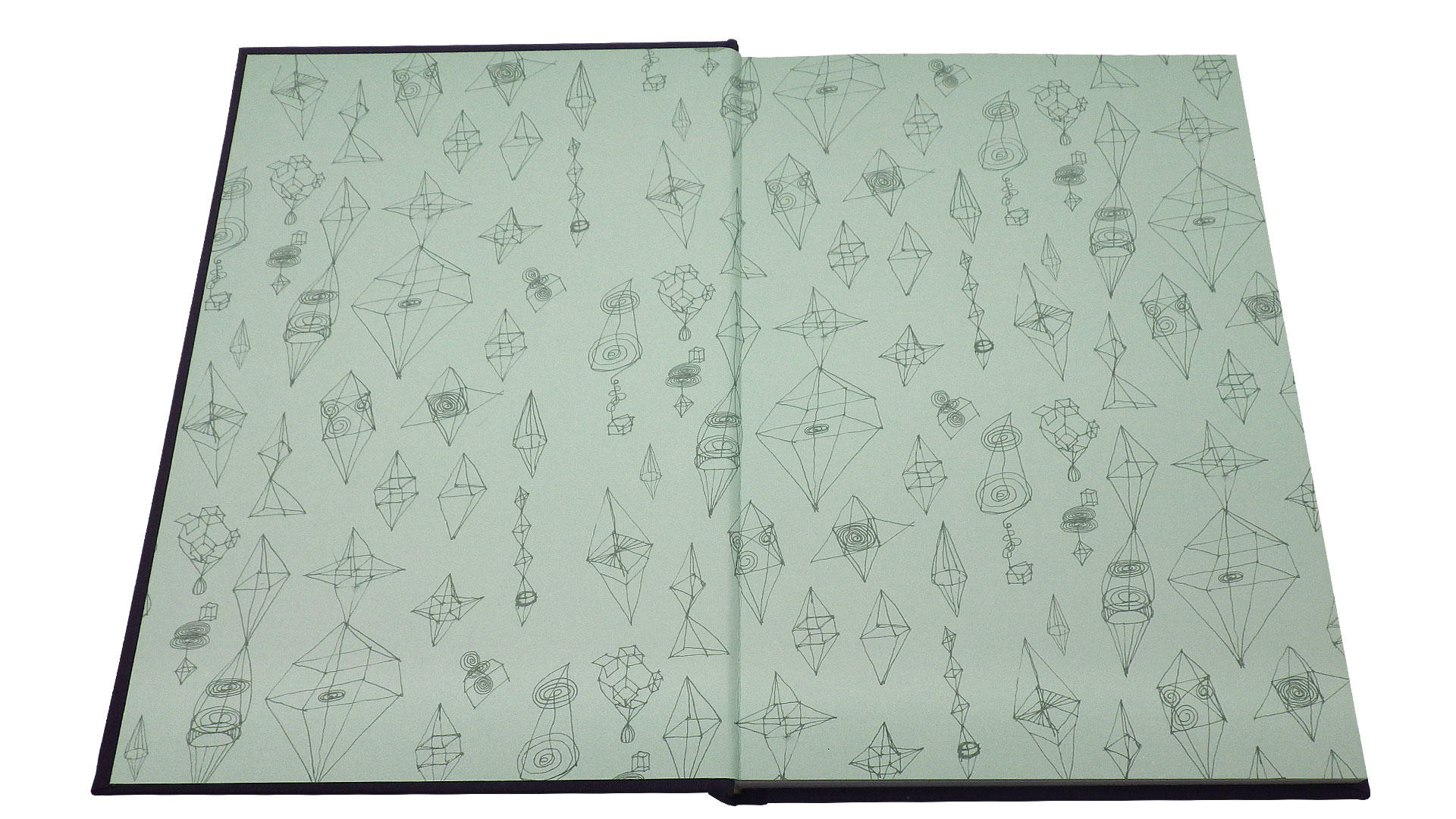
Tom suggested that we use his sketches for the endpaper, which worked well:
The typefaces used are Hatton, designed by Mathieu Desjardins, and Cirka by Nick Losacco. Both have an immediate calm elegance and reveal quirky details upon closer inspection. The book opens with a lovely and insightful essay by Tom.
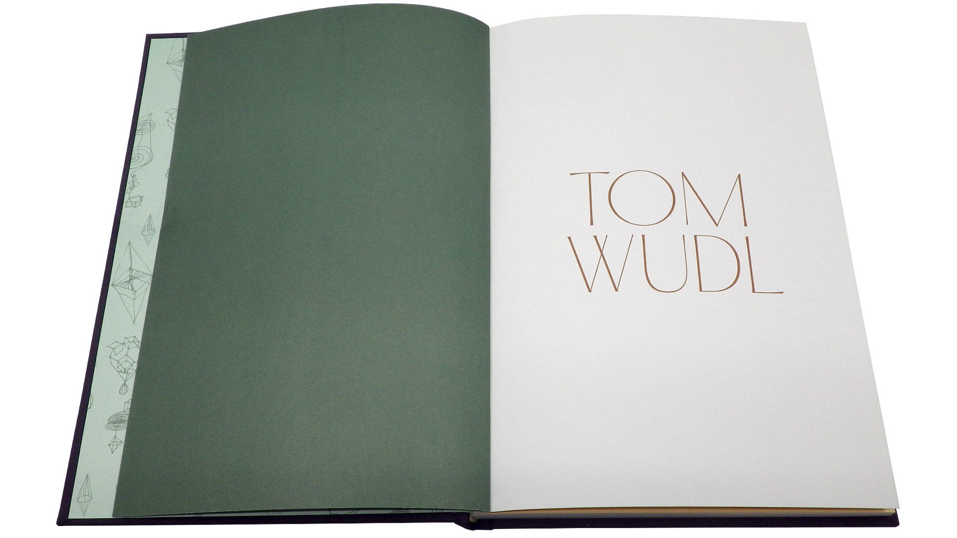
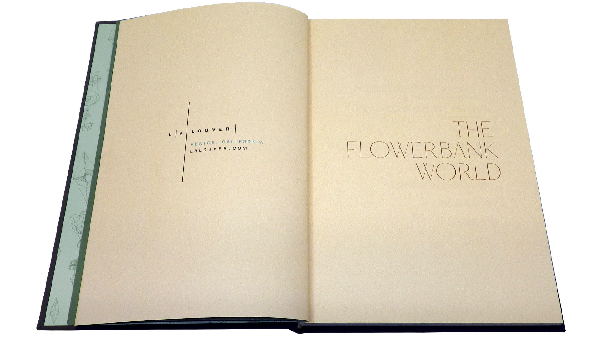
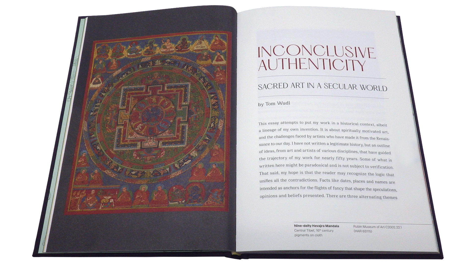
This opening section of the book is printed on uncoated paper. Tom had requested bible paper to give the feeling of a sacred object. Printing on bible stock has been on my wish list for years, but it never seems to work out. Sadly, this time was no exception. Regular sheet-fed printing presses can’t handle paper that thin. You need a specialized setup that is typically optimized for large runs. To make it happen, we’d have had to print parts of the book away from our usual partner, Typecraft, and unite the materials at the bindery. Time restrictions made this impossible. Instead we found a wonderful paper—70.0 lb Mohawk Superfine Text Ultra White with an eggshell finish—that let us keep all printing at our home base, and gave us beautiful results on press.
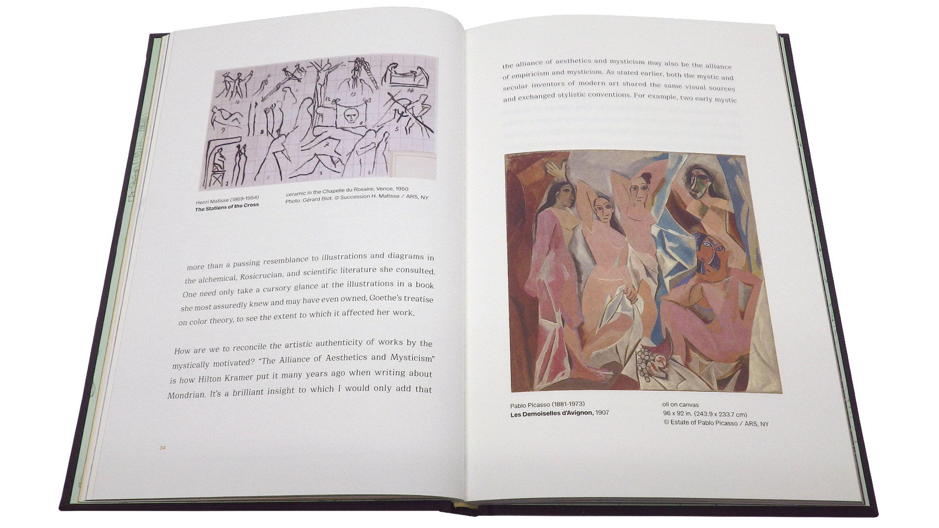
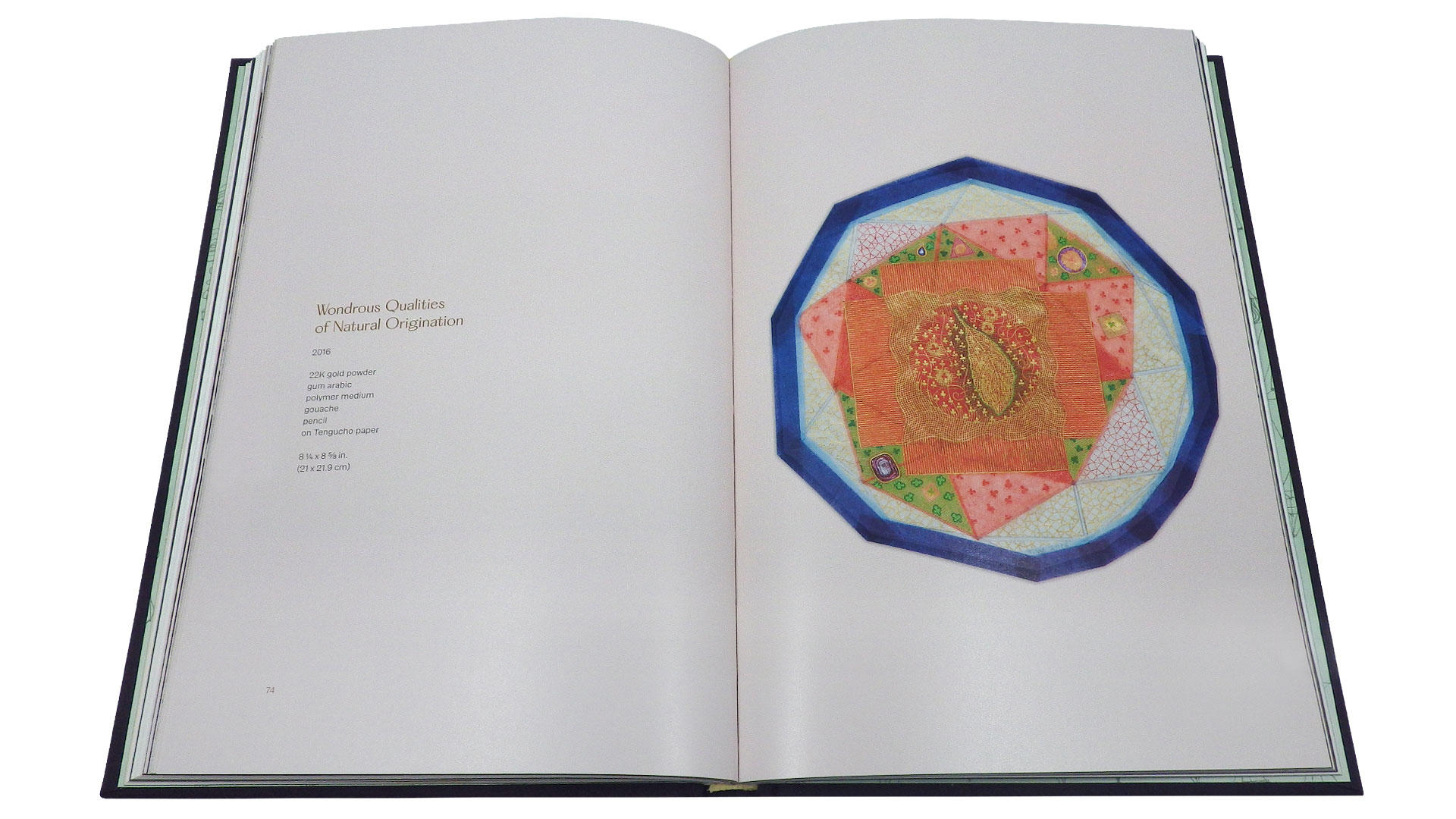
Once we get into showing the artwork, we switch to coated stock to allow for greater color fidelity and detail. Each piece is reproduced in its entirety before zooming into full size details, so you can more fully appreciate Tom’s divine madness.
As with all catalogs I design for L.A. Louver, my main job is to make my work transparent relative to the artwork. It’s usually the index where I get to show off a little bit. Not that this is an extravagant design, but I was happy with the way I structured the information. At this point in the book, we also switch back to uncoated paper.