UCLA EXTENSION (SUMMER)

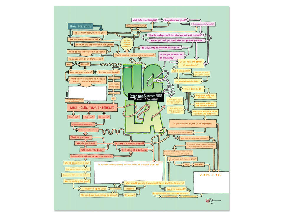
Ten years after my second UCLA Extension cover (and almost eleven years after my first) I had the honor of participating in the “Masters of Graphic Design” series once again. Creative director Scott Hutchinson asked me to write and design a catalog cover based on my book 344 Questions. Needless to say, I was more than happy to oblige.
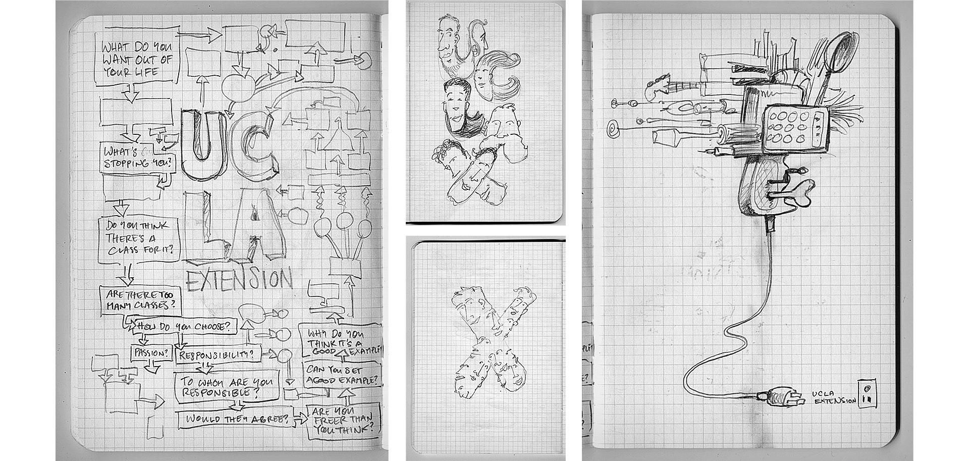
My initial idea was to create special UCLA themed LetterHeads for the cover. Scott was open to the idea, but reminded me, quite rightly, that this wasn’t an art commission, but that he needed a cover that would speak to current and potential students. He challenged me to dig a bit deeper, and I got busy making sketches of alternative options.
As you can see from these thumbnails I did pich the LetterHeads idea, and added an adaptation of my 344 Questions artwork, asking students questions about their hopes and dreams, and what’s keeping them from reaching their goals.

My “Big Idea” comp was based around an elaborate prop. I’d build an “Everything Machine”—a psychotic hairdryer Swiss Army knife raygun—that would symbolize the great, crazy all-encompassing enthusiasm of students eager to expand their skills, so they could do anything and everything! All that would be necessary was to plug in the machine. Between plug and wall outlet would be the words UCLA EXTENSION.
Scott enjoyed the idea, but couldn’t resist the potential of the Questions diagram. As much as building the Everything Machine would’ve been a great artistic challenge, I can’t argue with the benefits of the diagram: It draws the eye, it’s able to carry a ton of content, and that content is geared to create an emotional connection with the audience. Can’t beat that with a stick, nor can you beat it with a clever prop.
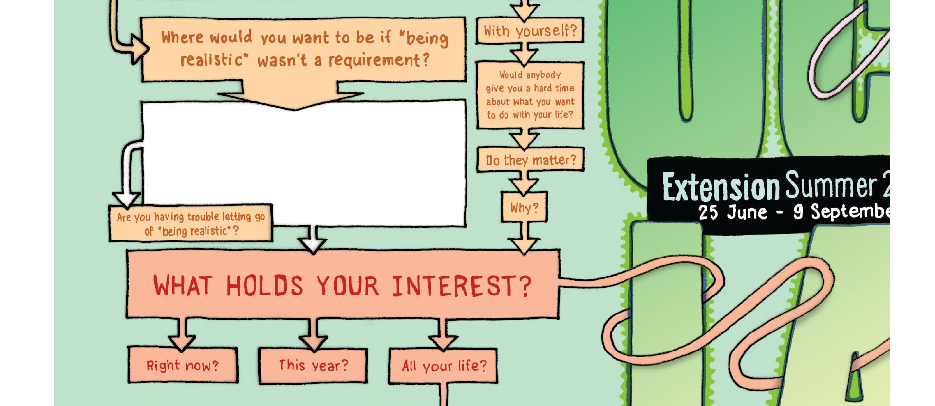
I set to work writing questions, and then turned them into an attractive diagram. Much time went into finding the perfect colors. I’m often seduced by bright, bold colors, but this time I wanted something more sun bleached and beachy, something appropriate for our fair city.
It was an honor to be part of the UCLA Extension cover series once again. We’ll see if they’ll have me back again in another ten years. I still haven’t done a Spring cover!
