LOVE, WHITNEY

Most of the phone calls I receive make some sort of sense to me. And then somebody will call me, and ask if I’d like to design a compilation of Whitney Houston’s greatest love songs. What now? My whole music portfolio at that point was full of electronica and earnest rock. “Whitney? Really? I mean… sure! Yes, of course. I’d love that!”
The person calling was Joe Mama-Nitzberg at Interscope/Geffen/A&M, who had previously hired me to work on the Sting CD. “I just need somebody who will make this a fun job to work on.” See… now it started making sense. With that introduction, and with everything that ended up happening to Whitney, you might imagine that this was a high maintenance job with lots of drama. You’d be wrong. I wish all my music gigs had been as smooth, pleasant, and well-run as this one.
The label had secured the rights to a shoot Whitney had done for Dolce & Gabbana with photographer Warwick Saint. The images were great, Whitney looked amazing, what’s not to love? All I did was to extend the background into a booklet appropriate Cinemascope format, and put in some tasteful typography. No fuss, no muss.
I did sneak in a few bits of flair. For one thing, the hairlines inside the booklet flare out into hearts as bullet points that anchor the individual song credits. I flopped the track listing on the back cover on its side, and aligned it with a stylishly slimmed down barcode. (Beautifying the barcode remains my eternal mission.) Lastly, I stole the little w-swoosh on the cover from Linda Wang just to add a little bit of softness. (Which is also the function of the comma in the title. Otherwise it’d be too imperative.)
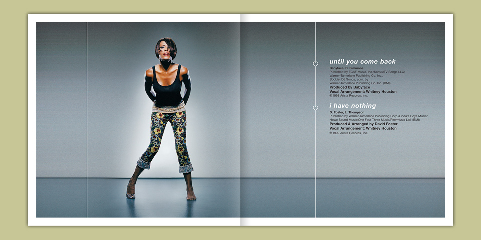
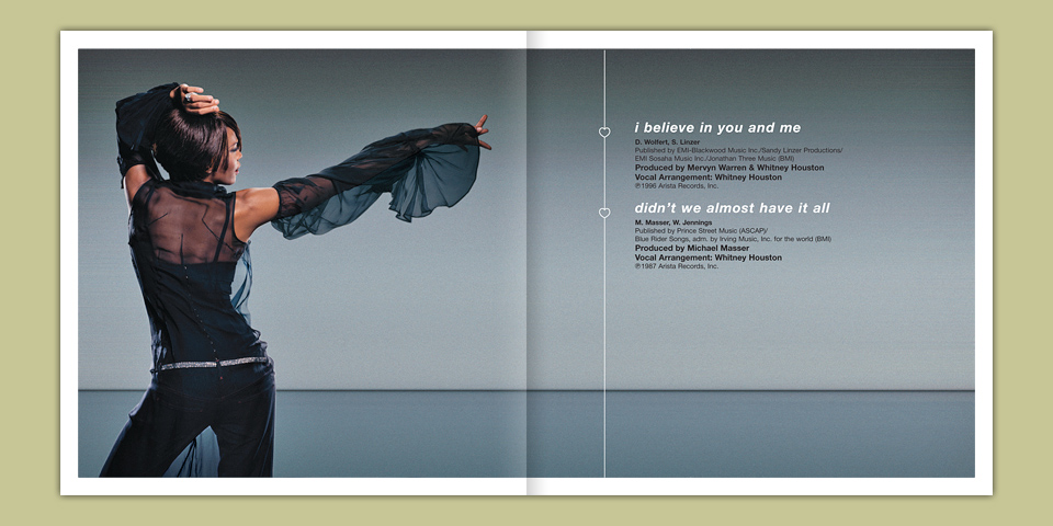
Spreads from “Love, Whitney.” Please note the stylish hearts.
Oh, and I used a few little production tricks on the disc itself. I loved working on the actual discs, because it would mean silk screening. The challenge was always what to do with the legal copy. Here I used a trick I had picked up from a Rage Against The Machine CD. (I want to say that it was “The Battle For Los Angeles.”) The legal copy is printed on the clear center ring of the CD, but it’s printed inverted. Then the whole thing is covered with a second, contrasting ink color. This way, the text is invisible on the front, and clearly visible when you flip over the disc.
It’s a really simple trick, but it’s really hard to get it approved, because the legal department doesn’t see mockups, they see PDFs. So they’ll say, “Hang on! Where’s the legal?” Or they’ll see a production file, and they’ll ask, “Wait! This legal copy is inverted!” It’s a credit to the production staff at IGA that they got this to happen here. Because even if you get approval, it can still get screwed up by a well-meaning pressman, who’ll switch the ink order. “We almost covered your legal! Good thing I caught that!” This very thing happened with the AIGA V01CE CD. Don’t get me started.

Thanks for the trick, Rage Against the Machine!
I’m very pleased that it worked out in this instance. Of course, the white ink ended up being semi-transparent, so it didn’t quite cover the bright green text on the front, but so it is. Life goes on. And who’d even notice with the pretty iridescent rays and tiny concentric “love, whitney” typography.
If I have one regret about this package it’s that I didn’t fight harder for a different cover image. Not that I dislike it. It’s just that I enlarged part of a smaller shot, and Whitney’s hair and her amazing feather thingamabob look a bit blotchy as a result. I wish we’d gone with a smaller crop to keep everything crisp. It’s still a nice design, but that’ll bug me forever.
Which is odd. Emotionally, I wasn’t tremendously invested. I like Whitney Houston. I had a big crush on her around “I’ll Be Your Baby Tonight.” But the Sting experience had scarred me a little, I think, so I just tried to be helpful to Joe and his team. I didn’t fight to cram clever little ideas into every corner of the thing as I would have usually done around that time. I just took a breath on this one, and the result is better for it. There’s a life lesson here, I’m sure. And how annoying is that? Moving on!