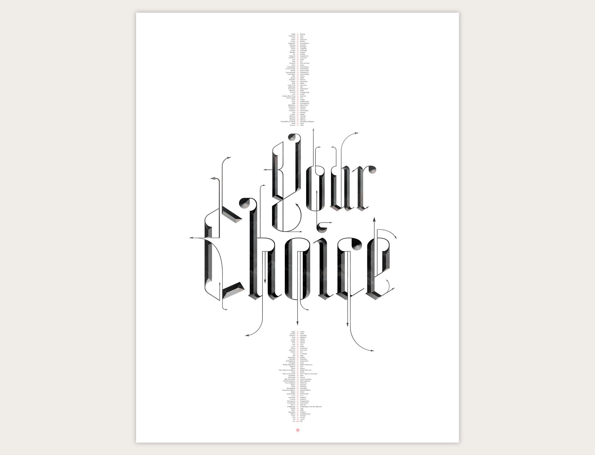
The PRO CHOICE Poster
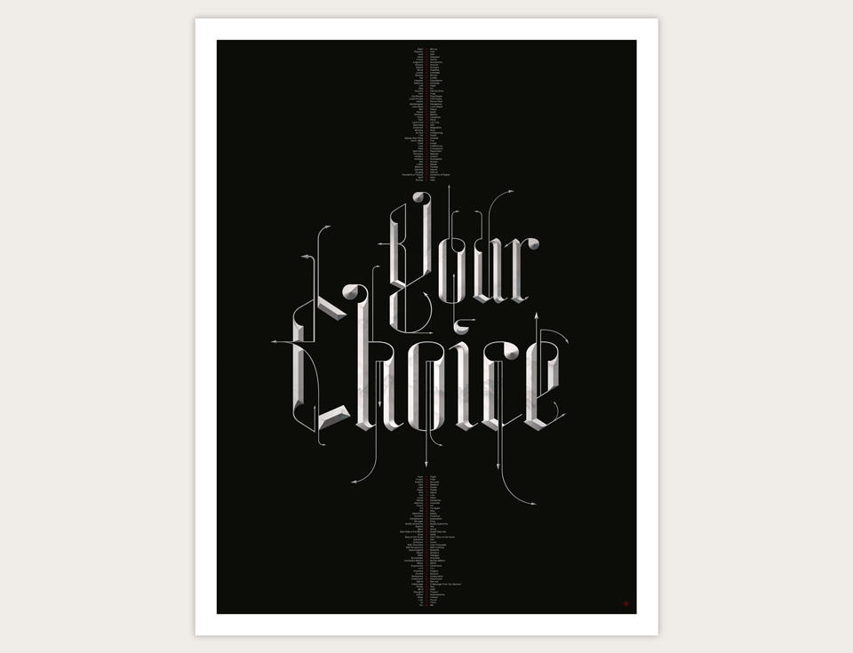
Over the last nine years I’ve had the privilege of working with a perceptive and kind psychotherapist. He’s been a huge source of safety and evolution. 2022 is a year of seismic personal change for me, and as I got busy creating a narrative around it all, my therapist said, “I want to make you aware that this isn’t just happening to you. You are choosing to do certain things and to not do others.” It’s obvious in retrospect, but it was one of those a-ha moments that let me think of my situation differently.
When an idea really hits me like that, I sometimes like to mark the moment with a piece of design or illustration. It’s like extreme note taking. Instead of just writing someting down, I have to be face to face with the idea for days and weeks. I spent several days over the course of a few weeks working on the main typography, as well as writing and pacing 100 choices that seem important to me these days.
As I was working on all this, the radical Christian majority of the Supreme Court of the United States struck down Roe v Wade, stripping constitutional protection from over a hundred million American women and invalidating their bodily autonomy. The Court rejected their right to the most fundamental choice—whether to give their body over to the arduous physical task of incubating and gestating a fetus that can eventually become a baby.
This obviously put a poster about choice in a completey different context. I finished the work with this assault on fundamental human rights firmly in mind. I’m putting this poster on sale in my Zazzle store (and on a few other print-on-demand platforms), and I will donate 50% of the proceeds to the ACLU Foundation. Will it change the world? One suspects not. But as of this writing, the United States are turning increasingly Weimar; it feels good to do something.
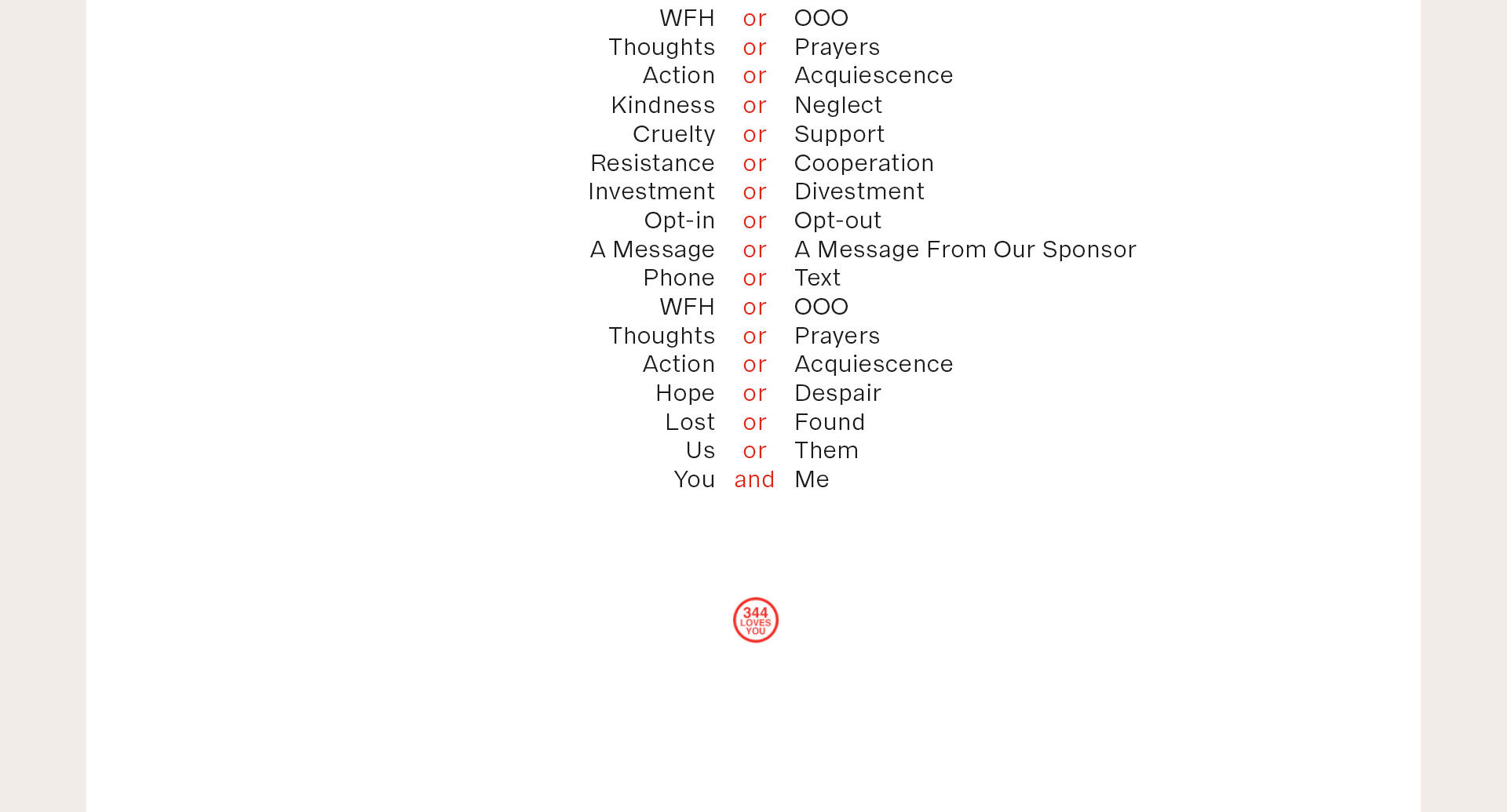
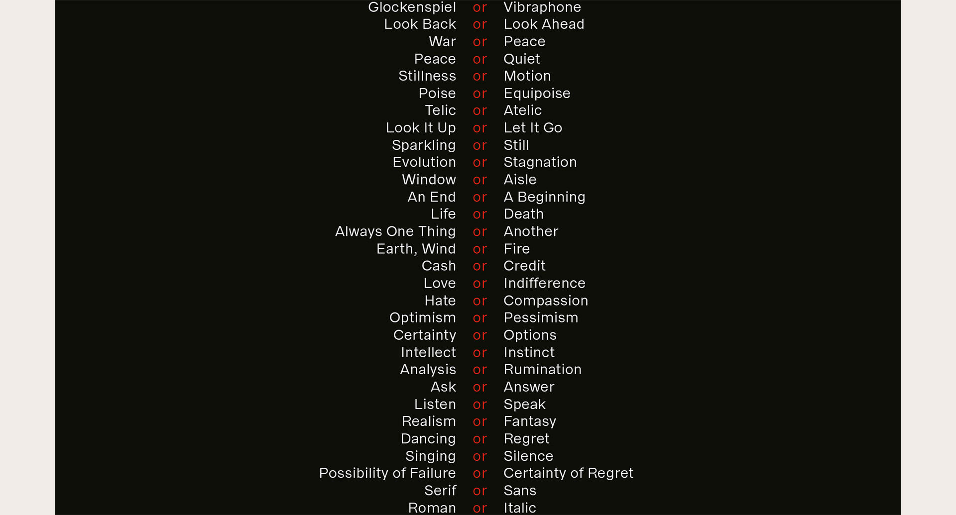
Here is a closeup of 23 of the 100 choices on the poster. I’ve always liked writing this sort of rhythmic pseudo-poetry. It feels good to my eyes and ears. I hope it’ll prompt a few interesting thoughts for you, and maybe even a smile here and there.
On the design side, I’m trying to maintain better boundaries between my life and my work. Because of this, I decided not to create the letterforms entirely from scratch. Instead, I started with the gorgeous Tannhäuser typeface by Ruslan Abasov. Here is a before and after of the unaltered and modified type:
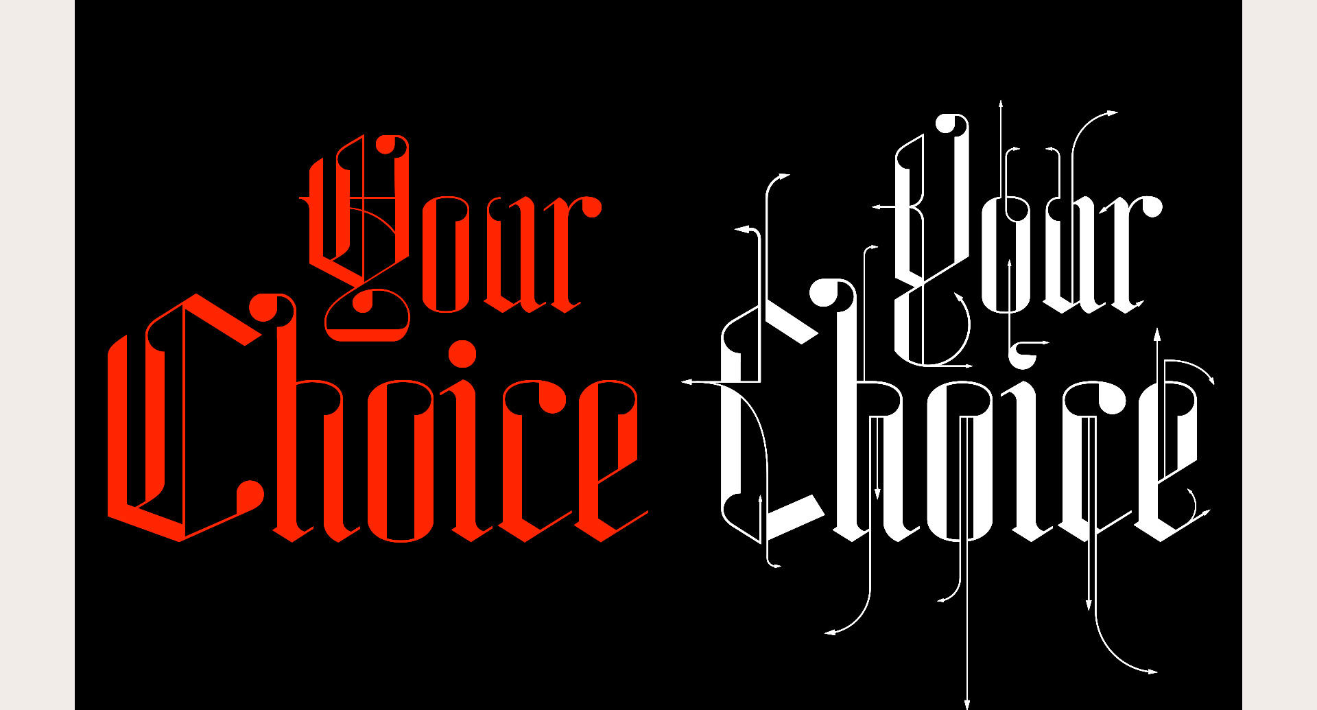
As you can see, I left the structure of the lower case letters alone and simply added adornments. The capitals got a bit more of a makeover. I lobbed the outer stems off the Y and the C to create a more condensed look, and did a whole little number on the descender of the Y. Across the board, I added ornamental calligraphy lines that turn into flow chart arrows, symbolizing choice.
Once I had the basic letterforms and ornamentation sorted out, I added a bevel and some basic lighting. This is also when the black background entered the picture. I’d initially planned on having white letters on a white background, assuming that the shading on the bevels would give me enough definition. But the fine lines of Tannhäuser were too thin for the job, and I didn’t see a way of fattening them up without fully redrawing everyting. Besides, the letters look great on black!
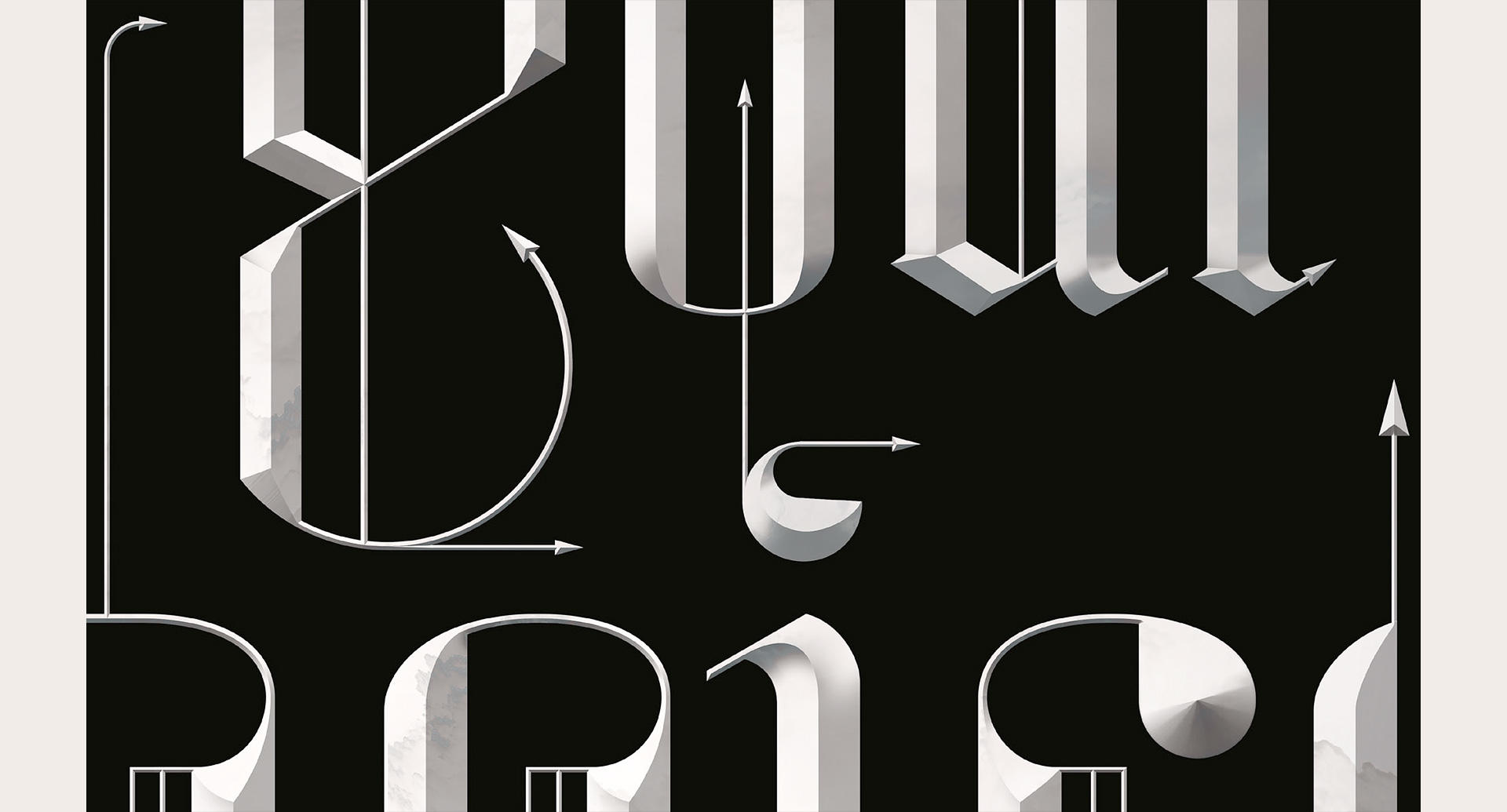
I’ve been obsessed with bevels for a long time, as you may know if you’ve seen my titles for the movie Mirror Mirror, for example. I grew up in an almost 800 year old small town in Germany—beveled lettering was everywhere. I never thought I could do anythig like that without becoming a stone mason or a wood carver. And then I met Photoshop, where beveling anything is a checkmark in the Layer Style palette. Since then, I’ve indulged myself, perhaps to excess.
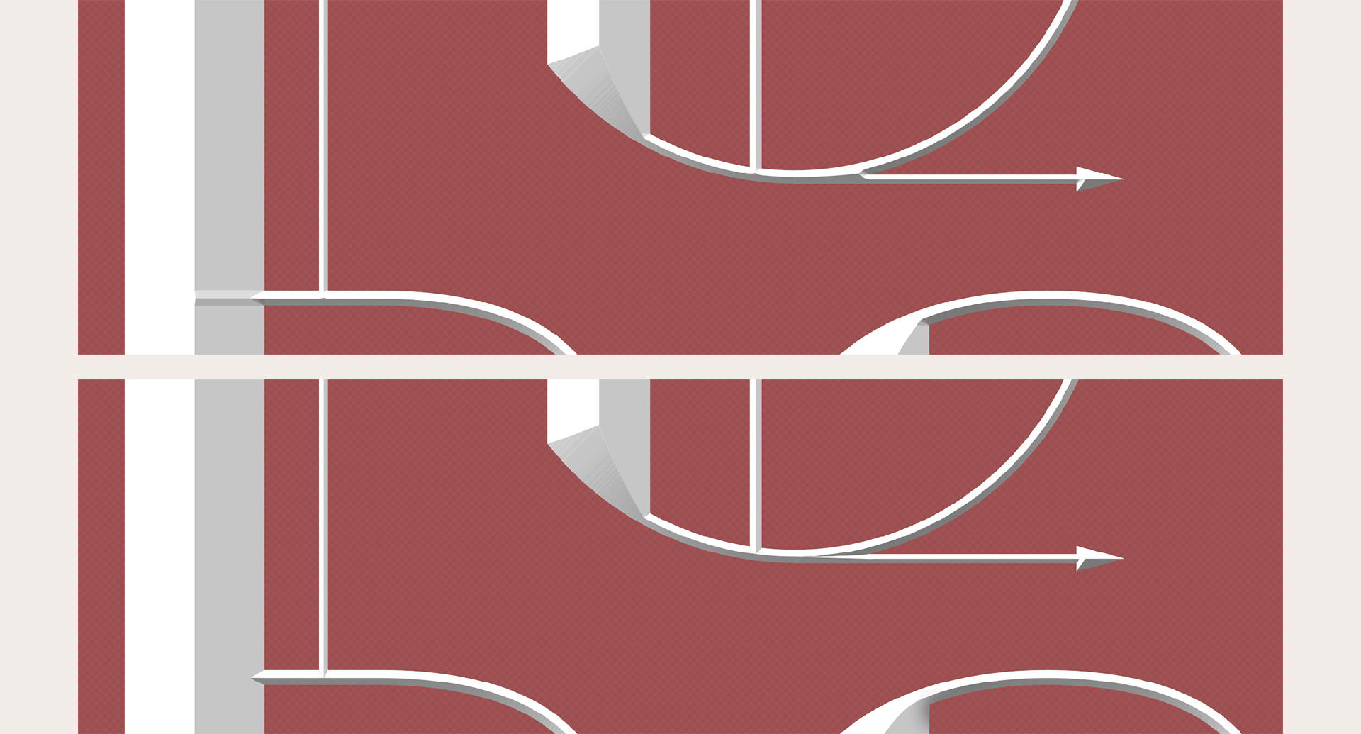
The natural barrier to complete beveled abandon is that Photoshop bevels are kind of terrible. They’re a solid start, but they fall apart as soon as angles and curves enter the picture. That’s where the many, many hours of retouching come in. Lasso, pen tool, quick mask, airbrush, eraser, lasso, pen tool, quick mask, airbrush, eraser, asso, pen tool, quick mask, airbrush, eraser… until everything looks logical and elegant. Here are some before and after screen shots:
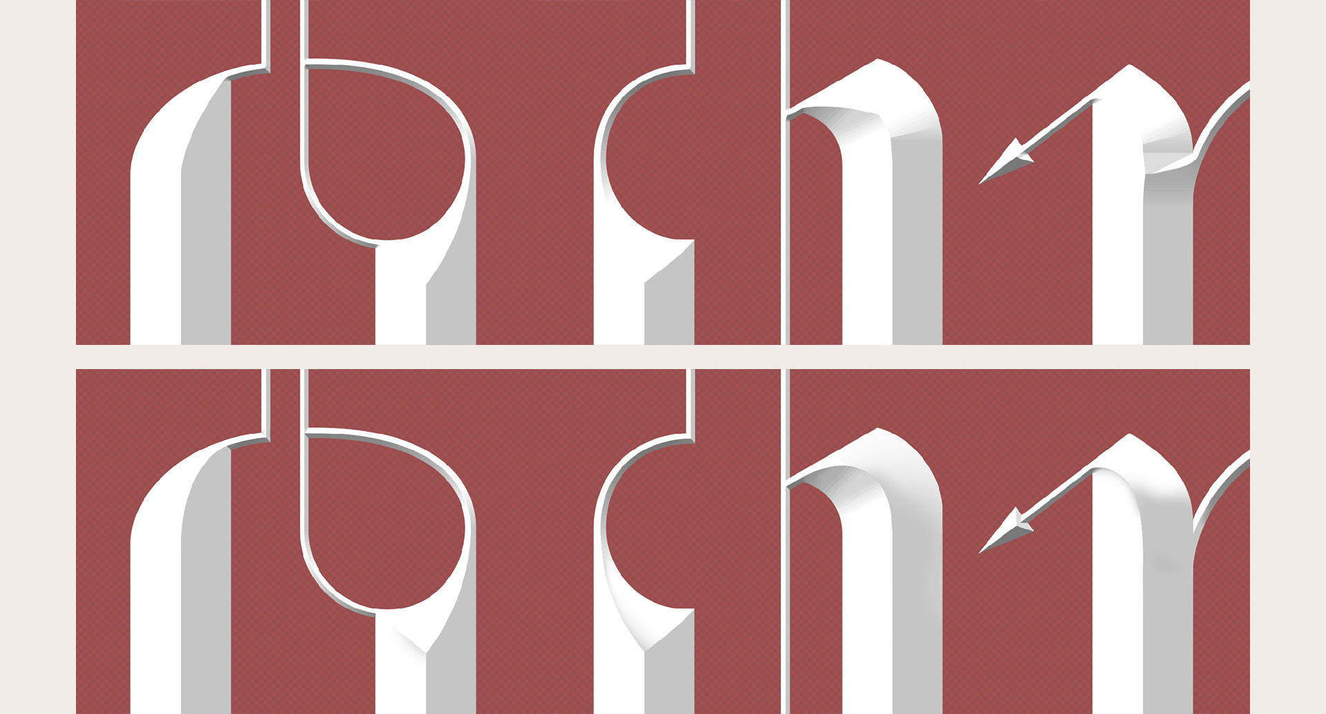
Next time you see beveled type on a movie poster, take a second to check the joints. See if everything is crisp, or if things are blobby. You can see a good example of what I’m talking about at the bottom of the Y.
TL;DR: Quality takes time, and I work hard to make quality work for you. If you’d like to support what I do and make a donation to the ACLU Foundation at the same time, you can pick up a poster in my Zazzle shop. Or a T-shirt. Or a laptop sleeve. Or a mug, of course. There must always be a mug!
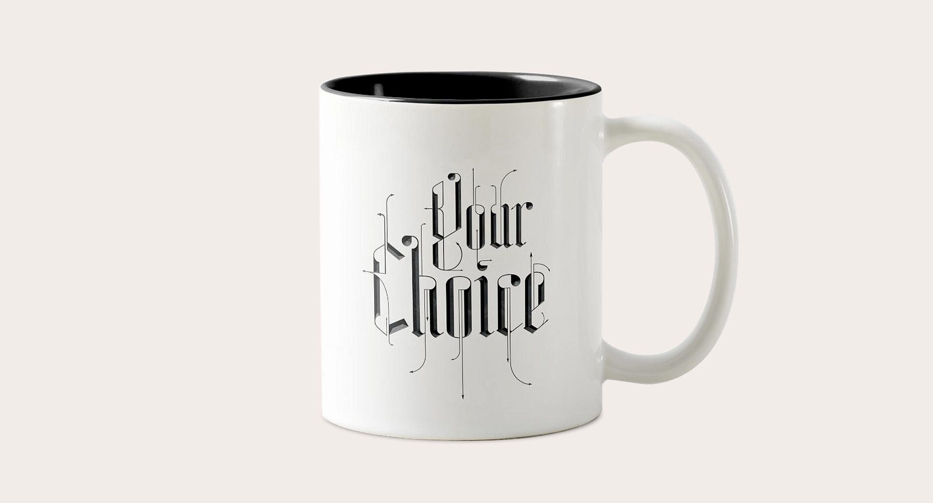
Oh, and if an 18 x 24 inch black slab doesn’t work with your interior design scheme, you also have the option of a black on white poster:
